All Themes
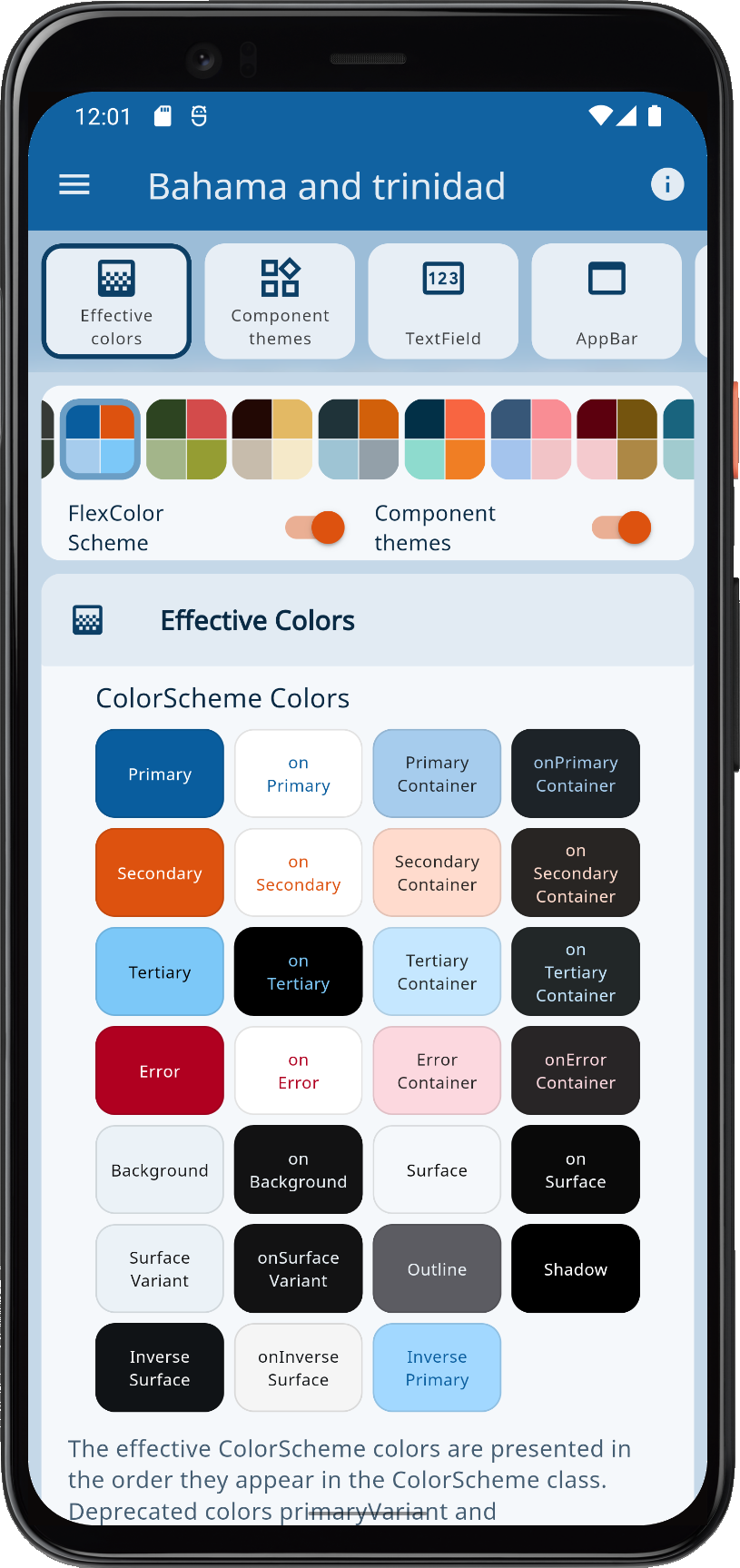
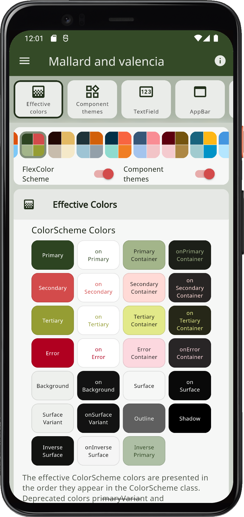
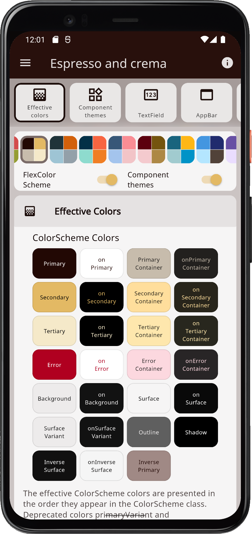
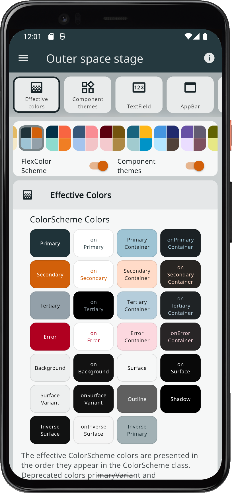
Themes are no fun without some built-in color schemes that are ready to use and can be turned into themes. FlexColorScheme comes bundled with 52 matching light and dark color schemes. You can use them in your applications if you like. Below is a grid showing all the color schemes in light and dark mode. You can click on the thumbnails to open a high-resolution version of each image.
 |
 |
 |
 |
 |
 |
 |
 | |||||||
 |
 |
 |
 |
 |
 |
 |
 | |||||||
 |
 |
 |
 |
 |
 |
 |
 | |||||||
 |
 |
 |
 |
 |
 |
 |
 | |||||||
 |
 |
 |
 |
 |
 |
 |
 | |||||||
 |
 |
 |
 |
 |
 |
 |
 | |||||||
 |
 |
 |
 |
 |
 |
 |
 | |||||||
 |
 |
 |
 |
 |
 |
 |
 | |||||||
 |
 |
 |
 |
 |
 |
 |
 | |||||||
 |
 |
 |
 |
 |
 |
 |
 | |||||||
 |
 |
 |
 |
 |
 |
 |
 | |||||||
 |
 |
 |
 |
 |
 |
 |
 | |||||||
 |
 |
 |
 |
 |
 |
 |
 | |||||||
| All available color schemes (click to open a high-resolution version of each image) | ||||||||||||||
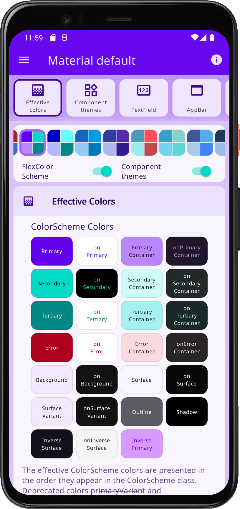
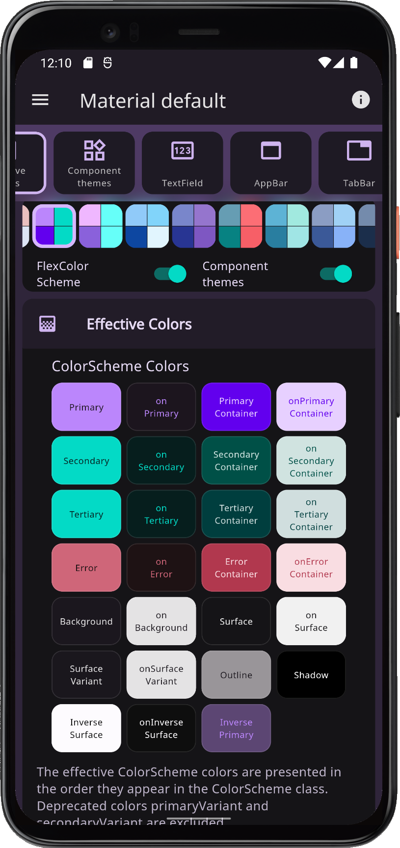
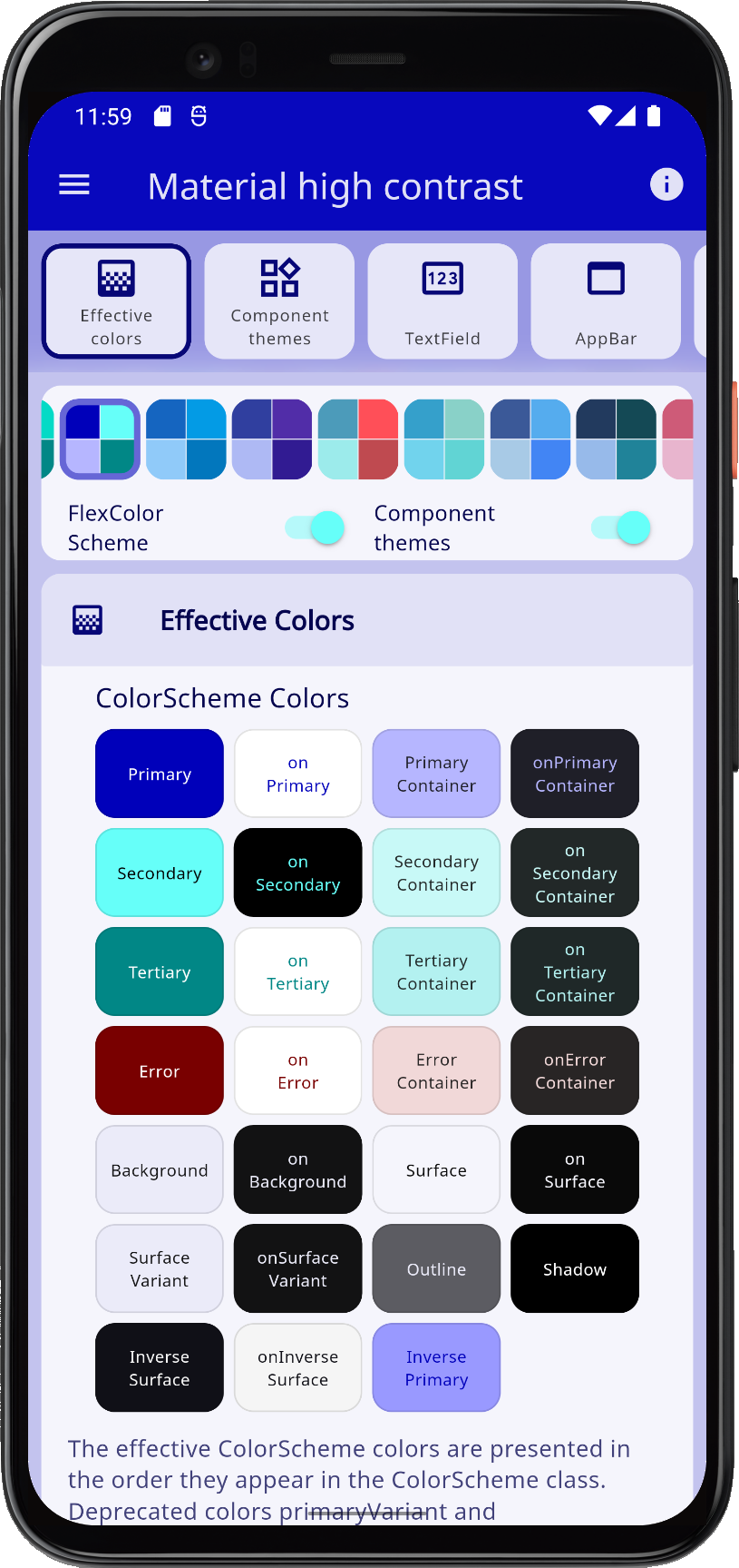
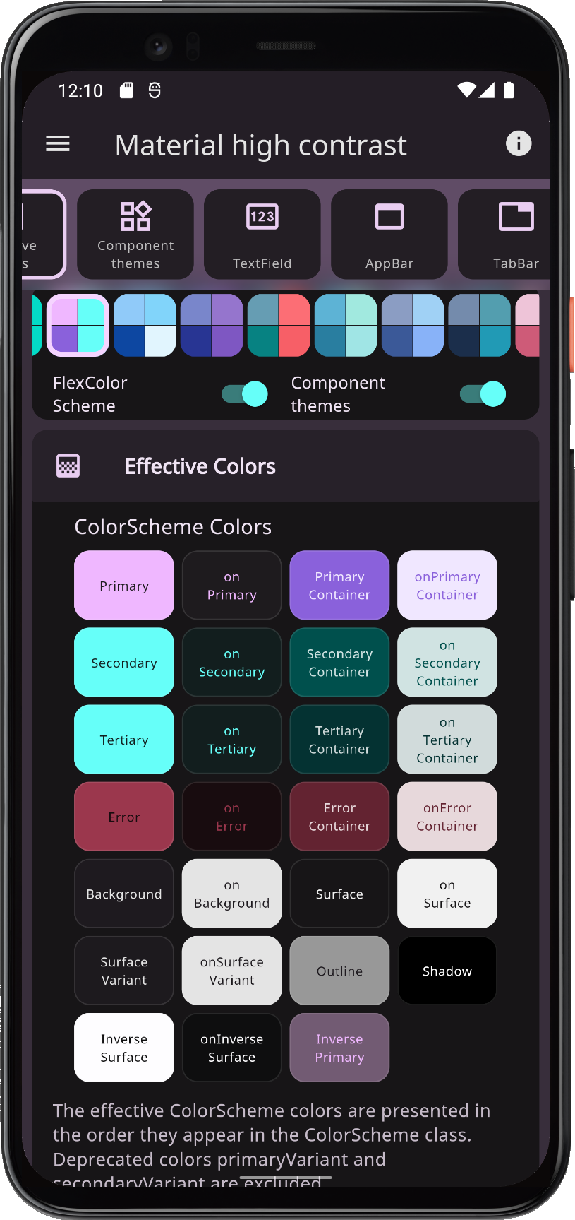
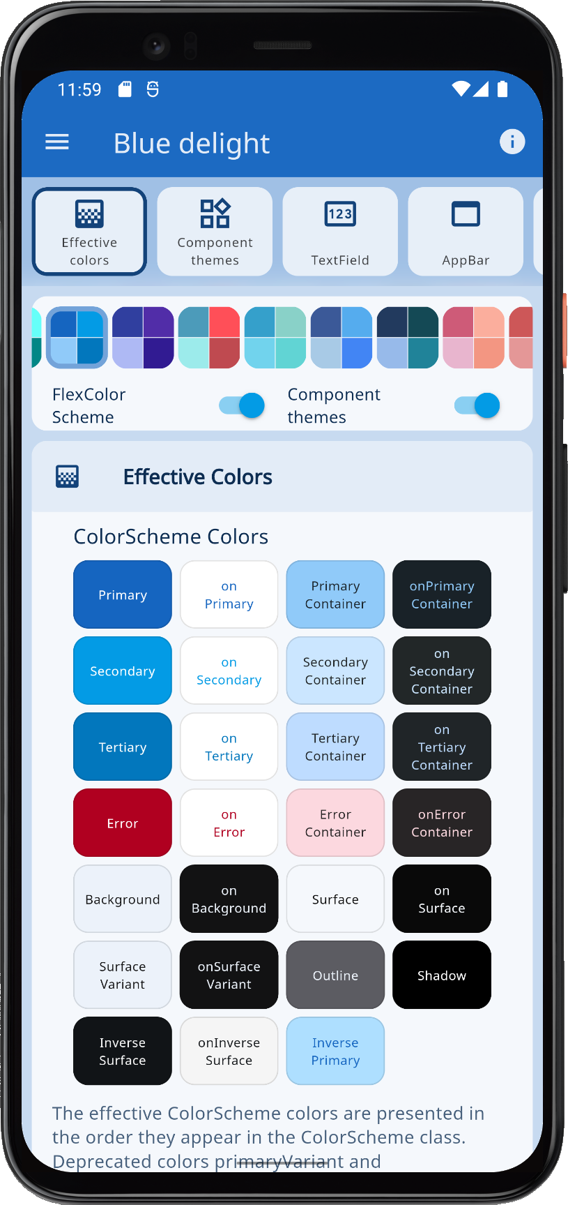
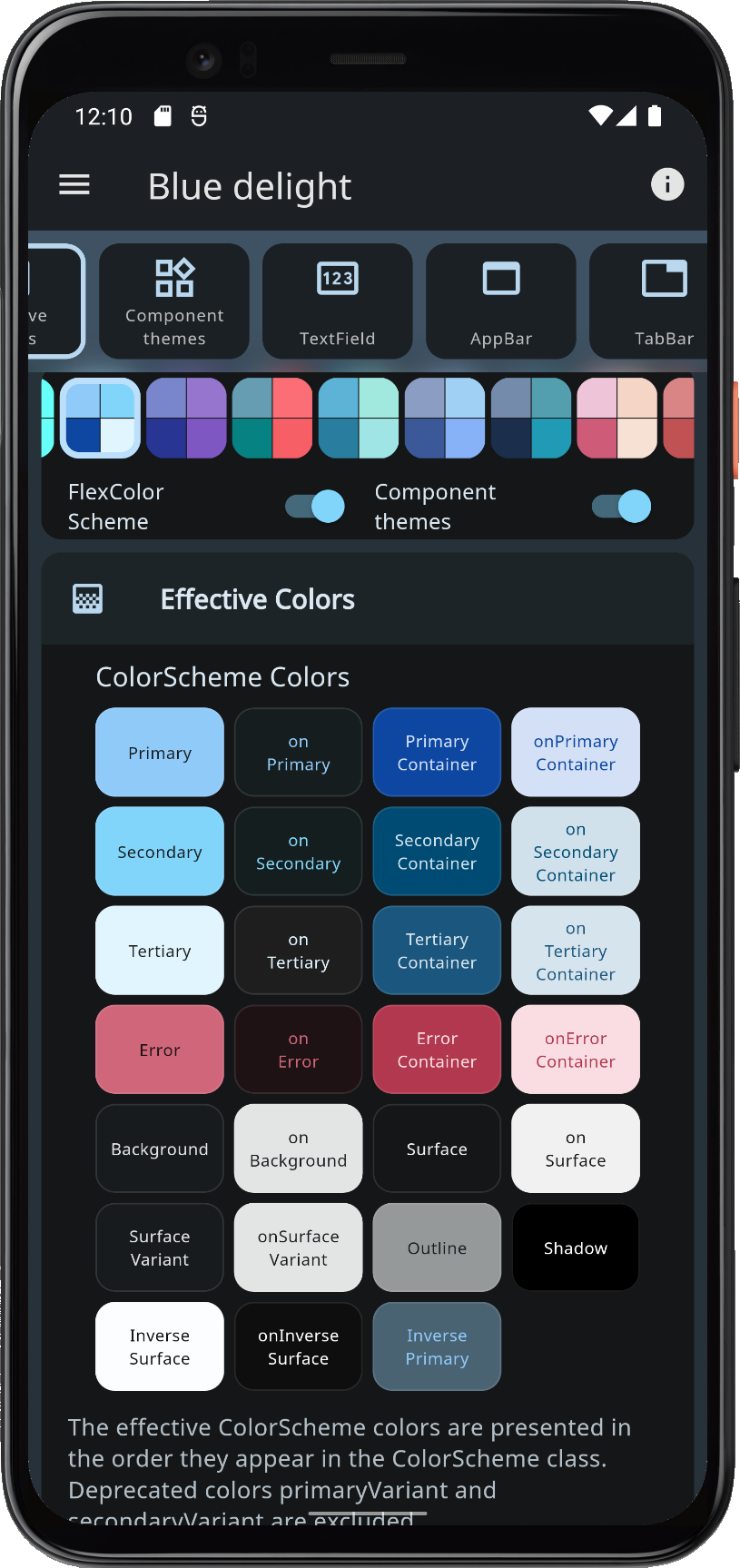
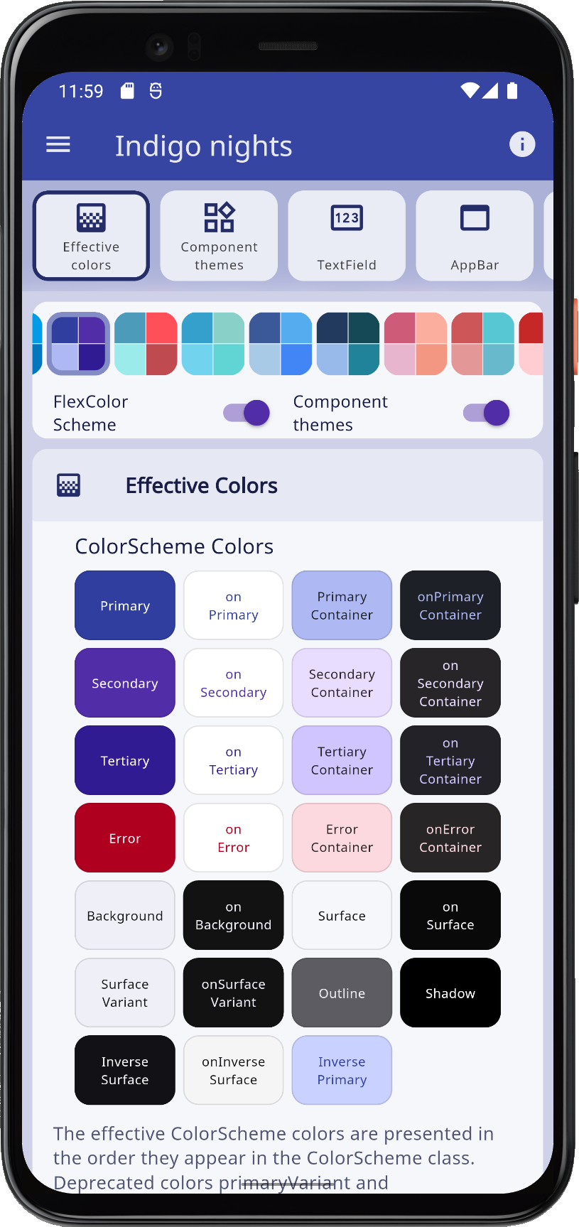
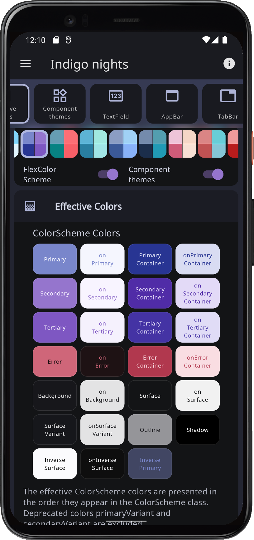
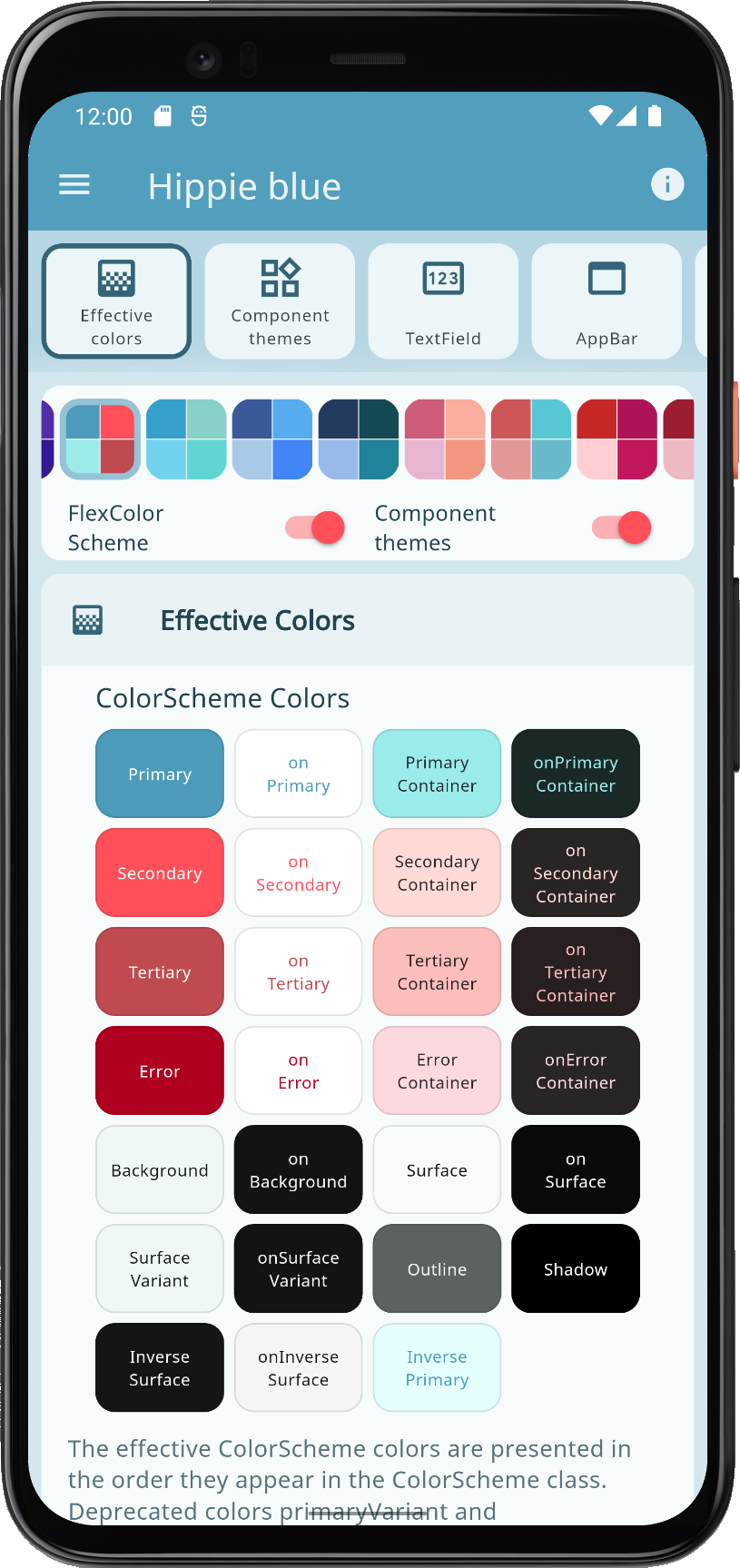
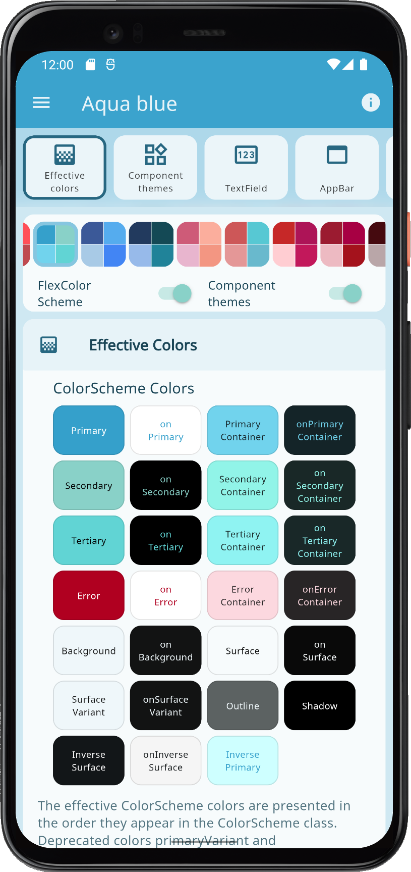
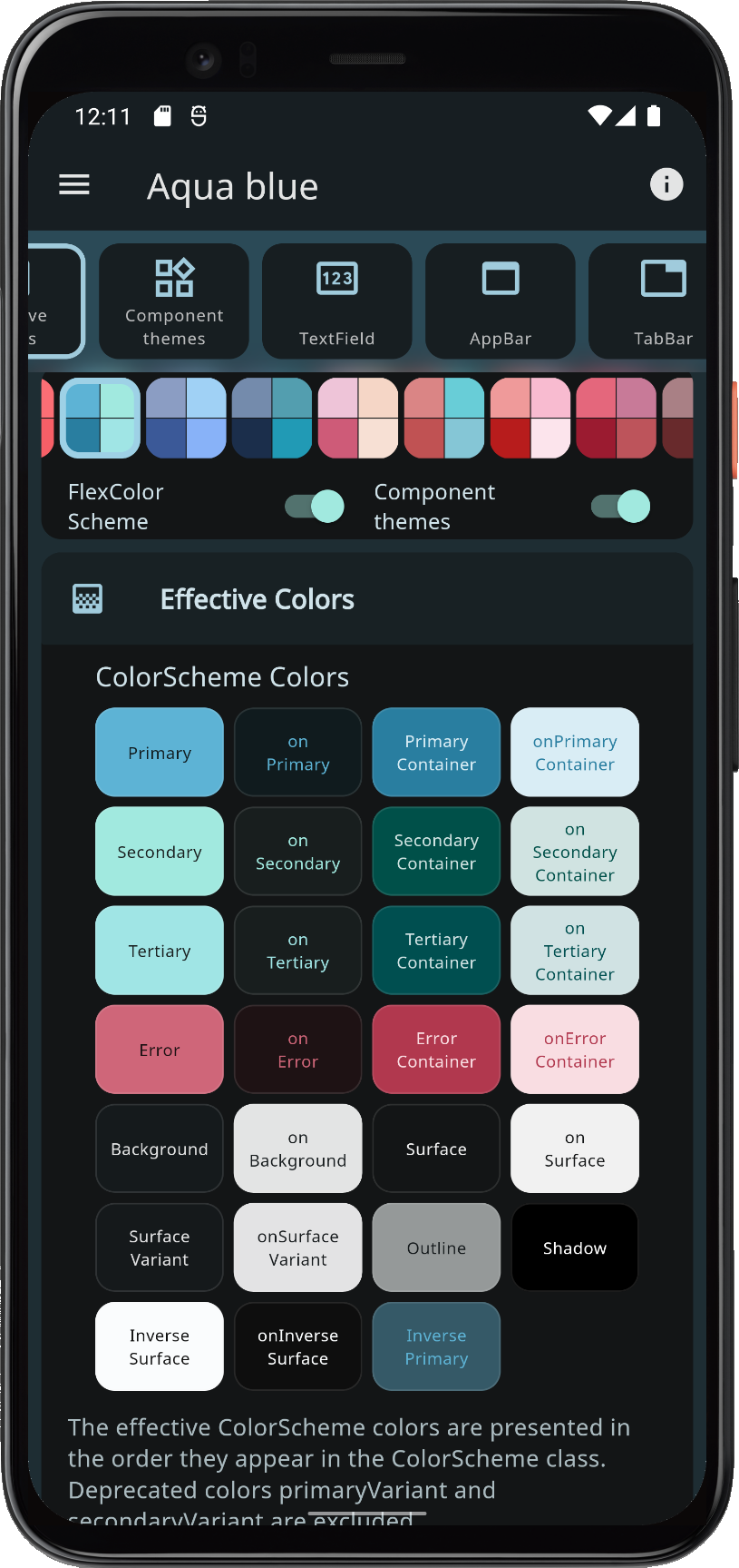
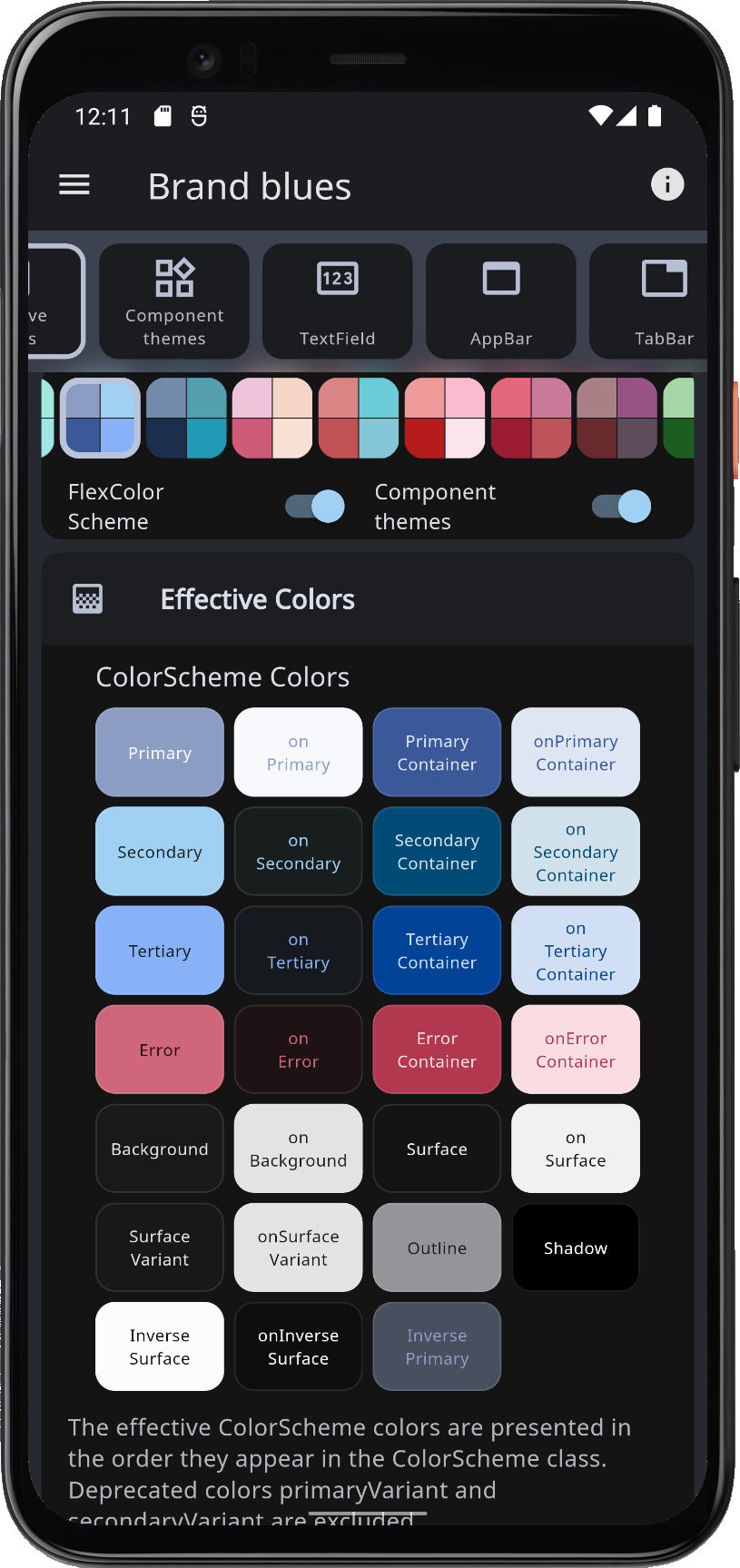
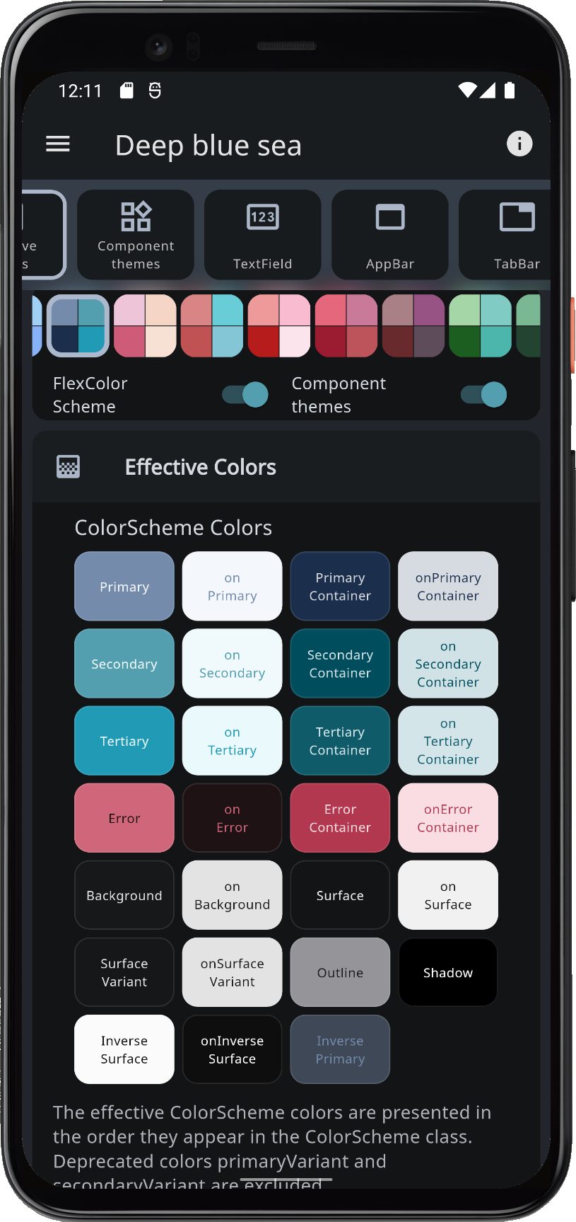
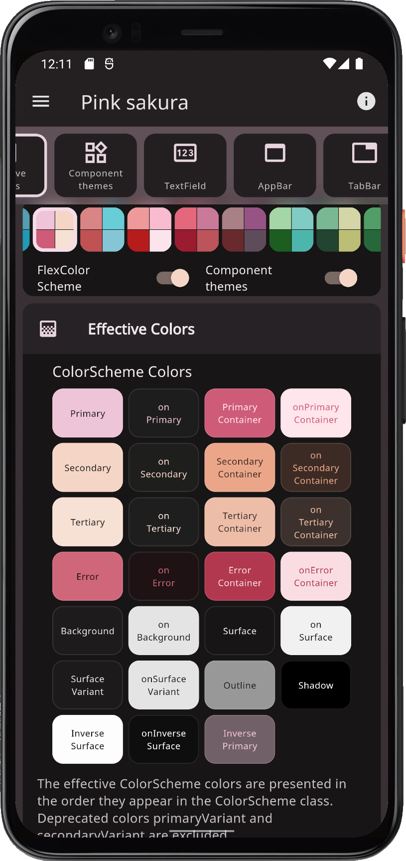
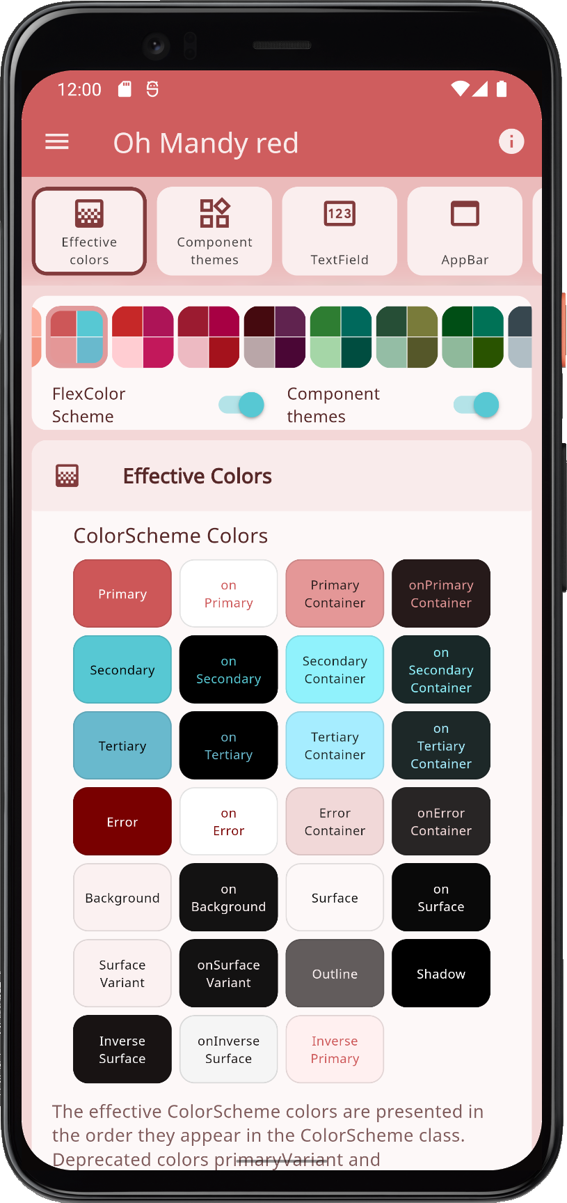
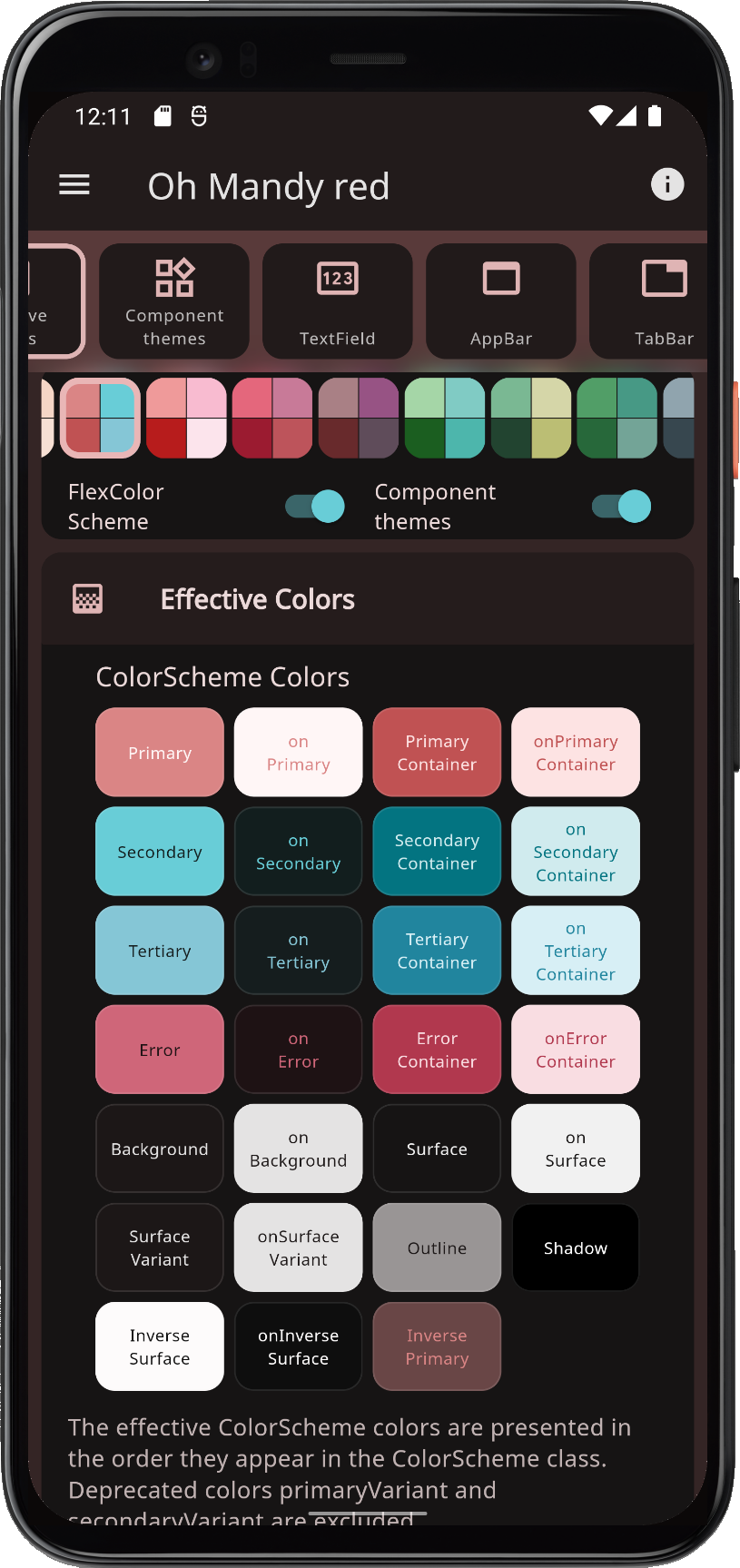
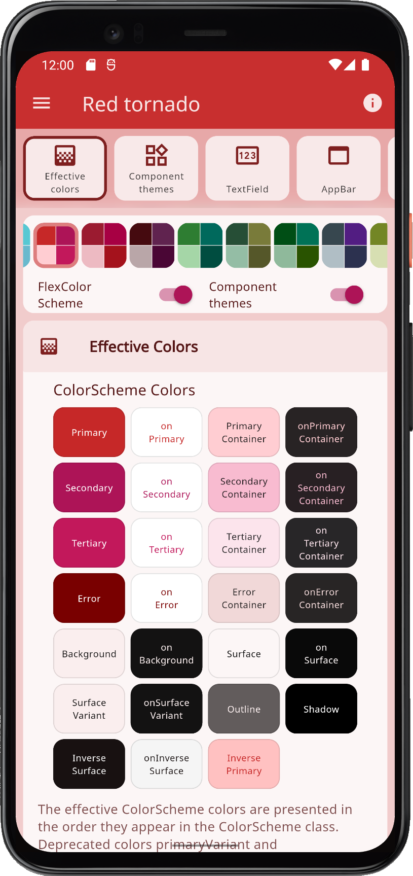
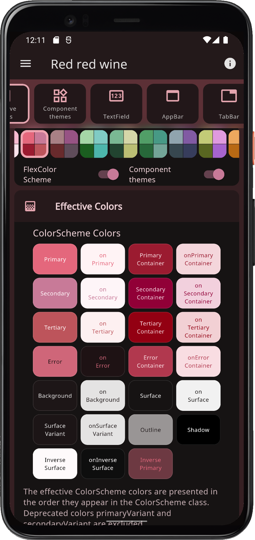
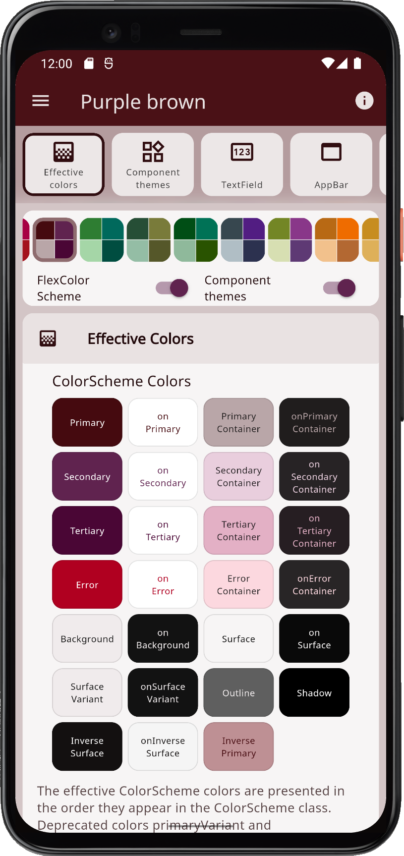
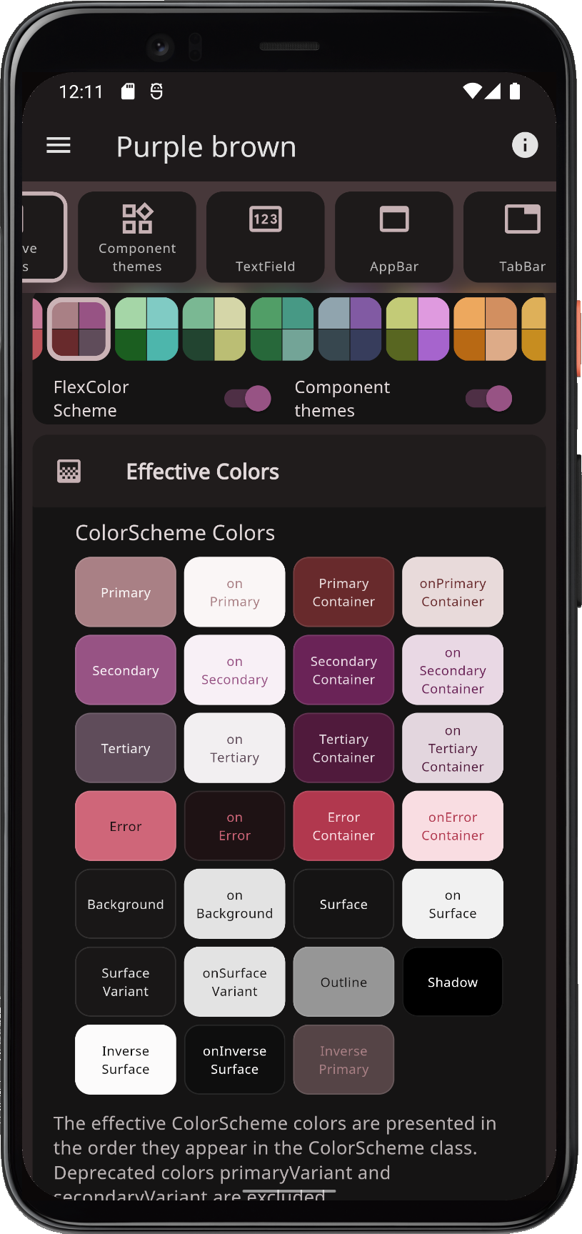
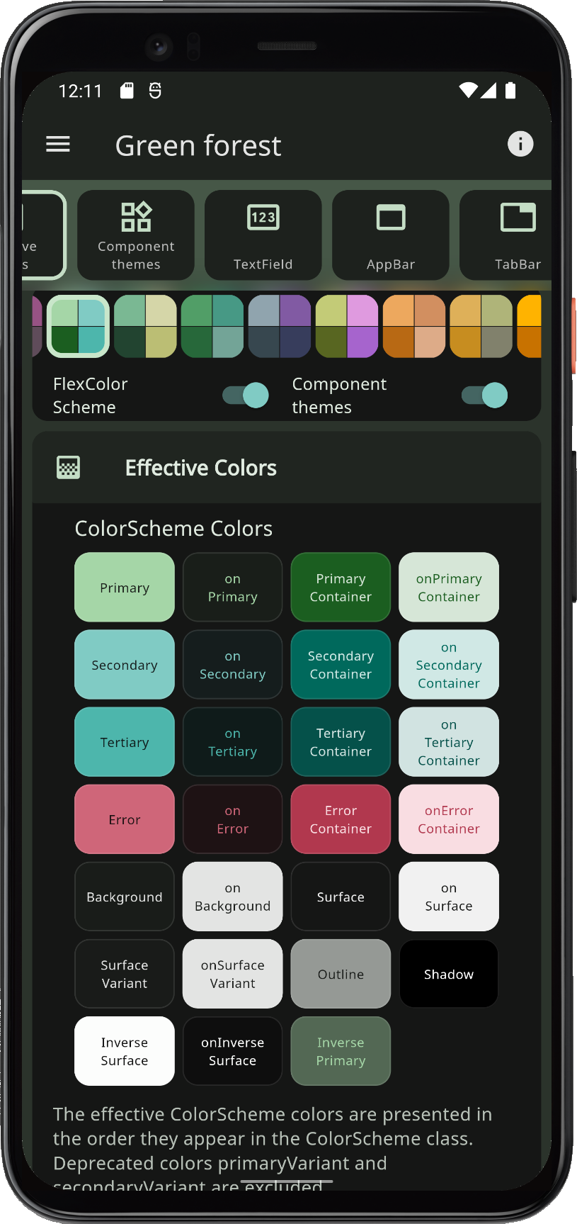
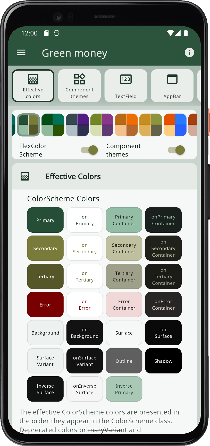
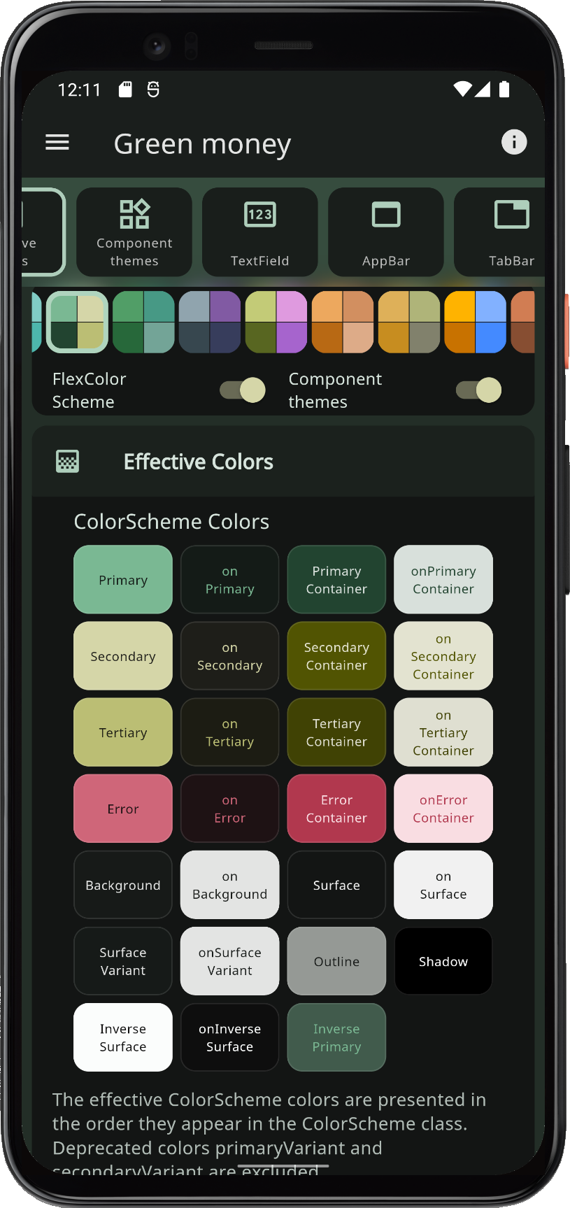
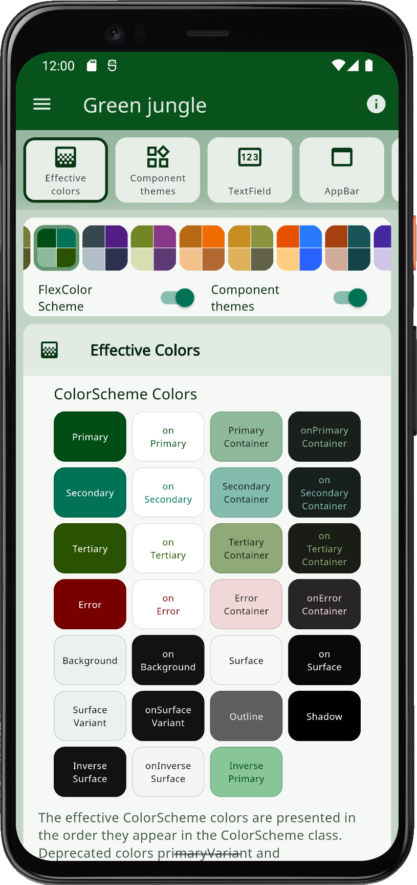
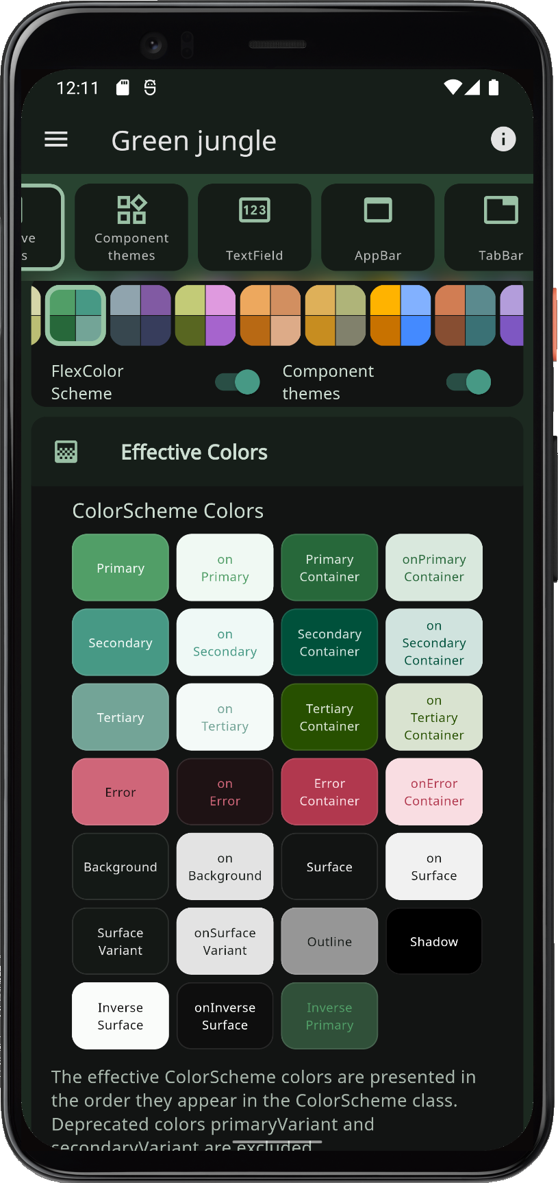
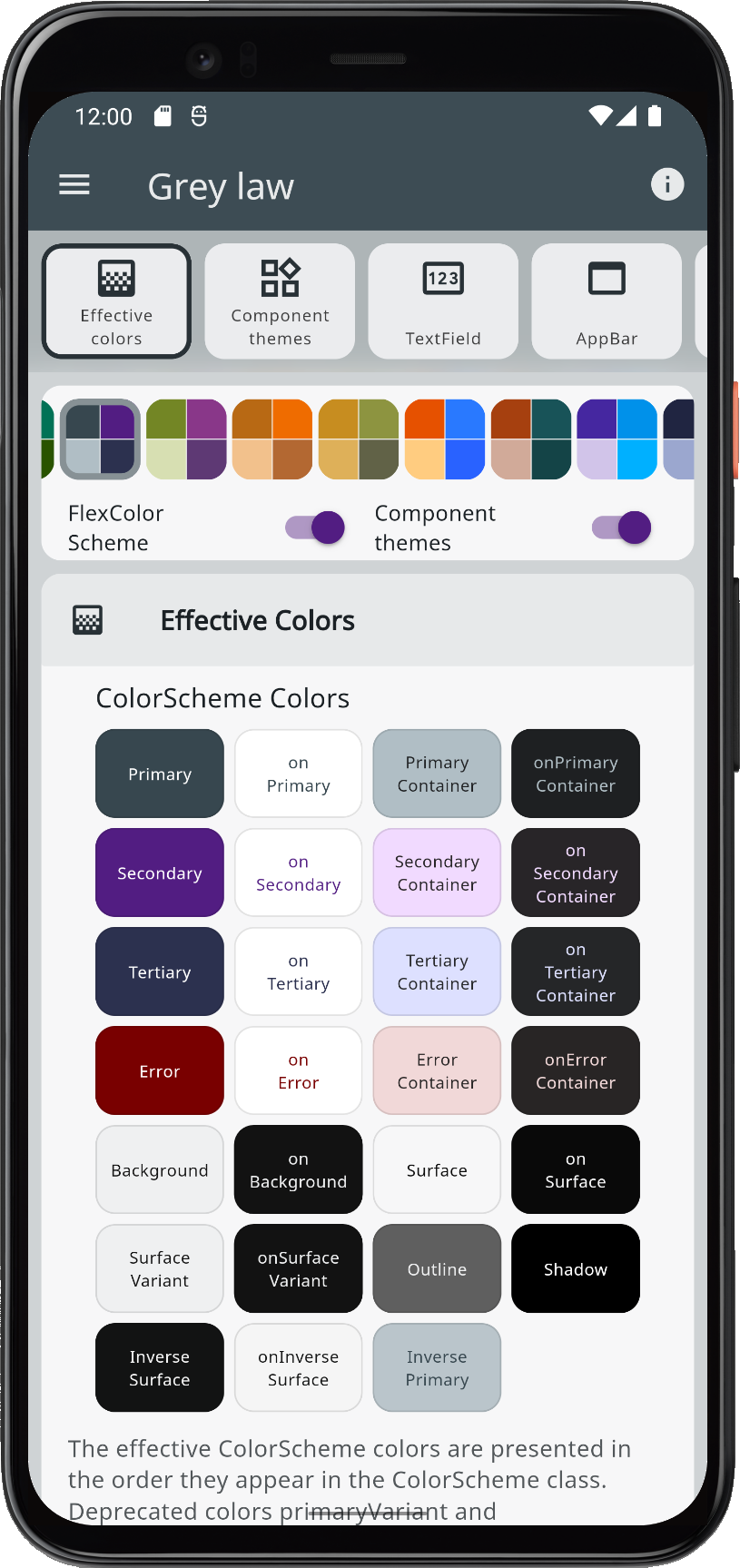
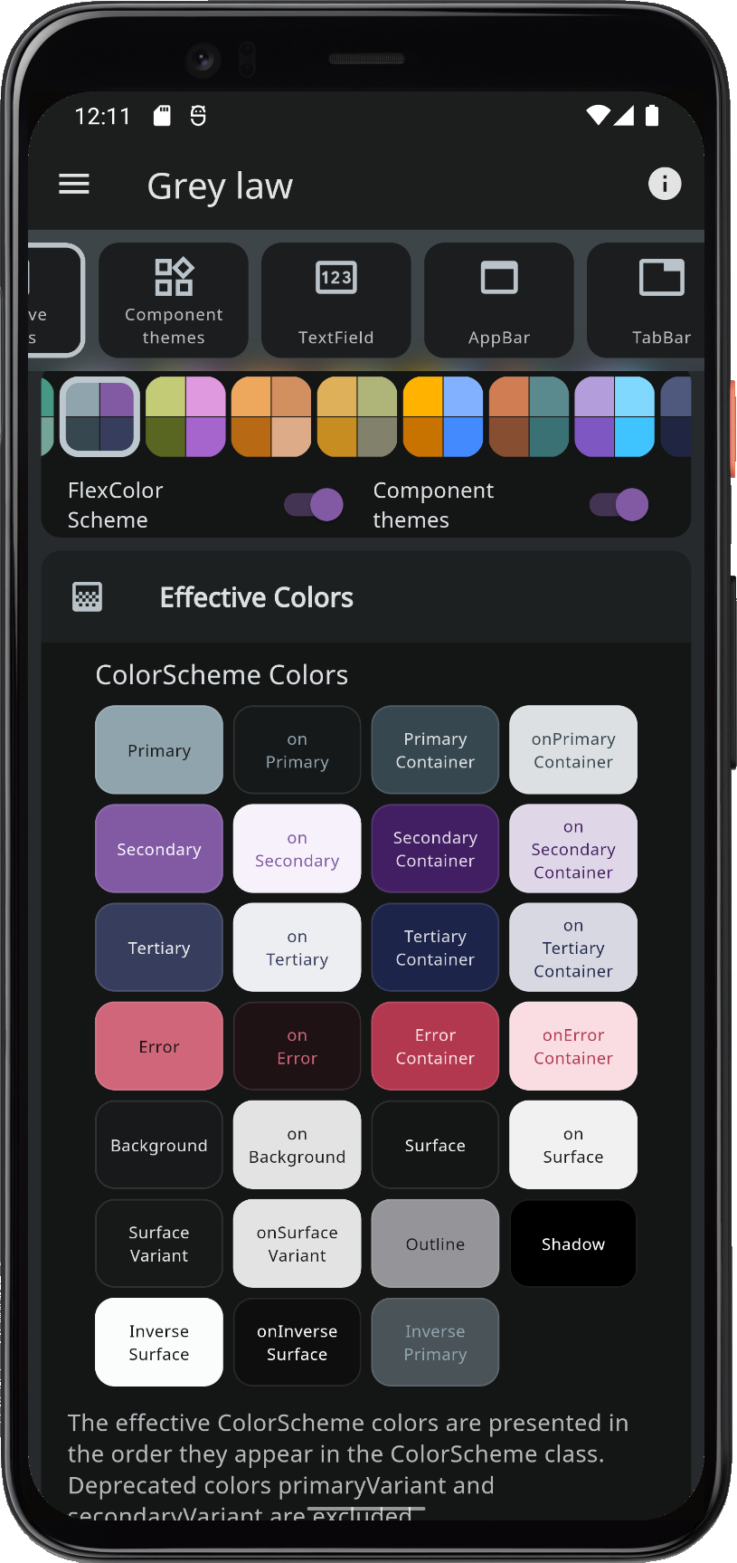
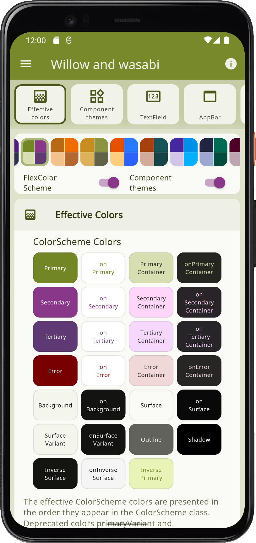
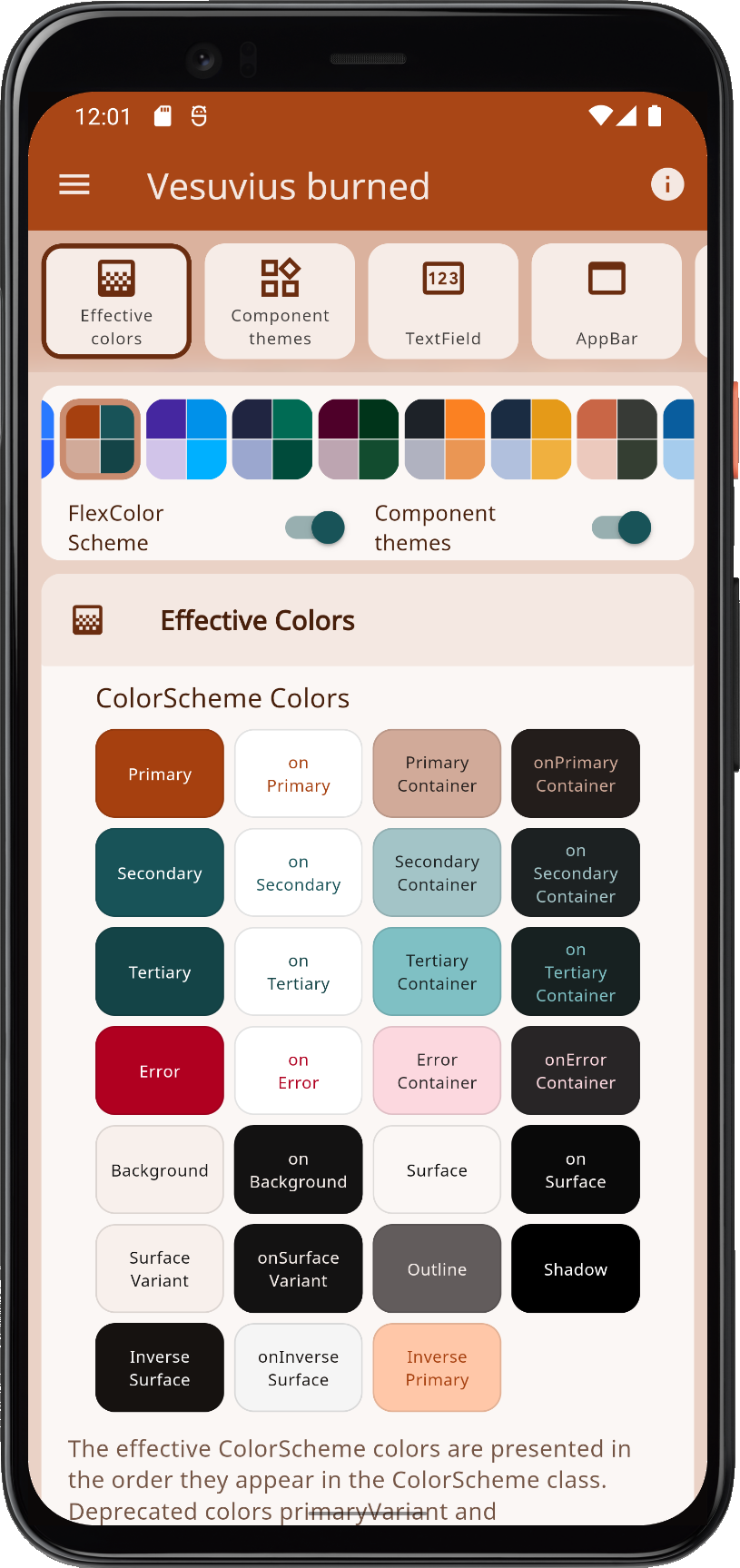
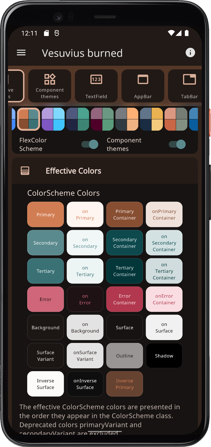
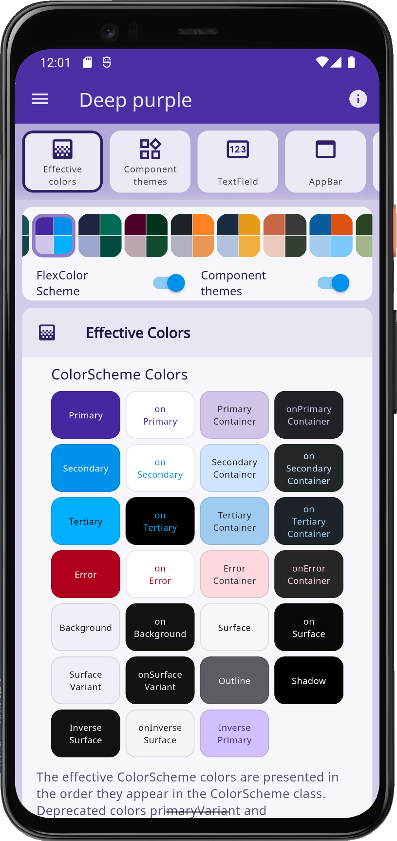
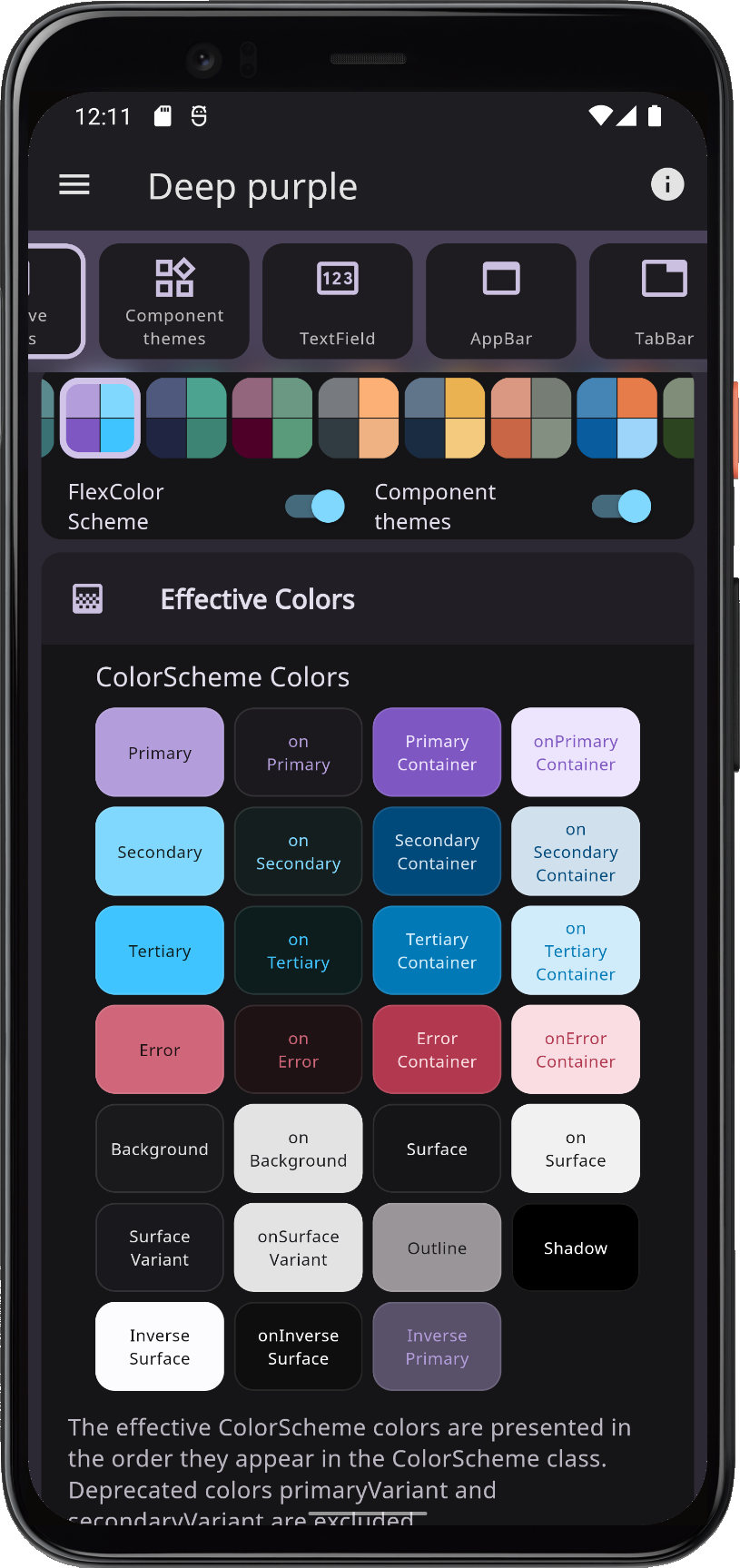
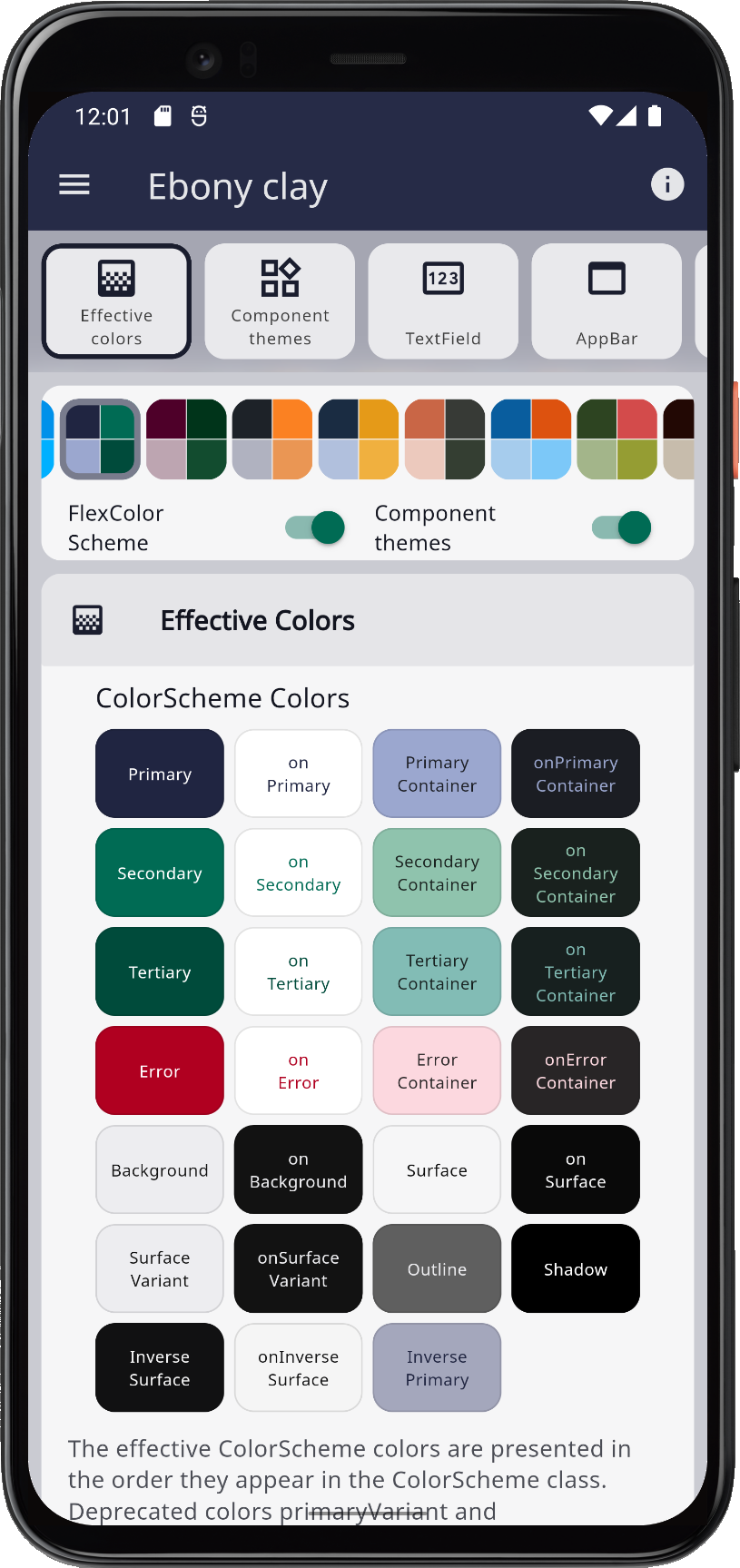
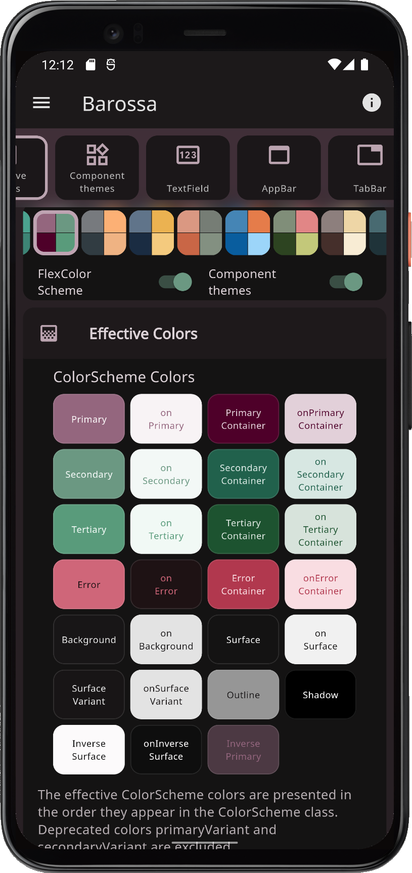
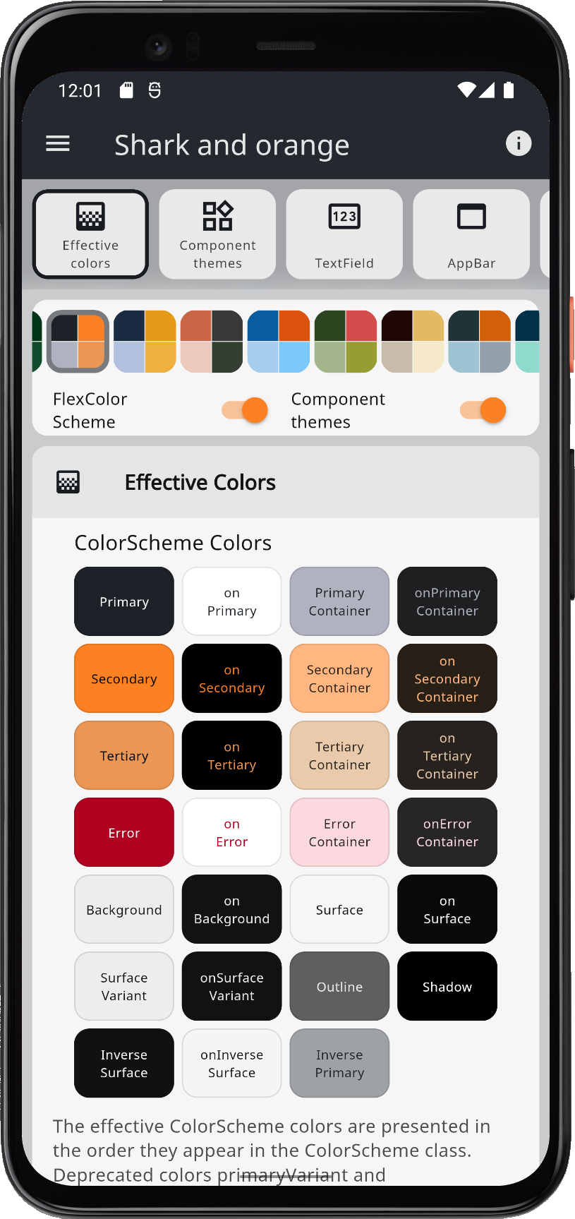
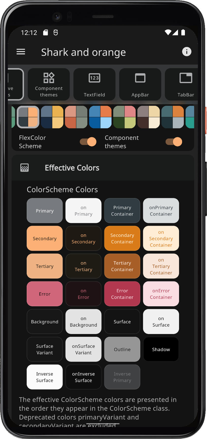
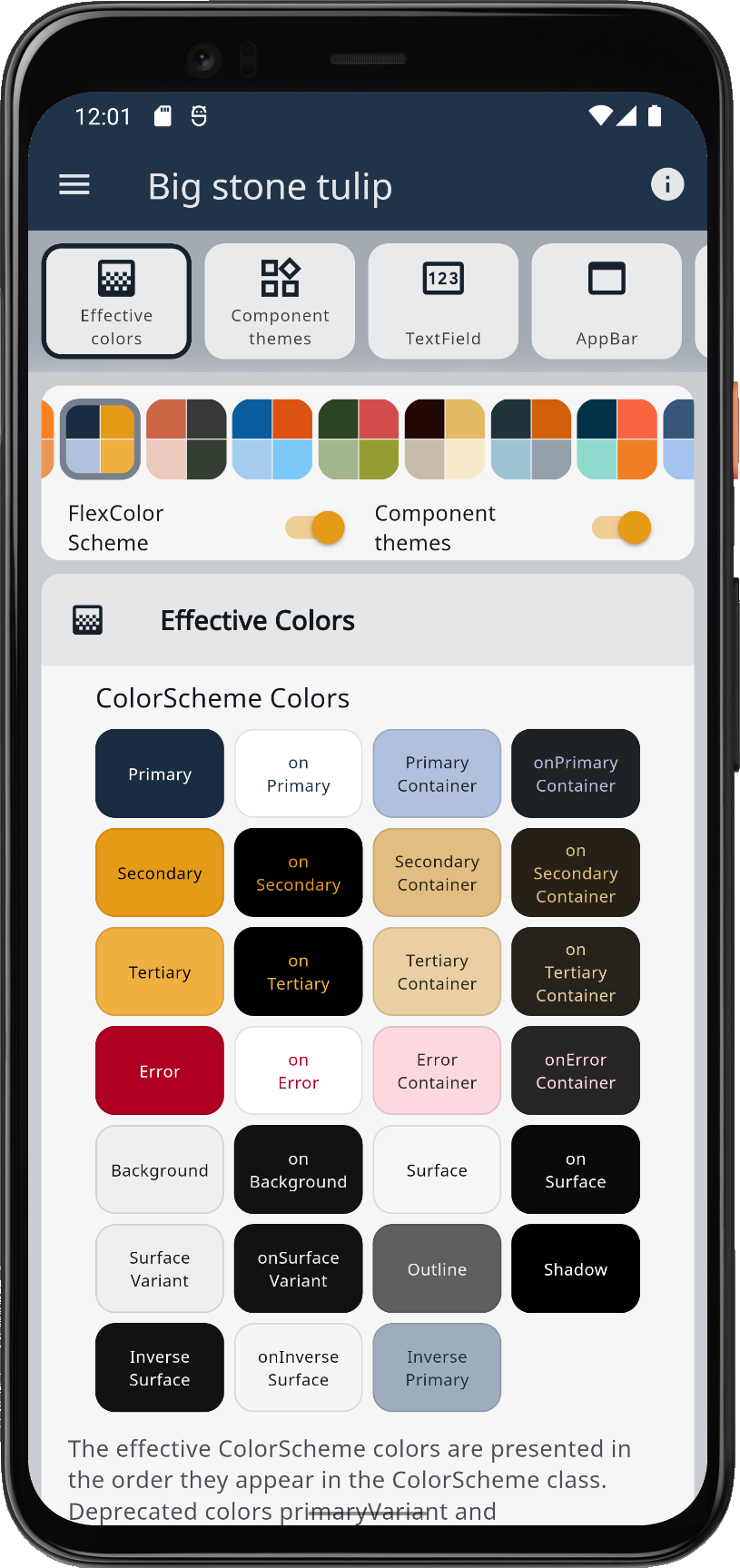
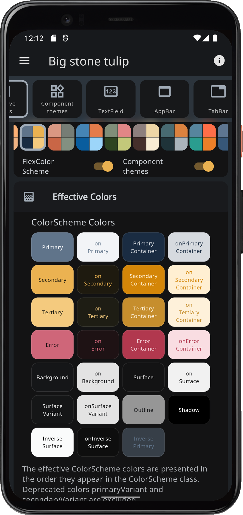
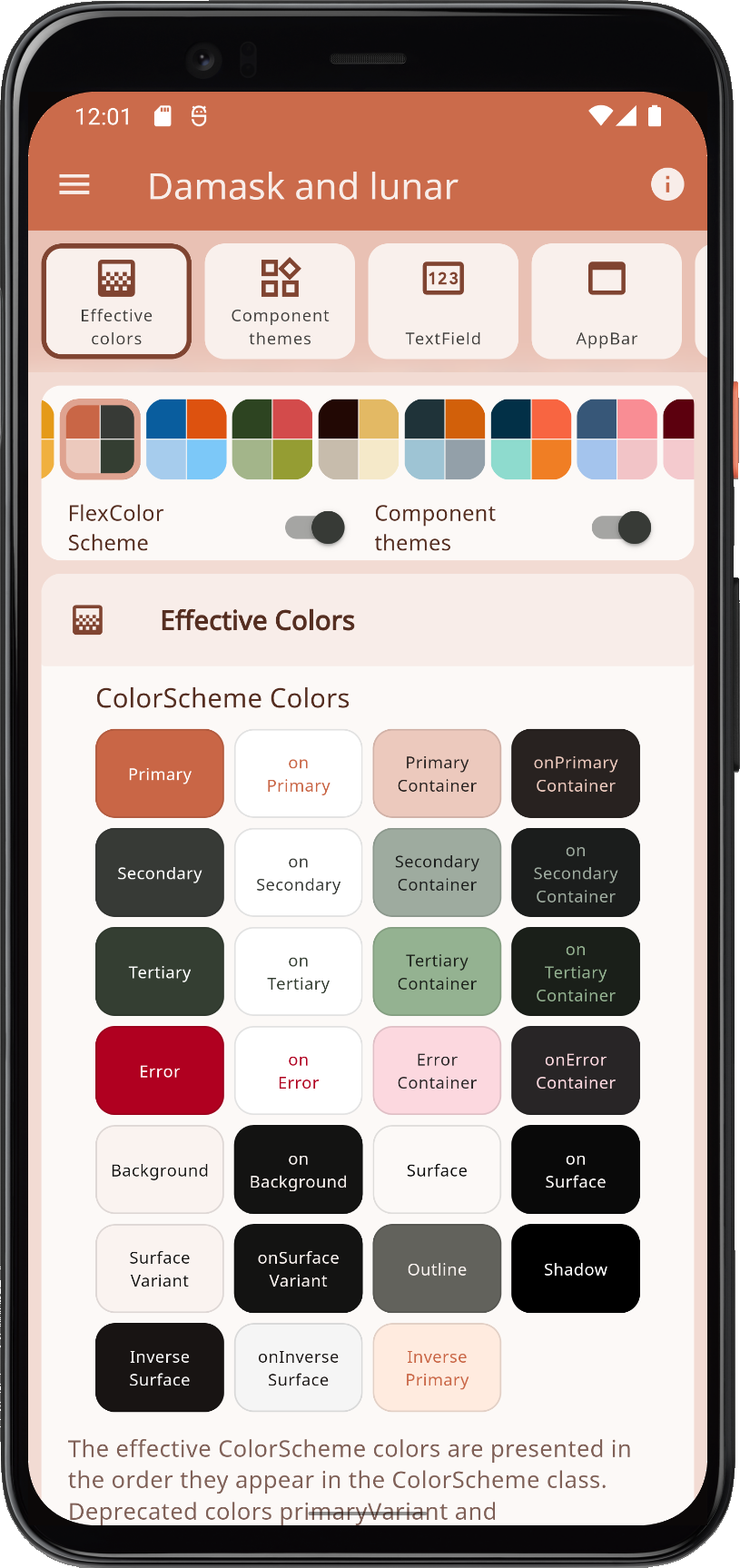
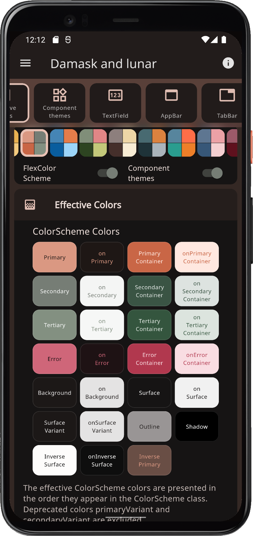
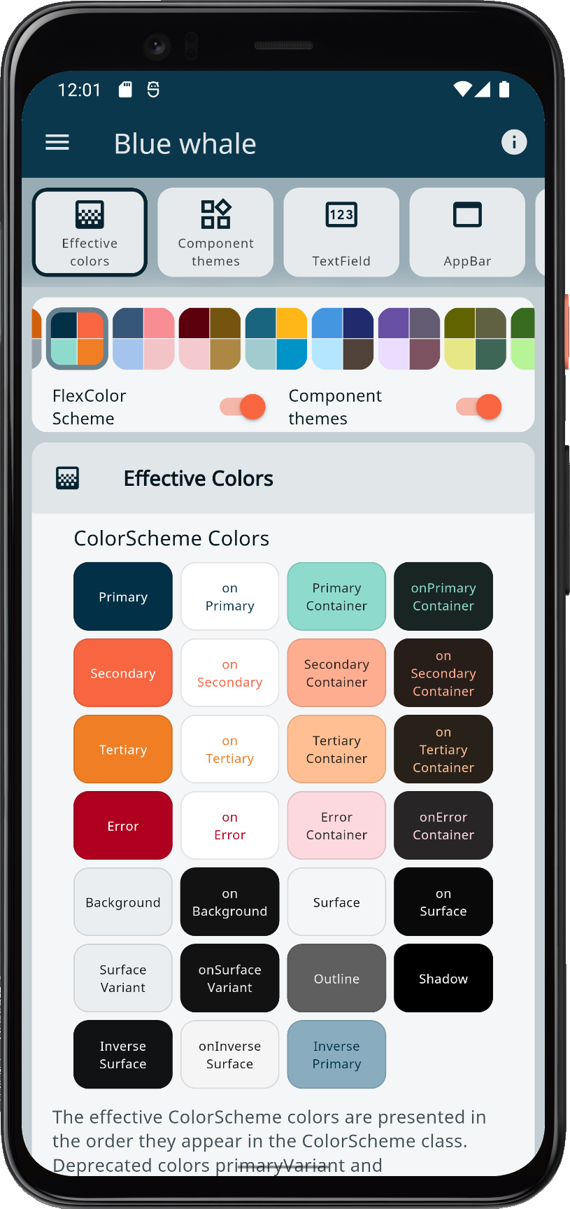
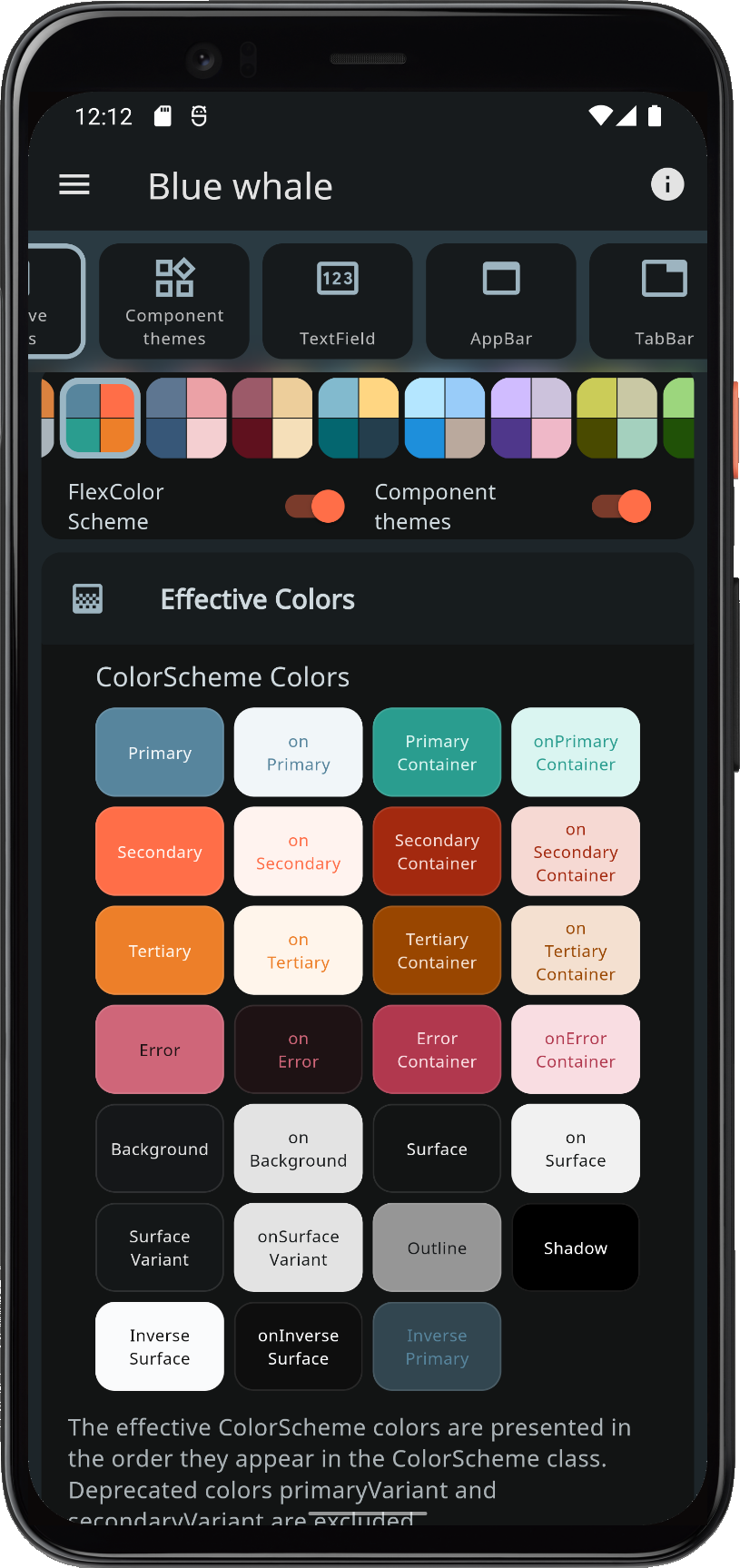
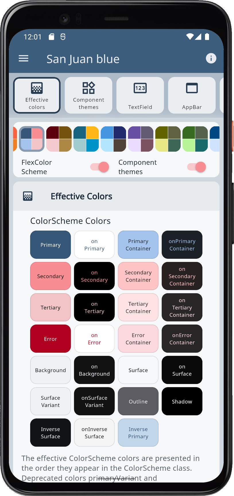
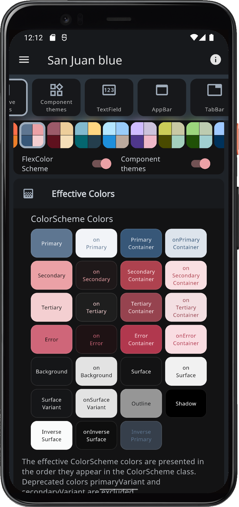
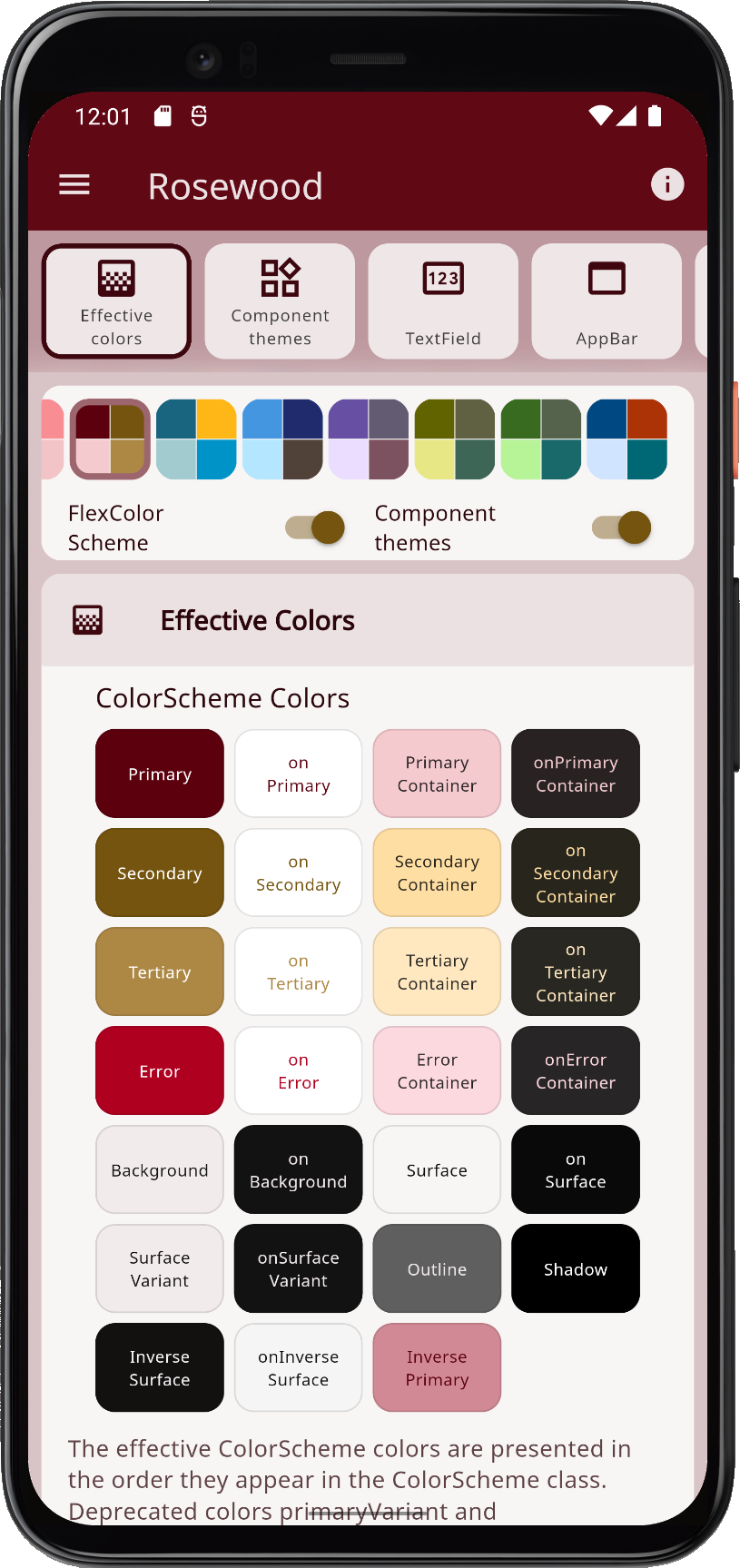
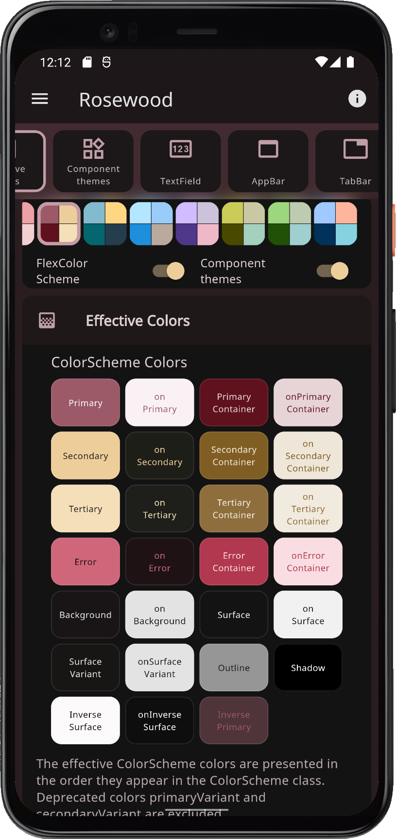
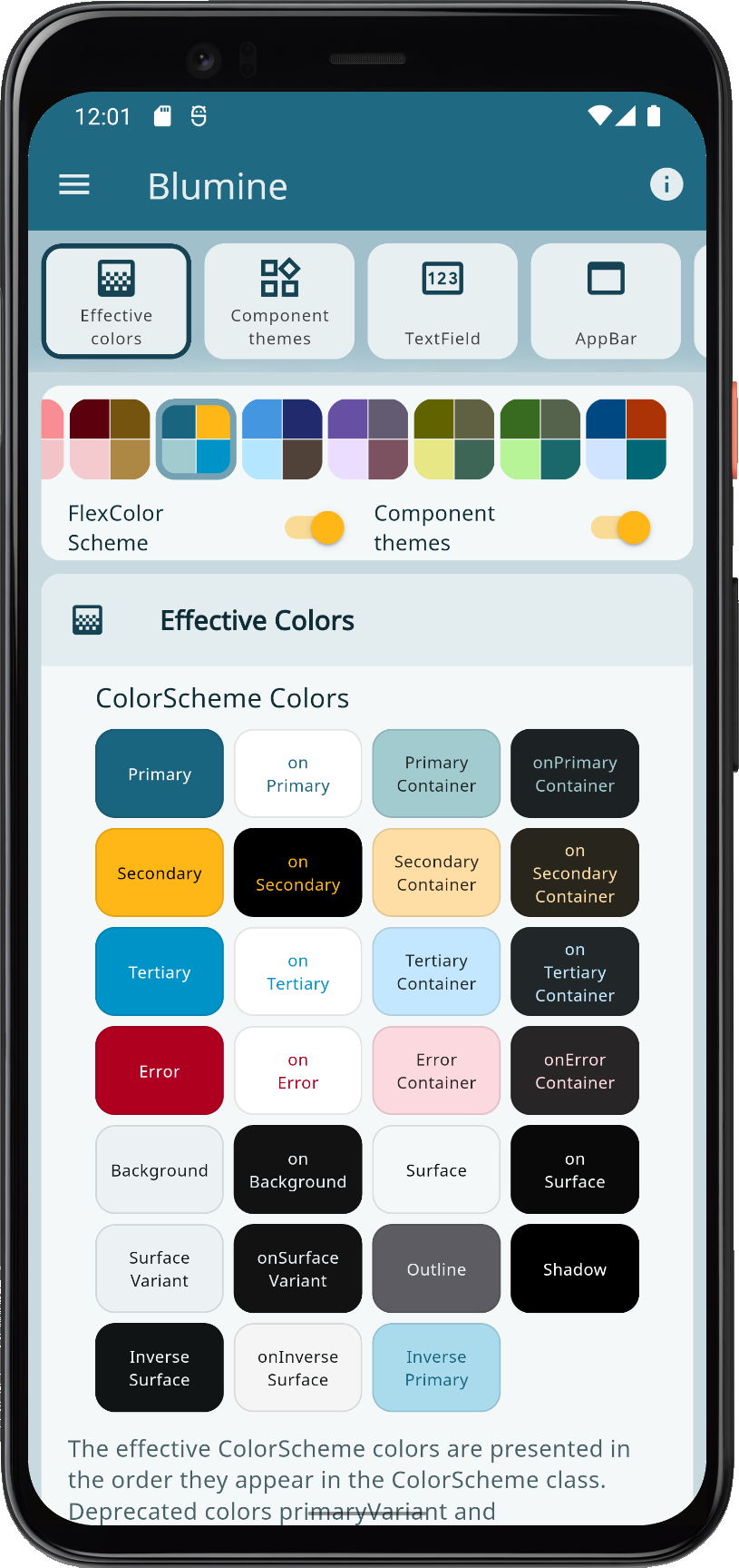
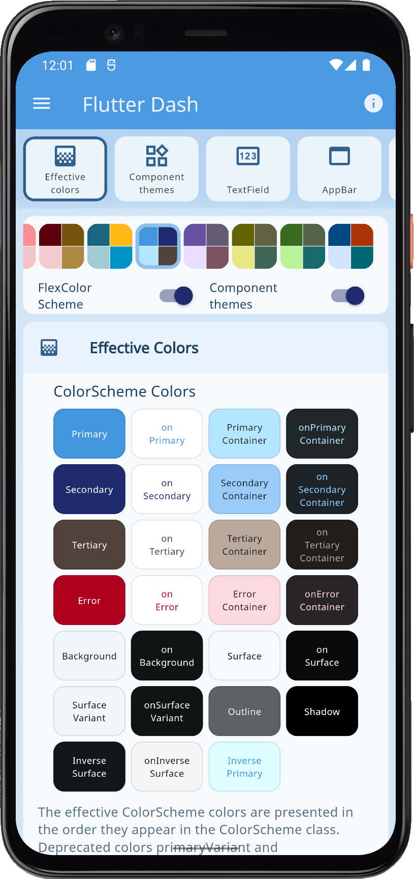
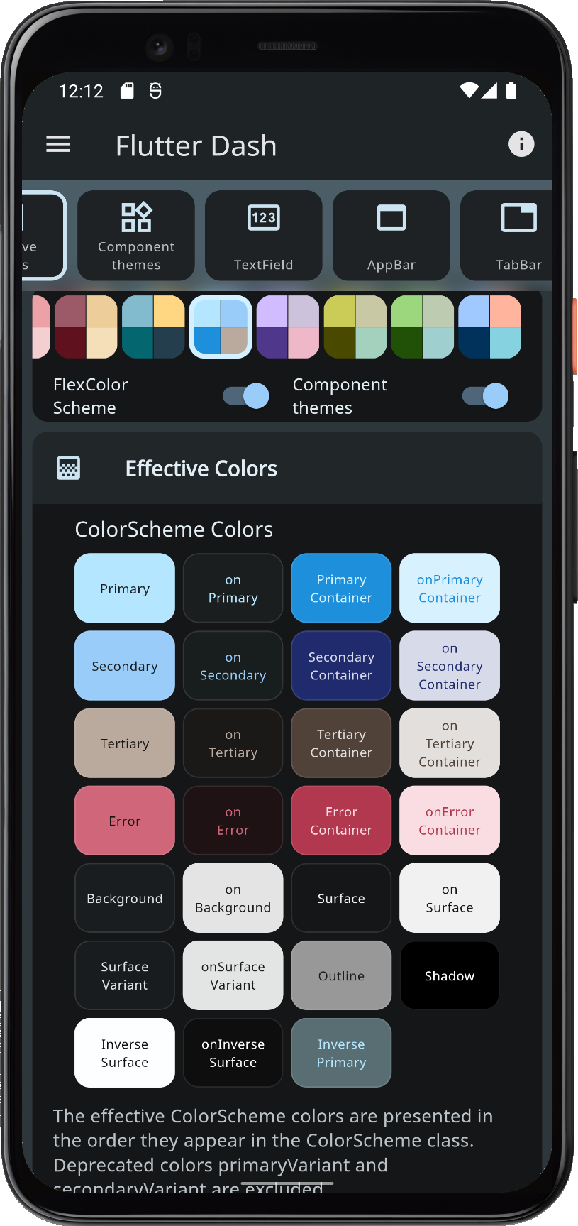
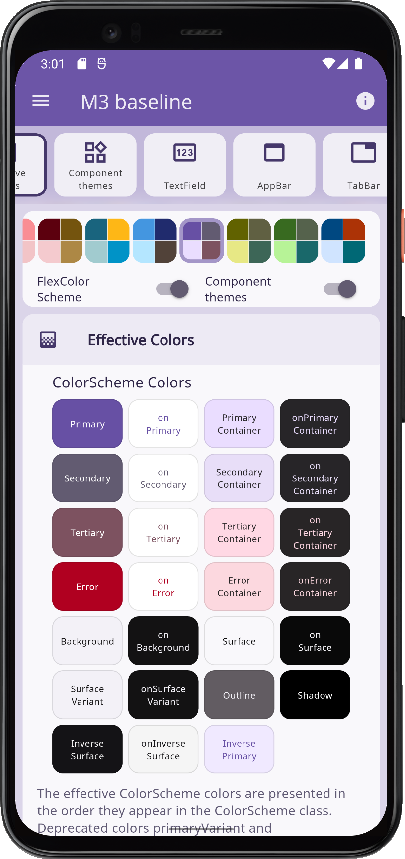
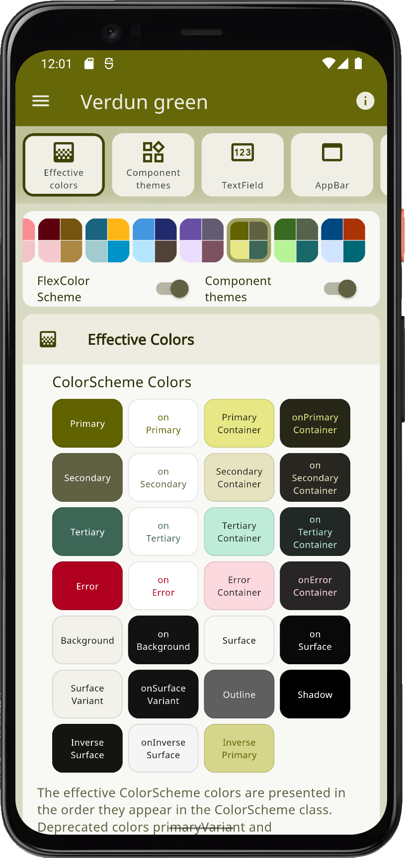
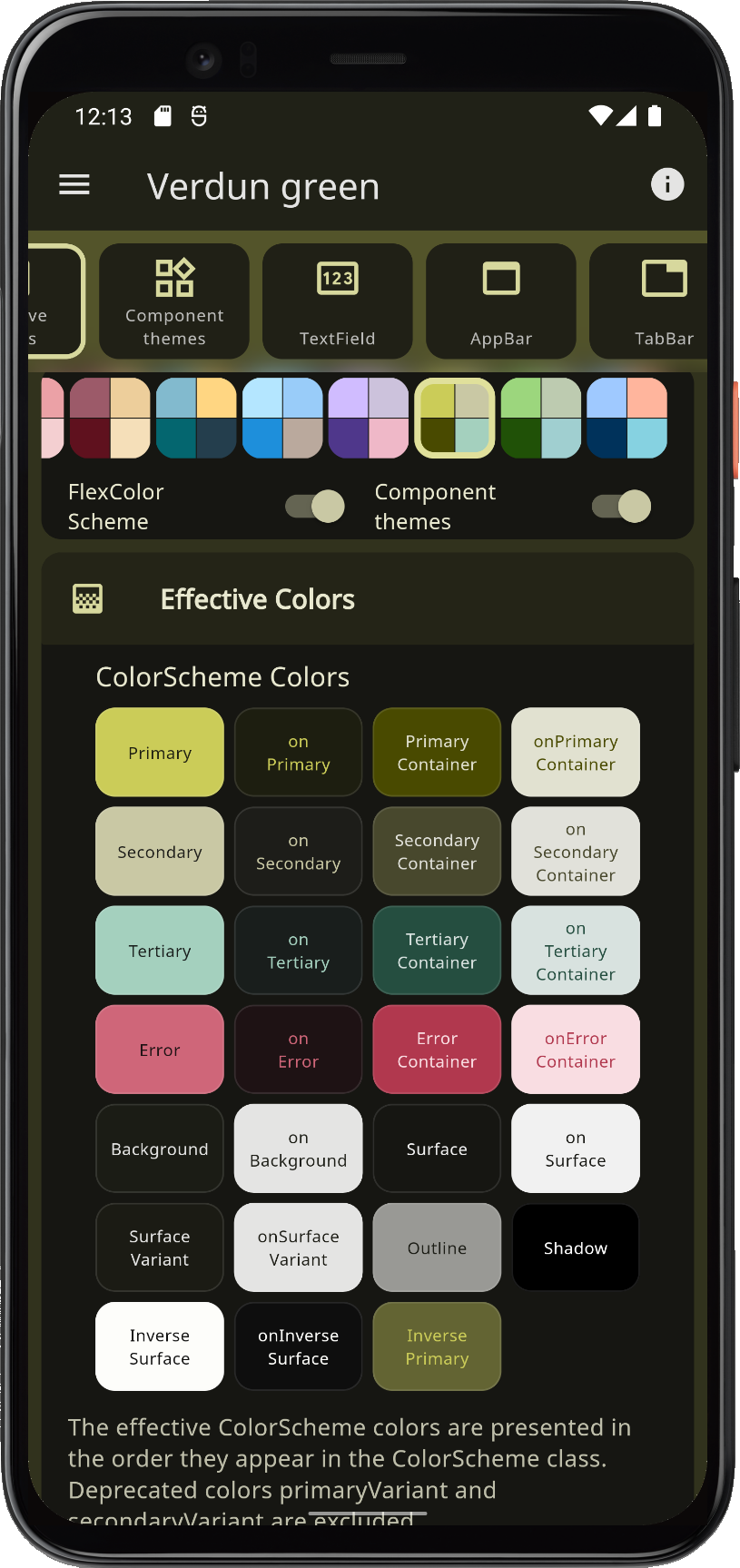
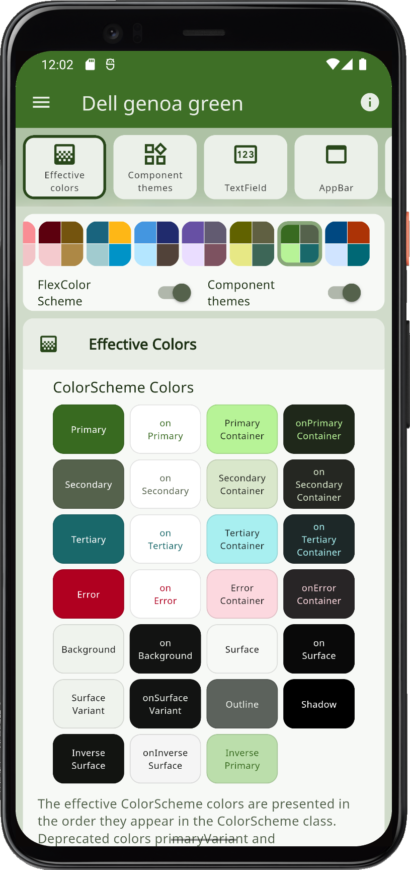
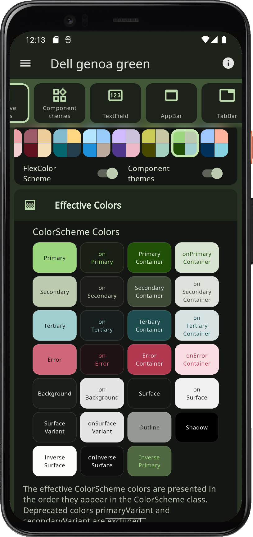
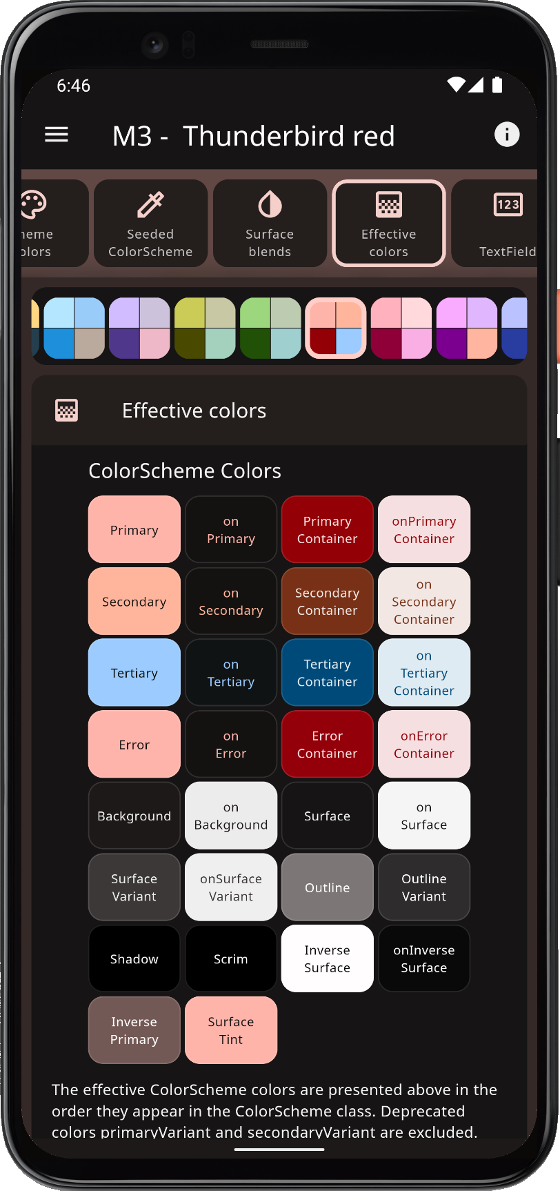
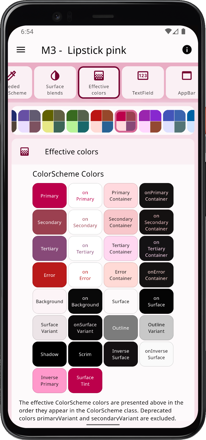
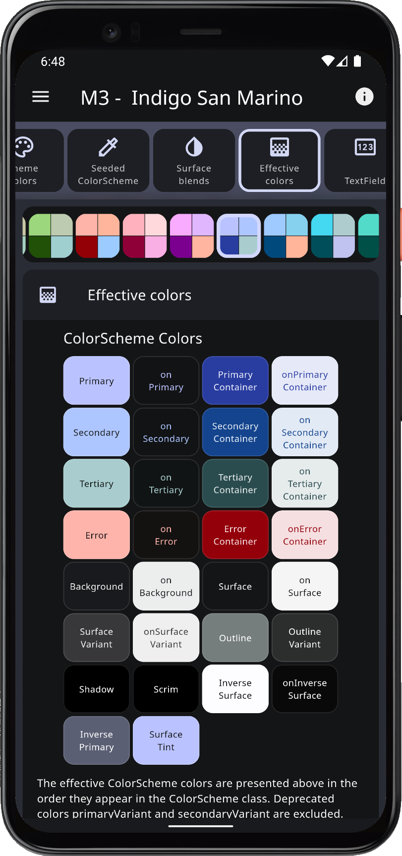
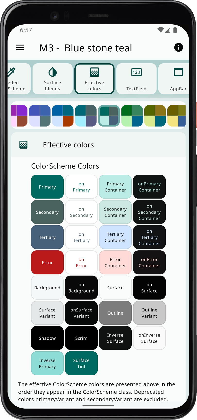
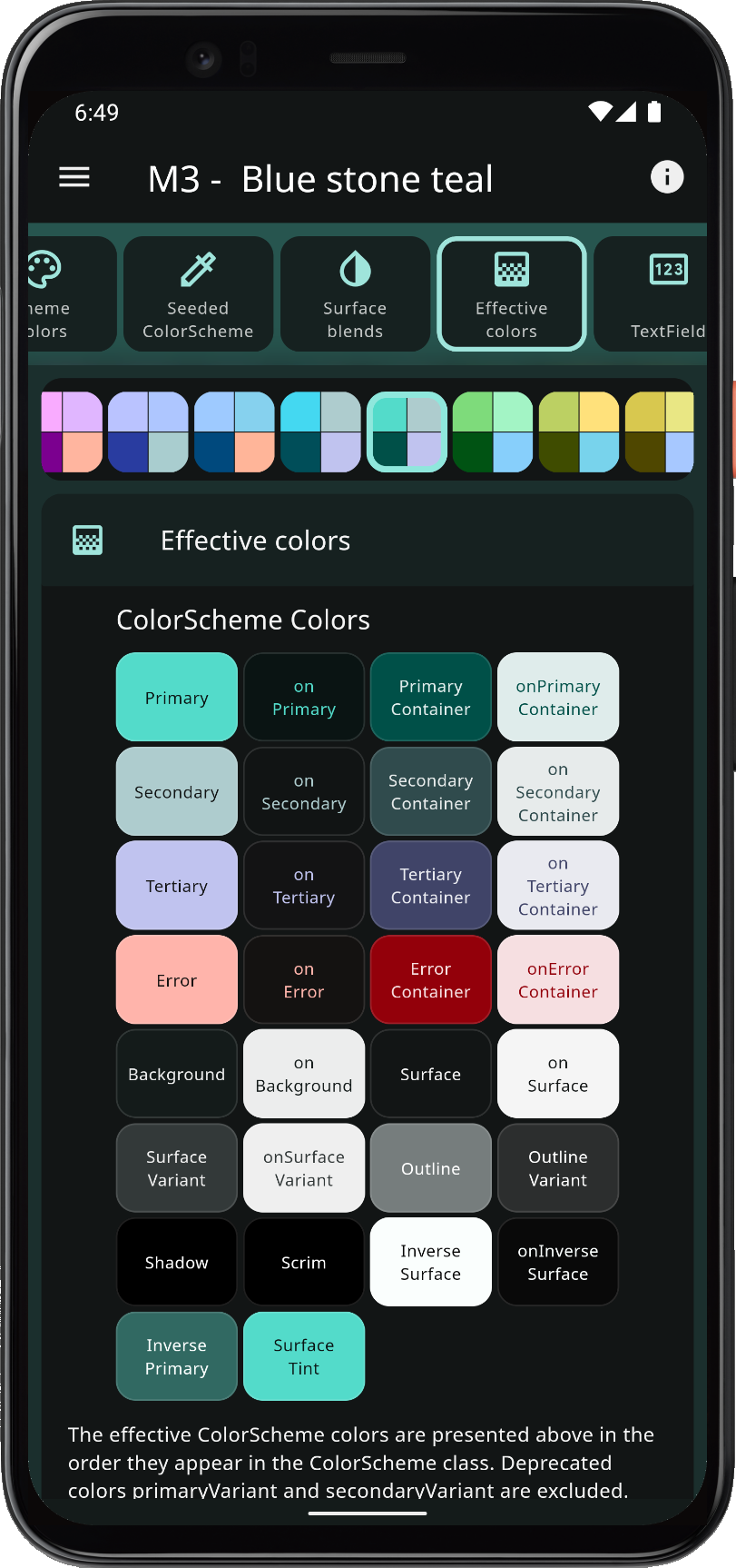
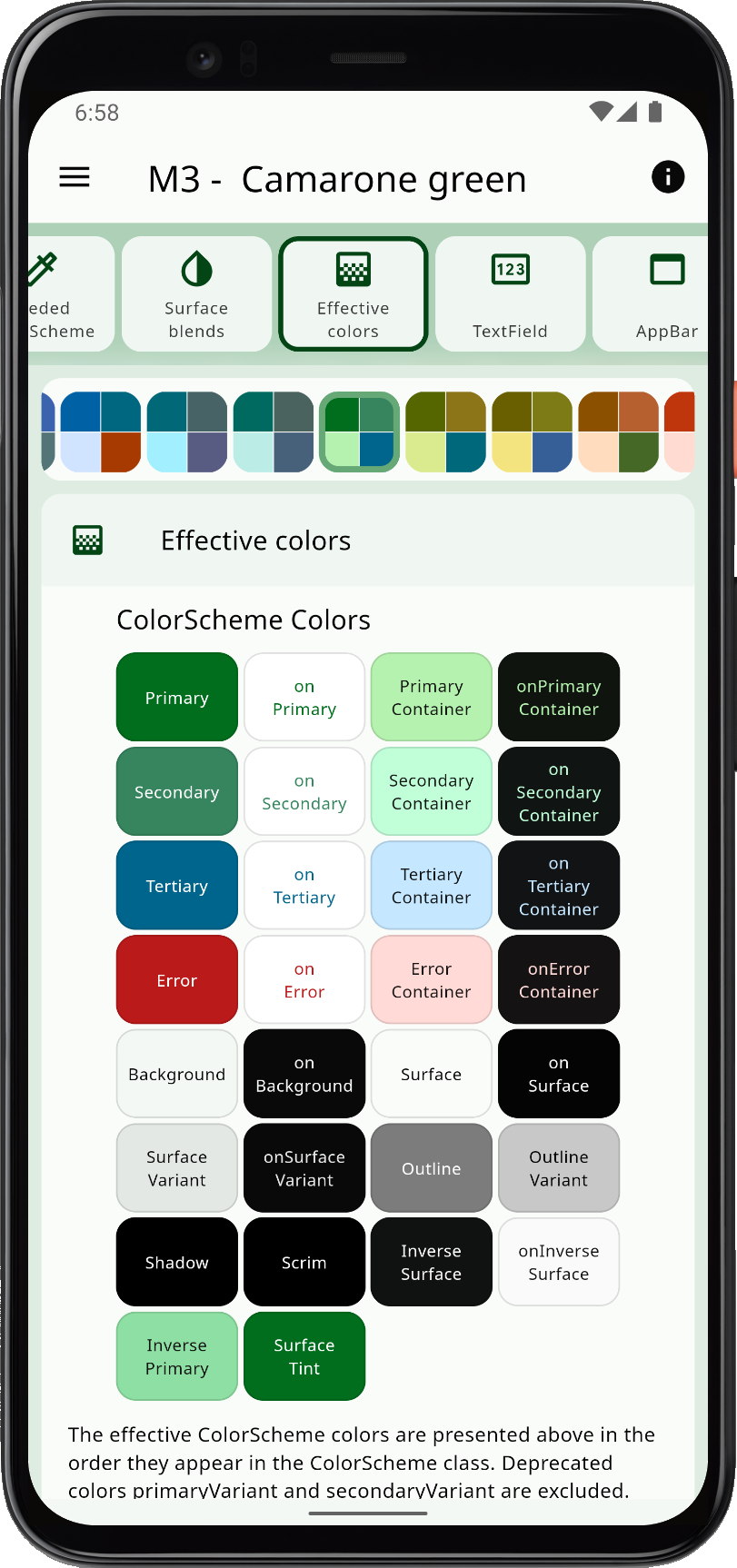
In the Scheme Reference, you can find a table listing all built-in color schemes with their FlexScheme enum value, name and description, plus some other useful information about the schemes.
Built-in Schemes
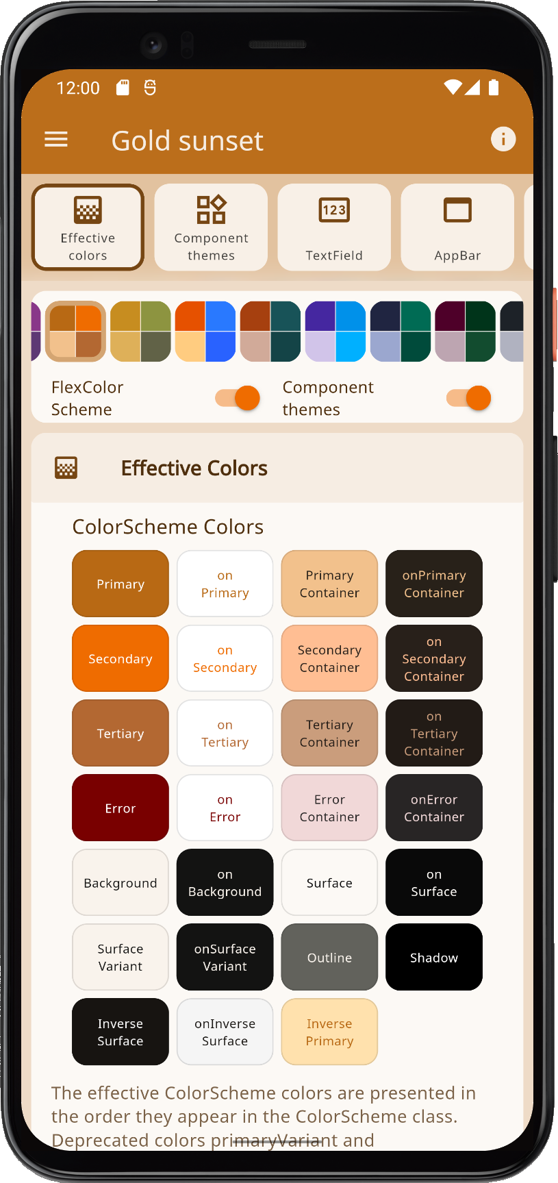
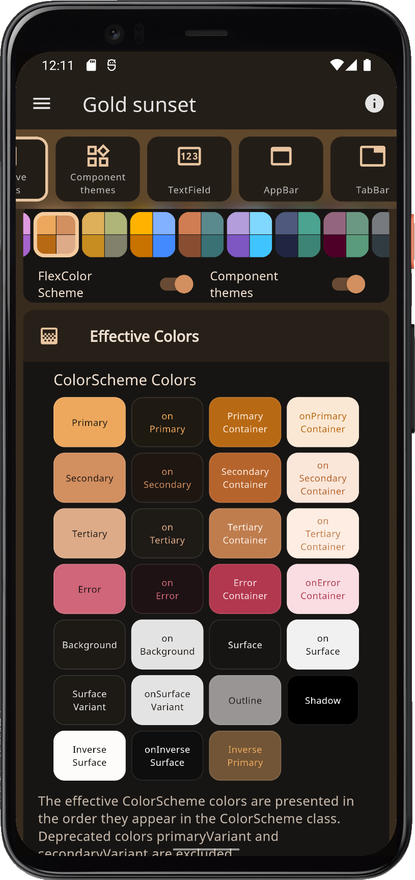
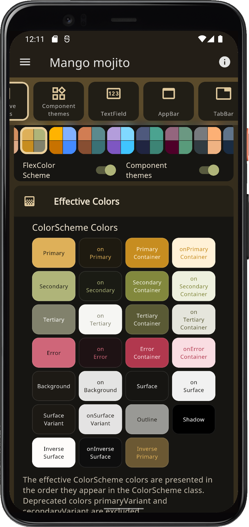
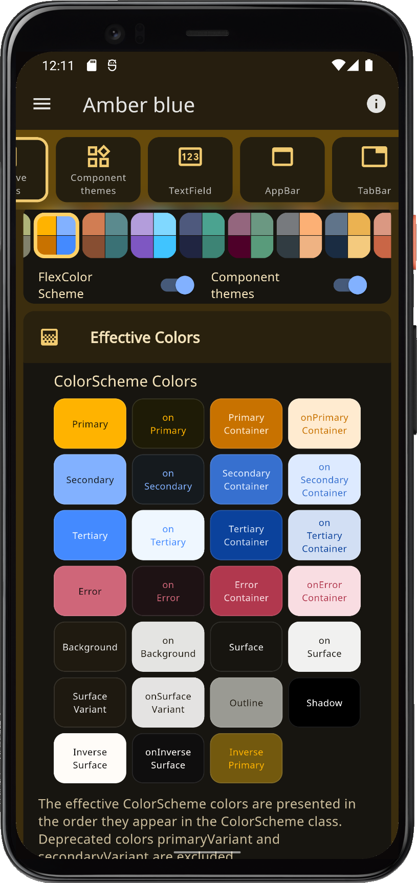
The built-in color schemes are all matching light and dark scheme pairs. Most of them are pretty conservative, but some are intentionally a bit more playful and bold. The first two color schemes are actually the Flutter and Material-2 Design Guide examples of light and dark color schemes, and the Flutter high contrast light and dark color versions as well. They have all received some new style-suitable colors that do not exist in their Material-2 specs. This is needed to give them more colors when they are used in Material-3 based color schemes. The color scheme "Amber blue" is intended as a high-contrast theme, as an alternative to the built-in Material high-contrast theme.
The built-in schemes do not claim to be a "this selection fits all needs" collection. Nor do they claim to be more correct than any other color scheme. What fits your needs and looks good to you, is the right choice for your application and use case.
Custom Color Schemes
You can make your own custom scheme totally from scratch or use the built-in ones as a starting point and inspiration. You can re-use colors from existing schemes, via their const FlexColor name. All the color values in the color schemes are available as const values, so you can easily make new custom combinations using existing color scheme colors and add a few custom color values to the mix.
In the tutorial, based on examples 1 to 5, we show how you can make and use our own custom color schemes with FlexColorScheme. Maybe the built-in examples will inspire your creative side to define your own beautiful color schemes. The tutorials walk you through how to define your custom color schemes and make themes based on them.
You can also create your own custom list of schemes, then use this list with only your own custom color schemes selection. You can append some, or even all the built-in schemes after your custom schemes and give your users a lot of theming options. This is demonstrated in the tutorial in examples 4 and 5.
Background
Where did the built-in color schemes come from? While building, testing and using this package over a long period of time, a number of color schemes were born as a side product while I tested it. I decided to include them in FlexColorscheme and offer them for re-use and inspiration as they are. It is, however, not necessary to use them to get the benefits of FlexColorScheme. Originally, I even thought it would just be the engine without any pre-made color schemes, but it is much more fun and engaging to use the package with some ready-made color schemes to try out.
Use Cases
You most likely want or must use some given colors for your customer projects, or your next big startup venture. To get things started, using pre-made themes is a great time saver when you have other things to focus on first. I have also found that it is a nice tool to use to try and experiment with different styles for apps I am working on. This helps me see how it looks and feels with different theme options.
With the launch of Android 12 and dynamic themes, we will se an increasing expectation from users to be able to customize the look of consumer apps completely. FlexColorScheme gives you a large selection of options that you can offer out of the box as pre-made choices, in addition to whatever main brand colors you have as default. FlexColorScheme also supports using dynamic themes, and can even generate them itself using key colors to make seeded ColorSchemes.
As advanced theme settings, you can even offer toggles for users to play with, like swapping main and secondary colors, reducing the number of used colors in the theme. Even the option to auto-tune built-in or custom themes, by turning on seed generated themes, and using their defined colors as key colors could be included. You can even add two or three tone options for the auto-tuning. You can also use FlexColorScheme to make a high-contrast version of whatever themes you defined.
The possibilities are limitless. The Themes Playground app, which is also tutorial example 5, shows you how this is done. It is remarkably simple, it is also quite addictive to play with different theme settings.