Theming Guide
This chapter gives you general guidance to application theming in Flutter. It is not about using FlexColorScheme, even if it on occasion mentions it. It is also not about how to make beautiful theme designs. Its focus is on the technicalities of why and how to define your ThemeData object in Flutter. How to make the theme work for you.
The chapter Theme and Scheme goes through different concepts and key aspects of ThemeData and ColorScheme and provides insights in which constructors to use to make correct M2 and M3 theme with them. In the Roads to ThemeData chapter, we look deeper at different ways to make a ThemeData object and analyze what their differences are, and demonstrate why the suggested methods produce the best results.
If you prefer to watch a live recorded talk about all these topics, there is also my talk from the Flutter Vikings event, August 31, 2022. You can find links to the recording of my presentation Deep Dive Into Theming here. In the talk, I present many of the same topics as those that are explained in this chapter and in the chapter Roads to ThemeData.
If you are not experienced in theming Flutter applications, then FlexColorScheme can assist you in many ways. FlexColorScheme does not do everything that is possible with theming in Flutter. Its goal is to make often used designs quicker and easier to achieve. Give you a starting point, with many quick configurable options. It should get you close to where you want to be with your custom theme design, or even fully there.
Basic concepts
The Flutter ThemeData object defines the look of your application, and to a degree also how it behaves. The ColorScheme class is a data class that in Flutter currently holds 30 Color properties. Flutter's built-in Material UI components use these colors in predefined ways. The colorScheme property in ThemeData defines these color values for the active theme.
How each Material component and corresponding Flutter UI widgets use the colors in the ColorScheme, is specified in the components part of the Material-3 Guide. Likewise, the older Material-2 design contains specification for how Material-2 components use these color properties.
The introduction of Material-3 makes defining a color system correct ColorScheme more complex than it was in Material-2. There are new features and tooling that can help with the complex color design. For more information about the color system, see the Material-3 color system.
ColorScheme tweet
This tweet, with 15 slides, offers an intro to the wondrous world of the Material-3 ColorScheme and color system.
Flutter theming
What is theming a Flutter app? Theming a Flutter MaterialApp refers to defining custom ThemeData objects for your application, typically at least one ThemeData for the light theme mode and another one for the dark theme mode, and assigning them to theme and darkTheme in MaterialApp.
MaterialApp(
  themeMode: ThemeMode.system, // or ThemeMode.light or ThemeMode.dark,
  theme: ThemeData(...), // Your light ThemeData object.
  darkTheme: ThemeData(...), // Your dark ThemeData object.
  home: ...
ThemeData objects and apply them to MaterialApp properties highContrastTheme and highContrastDarkTheme. These ThemeData objects then get used instead of the normal light and dark themes. The way they are applied is that MediaQuery.of(context).highContrast becomes true when high-contrast mode is requested in the device system settings. The MaterialApp will then, if ThemeData objects for highContrastTheme and highContrastDarkTheme have been defined, use them instead in light and dark theme mode.highContrastTheme and highContrastDarkTheme only have any automatic device depending effect when using accessibility settings on iOS platform. On iOs it is set via: Settings -> Accessibility -> Increase Contrast.Like the name suggests, the ThemeData object is basically a plain Dart data object containing data values and callback functions defining the theme. The values are given either as direct properties in the ThemeData object or as additional component sub-theme data objects, that in some cases even contain additional sub-themes.
The property values in the component sub-theme are all null by default, and the widgets extend these theme component theme classes with none null default values, that match the Material Design spec values, these values are used as null value fallbacks. The fallback first checks if a widget level property value is given, if not then the theme value, and last the value from the private fallback theme for the widget and property in question. When you define a none null value in a component theme, it will thus override the default fallback value and get used instead when the widget is built. If you specify a widget property value, that always gets used first.
A very involved and elaborate custom ThemeData object can get very large. A definition over 1000 lines of code is possible for just the light theme mode definitions. Since ThemeData is just a data object, you can define it in a separate app theme file. It can be const, final, or even a function, it depends on what you need. A function that takes input from user settings in your app and returns ThemeData, effectively making it a custom ThemeData factory, can be used to change the application's theme dynamically from within the app itself based on user preferences. You can also read such settings from local or server based storage.
Why theme an app?
You should strive to make the built-in widgets in Flutter look as close as you can to the look and design you want them to have in your application. You do this by defining an application theme that gets you as close as possible to it. By doing this, you are using Flutter's theming features to do the work for you, and not work against you. When you theme your Flutter app properly, all or at least most of your application's design will fall into place almost automagically. You just use the Material UI widgets and do not have to style them on widget level as you build your app, or wrap them in custom style wrapper.
Using custom wrappers to style basic Material UI widgets is a common practice in Flutter apps. It is not a good practice, it has some critical drawbacks. All members of a development team have to know how and when to use these custom wrapper widgets. With such a setup, you cannot use default Flutter UI widgets and get styles that match the intended design. If you don't you use the wrappers, you get no custom "design language" styled widgets. Depending on how you have defined and used those custom styling properties and wrappers, you may also lose all or most theme transition animations. Especially when switching between different theme colors in the same theme mode.
You can and should still define constants in core static classes, that you use as input definitions to properties in your ThemeData definitions. This makes it easy to change shared values in your ThemeData objects in a single place. You can potentially also reuse your setup and modify it for other projects and designs, by just tweaking these definitions. Basically this is how FlexColorScheme got started, it just takes it to another level.
You can customize a surprising number of details with ThemeData and all its component themes. There are certainly limitations, but always check first what you can do by theming the MaterialApp's ThemeData and all the built-in component themes it has. Match them to your design and style requirements as close as possible.
Component themes in ThemeData also keep getting more features, what did not exist as theming properties a few versions back, might be available now.
The introduction of Material-3 Design and its support in Flutter actually introduced a lot more theming customization options to many UI widgets when they got support for M3. Many UI widgets needed more configuration options than they had in M2, to support M3 design. Theming when using Material-3 in Flutter is thus actually more flexible and capable than it was in Material-2. Material-3 Design does however have much more opinionated starting points, and you may have to do a lot more adjustments to make it fit your custom design. FlexColorScheme, together with the Themes Playground, make such adjustments quick and easy.
Custom widgets
When it comes to simple custom-composed UI Widgets that you make yourself, you should aim to base their default styles on properties in the theme as well.
Consider what color, font, and other styles it could use as fitting default built-in behavior. Are there properties in ThemeData and its component themes that could be applicable to your custom-composed widget as defaults?
Also provide direct members to configure your custom widget for those one-off needs, when it needs to be different from what you set via the ThemeData properties it uses as its defaults.
To configure your custom composed widget, use the same principle that Flutter's built-in widgets use for their theming and default style behavior. Basically, they do a fall-through from widget property, to component theme and maybe even ThemeData and its ColorScheme, and finally, maybe even some default built-in behavior.
If you do this, then you are on your way to creating nice reusable composed custom widgets, that automatically also follows your application's theme as you change it.
As an example, say you have a fancy complex composed custom widget, that contains an icon, among other things. In this design you decided that this particular icon should have a default color that matches the background color of a FloatingActionButton (FAB), but in some case you may want a custom one-off color. Just do what built-in widgets do, give it a nullable Color? property, e.g. iconColor and let it fall through the same default color behavior that the FAB has:
  final ThemeData theme = Theme.of(context);
  final Color effectiveIconColor = iconColor ??
    theme.floatingActionButtonTheme.backgroundColor ??
      theme.colorScheme.secondary;
Now you have a color you can use on the icon, that matches that of a default un-themed FAB (in M2 mode in this example), using the ThemeData.colorScheme.secondary color as its default value, but if there was a FAB theme defined, it gets the background color from it. Additionally, you can give it a different custom color for those one-off needs.
Obviously as you change your application's ThemeData, the FAB and your custom widget, with its matching icon color, will now follow whatever style that is. If you do the change interactively in your app, its default color also lerp animates, since it depends on a theme color.
Don't hard code color and styles for your custom widgets. Don't even default them to colors, styles, and properties that are not derived from the application's theme. At least not if you want them to change with animation as you modify the theme of your application.
If your application supports different themes that the user can switch between interactively, including dark mode, then it is important that you use theme and theme-mode aware properties in your custom widgets. If you do, all your custom widgets will adjust accordingly when you change the theme, and their change from one theme mode to another will animate correctly with the rest of the app's theme change.
You can go even further than this and create a custom theme extension for your custom widgets and their properties. This is discussed in Theme Extensions further below.
Colors
The ColorScheme in ThemeData is the main source for color styling your UI in a Flutter MaterialApp. The primary way to define colors that your Flutter app will use on its UI components and widgets, is via the ColorScheme in ThemeData.
With Flutter 2.10 and later, we have a revised Material-3 based ColorScheme that contains many more theme colors than it had before when only Material-2 design existed in Flutter's MaterialApp. There are no 30 color properties in ColorScheme. Since there are so many colors available, consider first how you can use the ColorScheme colors in your application and design.
Sometimes you may need a shade of color that is not in the ColorScheme, but before adding more shades of existing colors, consider if you can compute some additional shades from the colors in the ColorScheme. There are many ways to do this. Here is a simple way that uses white and black colors as overlays with an alpha blend:
// Using alpha blends is a simple way to make a lighter shade of an existing
// color. Use the source color as background, and overlay it with white and
// vary its alpha to produce a lighter shade of the source color.
final Color lighterPrimary = Color.alphaBlend(
    Colors.white.withAlpha(0x66), Theme.of(context).colorScheme.primary);

// To make a darker shade, do the same but use a black overlay and vary its
// alpha to produce a darker shade of the source color.
final Color darkerPrimary = Color.alphaBlend(
    Colors.black.withAlpha(0x66), Theme.of(context).colorScheme.primary);
As mentioned in the introduction, in both M2 and M3 theming mode, the UI widgets map colors for things like foreground, background, text, borders and other elements in the Material UI widget, to predefined color properties in the ThemeData's ColorScheme.
By using and defining custom component themes in ThemeData, you can override these themed default colors to any color you want. Often this is a bad idea, if you are not a skilled designer, you may create an app that does not have a cohesive color design. Instead, consider using other colors from the ColorScheme, and assign another color property than the one that is used by default to component theme color properties. This will keep the app's colors to the colors defined in your ColorScheme and keep things cohesive. This does not totally prevent creating poor designs, but makes it less likely.
The Material UI components use a design that expects certain relations between colors they use on different elements in each widget. This is even more important in Material-3 than it was in Material-2. This is also why understanding the Material color system is important, and why there are certain rules for how color should be applied to each color in the ColorScheme. To learn more about the current color system in Material design, please see this chapter in the Material-3 Guide.
ColorScheme tooling
Since there are 30 colors in ColorScheme and when using light and dark theme, this gives us 60 color values to define. Plus, you have to understand their intended usage and internal relations. It is clearly too much to fiddle with for most developers that just want to build their app.
This is why there is tooling available to help you produce you light and dark ColorScheme. One such official tooling is the Material Theme Builder, that you can use to produce and export a ColorScheme object. The ThemesPlayground also allows you to export just the Flutter code for the ColorScheme you are looking at, or have defined in the Themes Playground.
It is not a requirement to use these tools to produce a good ColorScheme even for M3, but they certainly help. You can also combine using the available ColorScheme tooling and just override important color values in it with custom brand colors, over what the tooling produced. You can also override things like the tinted surfaces and tinted on colors, with plain white/black or gray shades. For a less color expressive design that the M3 Color System tooling produces. This might be desired for a more platform-agnostic design.
In Flutter the ColorScheme helper ColorScheme.fromSeed can be used to do what the above Material Theme Builder does to generate a M3 Color System based ColorScheme. The ColorScheme.fromSeed does however only support using a single seed color to generate the ColorScheme. With the Material Theme Builder you can use separate input seed color for each generated Tonal Palette, that the colors are picked from to each ColorScheme color property.
The package FlexSeedScheme also allows you to use separate key colors for each tonal palette. You can use its SeedColorScheme.fromSeeds to make a seed generated ColorScheme as a more flexible and capable version of ColorScheme.fromSeed. It also allows you to change chroma limits for each palette, even customize which tones are mapped to which ColorScheme property. It has many useful features to create more vivid and contrasty seed generated ColorSchemes, which might be useful, since after a while all the ones made with the default parameters of the HCT algorithm that Material-3 uses, will start to look pretty similar. FlexColorScheme uses FlexSeedScheme under the hood when you make seed generated ColorScheme. It can use all of its features, even custom tone mapping and chroma limits. You can also it in the Themes Playground, but there it is limited to nine pre-built mappings and chroma setups include as default. By default, if using only primary seed color and no custom config, SeedColorScheme.fromSeeds produces the same result as ColorScheme.fromSeed.
More colors?
Sometimes you might need a lot of different colors not suited to be stored in ThemeData or its colorScheme or any of its sub-themes. This is common e.g. for statuses, legends on charts or maps. For those cases, using a collection of const colors that define them and using them globally is often an acceptable and pragmatic solution. Beware that if you do that, such colors will not lerp-animate when you change themes.
These colors are not application design colors. They are typically semantic colors, attributes that represent certain properties in the real world, or at least a studied data set of it. Such colors depend more on how you want, or users expect, the visualized data to be presented, not on how the application design should look. These colors are typically outside the core application design theming.
If you only need few such colors and are not using all the colors in the ColorScheme for your application's design, then nothing really prevents you from tucking in 3 to 4 colors in the ColorScheme for this purpose. If you do so, you may need to set colors of some component themes to some other colorScheme based color values, if they used those colors. In Material-2 this is not big challenge as most Flutter UI Widgets typically only use ColorScheme.primary or secondary color by default. Still doing this is messy and not really recommended. Using theme extensions is a better way, we will look at that later.
In component themes, you can despite previous design warning, technically use any Color value that is not from your ThemeData.colorScheme color set. If you change the colors used in a component theme interactively, their transition will also be nicely animated when you change the theme. They are still themed color values, but not just defined via the ambient application ColorScheme. The Flutter's Material components are designed to use a coherent shared ColorScheme based design, so if you do this, you should verify that your alternative design looks pleasing too.
ColorScheme based colors when you customize what colors its opinionated component themes should use on themed component parts. If you make completely custom component themes, you can of course use whatever colors you prefer in them. You can also override parts in the produced ThemeData using copyWith.Default colors?
What colors are used by Flutter's UI widget by default?
This is a good question. In Material-2, they follow the Material-2 design guide defaults, and when you enable Material-3, they follow the Material-3 design guide defaults. The widgets that have been migrated to support Material-3 in Flutter 3.3 and later do. In Flutter 3.3, there are still many widgets that do not yet implement Material-3. In Flutter 3.7, the implementation is mostly complete. In Flutter 3.10 it is even more complete. However, some widgets depicted in the Material-3 Guide, do not exist even in Flutter 3.10. The Material-3 Guide is still evolving, changes and new features are still being added to it. It takes a bit of time for the implementations in Flutter to catch up.
When it comes to default color usage in Material-3, the Material-3 design guide is the source for all the design details and specs. As widgets adopt the Material-3 styles when you set ThemeData.useMaterial3 to true, we can see and check in the Flutter source code what the implemented defaults are.
Saying that components use M2 and M3 defaults as their colors is not really a very useful answer. As a future update to this guide and documentation, I may add a cross-reference table that lists color defaults for different widgets. Showing them as defined in Material-2 and Material-3, plus in FlexColorScheme with no component themes and with them enabled. Hunting for the color defaults in the Flutter SDK source code is possible, but it is a bit tedious. A table listing them "as implemented" in the source code, would be very helpful.
It is worth noticing that Flutter widgets that have been migrated to support Material-3, typically have had their default un-themed styles and behaviour implementation updated for Material-2 as well. You can now at the end of each widget, find two component theme extensions for the widget in question. One that extends the component theme with Material-2 defaults and another with Material-3 defaults. Depending on if you have opted in on using Material-3 by setting useMaterial3 to true in ThemeData, the widget then uses the default from corresponding class. It is a neat setup and also a convenient new way to find what the UI widgets' default theme and property values are.
You can typically find the default values last in the code file for each UI widget implementation. For example, for the Card widget at the end of the file /flutter/lib/src/material/card.dart, we find:
// Hand coded defaults based on Material Design 2.
class _CardDefaultsM2 extends CardTheme {
  const _CardDefaultsM2(this.context)
      : super(
      clipBehavior: Clip.none,
      elevation: 1.0,
      margin: const EdgeInsets.all(4.0),
      shape: const RoundedRectangleBorder(
        borderRadius: BorderRadius.all(Radius.circular(4.0)),
      )
  );

  final BuildContext context;

  @override
  Color? get color => Theme.of(context).cardColor;
  @override
  Color? get shadowColor => Theme.of(context).shadowColor;
}

// BEGIN GENERATED TOKEN PROPERTIES - Card
class _CardDefaultsM3 extends CardTheme {
  _CardDefaultsM3(this.context)
      : super(
    clipBehavior: Clip.none,
    elevation: 1.0,
    margin: const EdgeInsets.all(4.0),
    shape: const RoundedRectangleBorder(borderRadius: BorderRadius.all(Radius.circular(12.0))),
  );

  final BuildContext context;

  late final ColorScheme _colors = Theme.of(context).colorScheme;
  @override
  Color? get color => _colors.surface;
  @override
  Color? get shadowColor => _colors.shadow;
  @override
  Color? get surfaceTintColor => _colors.surfaceTint;
}
We can, for example, see that its theme default uses Theme.of(context).colorScheme.surface as its background color in M3 mode, and still Theme.of(context).cardColor ("still" because cardColor is planned to be deprecated) in M2 mode. As another example, we can also see that its border radius is 4 dp in M2 mode, and 12 dp in M3 mode.
Theme Extensions
A still reasonably new and excellent theming feature that arrived with Flutter version 3.0.0 is Theme Extensions. This feature is nicely presented in this FlutterDev YouTube channel video, released May 3, 2022:
Flutter Theme Extensions
Theme Extensions finally solves the limitation of not being able to easily hook into the Flutter theming engine and extend it with properties your custom theme and widgets need.
A basic use case of Theme Extensions is adding more colors to the theme that your application needs. It is a good way to add semantic colors to your application and make them accessible via the theme. There is no need to limit yourself to this you can add any other property values your custom widgets need, as well as custom content text styles.
With theme extensions, there is no reason why your custom widgets should not have its own theme, if it is complex enough to warrant it. Going forward, we may see that user interface packages that come with their own theme extensions. This is still not very common though.
Theme extensions completely change what you can do with theming in Flutter. You can finally build a design system that uses the Flutter theming engine. This can be used to ensure reusable design consistency by development teams and in projects.
Starting from version 5.1.0, FlexColorScheme also supports the Theme Extensions API directly. It is a convenience pass-through to the ThemeData API, so you don't have to add it with an extra copyWith. You use it exactly the same way as the extensions in ThemeData. The default example includes a simple demonstration on how to use it.
Starting from version 6, the Themes Playground also contains a nice example of how to use Theme Extensions. It is used to define the code highlight colors, they are a form of semantic colors in the Playground app. The used extension also harmonizes the code highlight colors towards the selected theme in the Playground. To learn more about why harmonizing semantic colors towards the users active theme is a good idea, see Material-3 guide and custom colors. You can find the theme extension for the code theme highlighter here.
TextTheme
The Flutter TextTheme contains many different TextStyles. These text styles are used by default by Material UI widgets. Which style is used by which widget by default?
The main place, pretty much the only place where you can find this information, is in the Flutter source code. I often search in Flutter SDK source code to find where each TextStyle is used. The Material-2 and 3 Design Guides contain specifications that specify which TextStyle each Material widget should use for all its parts by default. Flutter Material UI widgets implement these defaults. The Flutter API docs sometimes mention the defaults, but not always. The only reliable place to find them all is to look in the source code.
Searching with the IDE to find all references to a given TextStyle is pretty quick, but it is not a good excuse for not having a good cross-reference of them in the official documentation. I might consider adding a cross-reference table for this to these docs in the future.
This article by Didier Boelens contains an older Excel cross-reference table of which TextStyle in TextTheme is used as default style by each Flutter Widget. Since the article is a bit old, some of them may have changed. There are also newer widgets that are not covered, simply because they did not exist when the article was written. For the same reason, it also does not contain a cross-reference of the new M3 text styles names and with past M2 text style names.
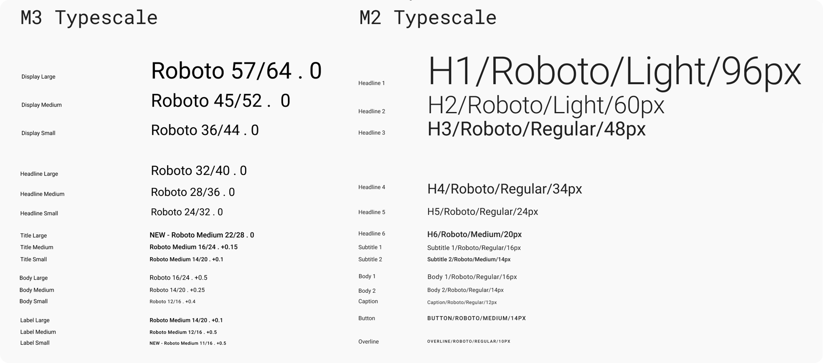
You can find an image comparing the new Material-3 with the Material-2 text styles in this Flutter issue #89853. For quick inline reference, here is the same image borrowed from the above source:
Modifying the TextTheme
Defining a custom default TextThemes for Flutter's ThemeData may result in unexpected results, at least if you do not know exactly which component uses what style. You may end up with unforeseen default text style changes on many Material UI widgets.
The large heading styles are generally not used much, or at all in the Flutter SDK. They can typically be modified without impacting component defaults in unforeseen ways. This is exactly what the Material-3 styles did. This was a good change, since pretty much all the M2 heading text styles were too big to be very useful by default.
The smaller TextStyles in the TextTheme are used in the Flutter SDK all over the place as defaults by UI widgets. It is not well documented anywhere in a consolidated overview where they are used, other than in the above article. If you need to know, you can use it, or preferable do a search of a TextStyle in the SDK source code to find out where it is used.
If you modify the text styles and don't know exactly how and where they are used, you will get unforeseen results on some widgets due to the changes you made.
Adjusting the midsized TextStyles a few point-sizes up or down, may work fine most of the time. However, as an example, ListTile uses the color and opacity from one text style and applies it to the style it uses for its subtitle property. This is done to create less impactful default subtitle text style for the ListTile, by using an opacity value it does not have in M2 on the TextStyle that is used for size and letter spacing on its subtitle. If you were to change the source TextStyle's color opacity it uses for this styling, your ListTiles would no longer look as intended or expected.
This was just one convoluted example of how Flutter widgets may depend on the built-in TextStyles. There are many other details like this built into default text style behavior used by Flutter SDK UI components. This makes modifications to the TextTheme in Themedata even more challenging than just the font-sizes.
Minor TextStyles changes
Prefer to only make custom font family adjustments on the global app TextTheme in ThemeData. Don't change font sizes, not a lot anyway. In Material-2, avoid messing with the font colors that include opacity. If you do anyway, consider using similar opacities on them as the defaults' use.
The TextStyles using big font sizes can be adjusted more, especially if you are using Typography2014 or Typography2018, where the big text styles are typically too big to be useful anyway. On the smaller and mid-sized TextStyles in TextTheme, only make really minor point size adjustments, up or down a point size or two. Beware that even this might be stretching it. It all depends on what font you use as well. You can also make minor letter spacing tweaks. In summary, don't do anything too radical with the TextTheme in ThemeData. If you stick to this, then your app's UI widgets default texts will still look fine and work as intended, with your custom TextStyle applied to all UI widgets by default.
Significant TextStyle changes
If you need more radical changes on individual components, add your custom TextStyle to the component theme level instead. For example, if you want an AppBar with a custom TextStyle, you might think you have to dig into the source to see what TextStyle(s) from the global TextTheme it uses by default. Then modify the global TextStyles it uses for your app's global TextTheme, to give your AppBar the desired themed TextStyle. Don't do this! If you do, multiple other UI components in Flutter will be impacted.
The AppBar is good example, because in Flutter early days it did not have properties in its component theme to allow styling all its text properties completely via theming. As with most other UI widgets, this has been fixed over time.
The AppBarTheme has a titleTextStyle and toolbarTextStyle. Define these TextStyles instead to follow your custom design need for the AppBar component. Repeat this principle with other components that require custom TextStyles in your design.
This only works if the component theme has and uses component level TextStyles. Always check if it does before you go berserk on the global TextTheme, potentially creating a big mess. And if you run across a Text in a Material UI widget without a TextStyle that can be themed, please open a new issue in the Flutter repo and request it to be added.
Content TextThemes
If your application has a lot of content that needs their own text styles, consider adding them as content text styles that you add to the theme via theme extensions.
Maybe you have blog like entries, or social media posts, chats, journal entries etc. Trying to fit them into the global TextTheme in Flutter is typically a bad idea. You should think of the TextThemes in ThemeData as something your UI widgets use by default. And something you can override on component theme level to change for UI widgets. Prefer not changing them to other styles, just because you need some additional styles used by content in your application.
TextStyles. You can then modify the styles used by content in your app, without impacting any TextStyle used by text in the apps Material UI widget.A simple and naive approach is to just add const TextStyle for your content. Like with semantic colors, if you instead add them as styles to Theme Extensions, they will also lerp-animate when the rest of your app theme changes. If you have them as const values, you get an immediate jarring color switch when you swap between light and dark theme.
If the default TextTheme and its TextStyles also work for your content, you can certainly go ahead and use them as you see fit on any content in your app. If you do, you may still want to consider giving them some more app-specific semantic alias names that you use instead. Later if you need to modify them, you can then do so by changing them to use custom TextStyles via theme extensions instead.
FlexColorScheme and TextTheme
FlexColorScheme only has a few component level TextStyle properties included in its opinionated component themes. None of them are included as settings in the Themes Playground.
FlexColorScheme supports textTheme, primaryTextTheme, fontFamily and fontFamilyFallback as pass along properties to ThemeData, for the global app TextThemes.
It also offers easy Typography switching between 2018 (M2) and 2021 (M3) Typography, and optional color tinted text using the theme's ColorScheme.surfaceTint as its tint color. The tint is very subtle, but might be an acquired style. M3 already does a bit of tinting on its text theme color via the onSurface color, that when using the Material Color System, gets a hint of ColorScheme.primary via the neutral tonal palette that includes low chroma from the used primary seed color.
FlexColorScheme may in later versions add more convenience TextStyle configuration options to its opinionated components themes. At least if a particular one is frequently asked for. Where would you like to see them? Drop your thoughts and request on this in the repo discussions. Remember, you can add them with copyWith already now.