Roads to ThemeData
In this chapter we compare different ways to define and create a ThemeData object and look at the differences we get in effective colors in the theme. We examine 13 different ways, or roads to make a ThemeData object.
ColorSwatch based
- a. ThemeData.light/dark, and b. ThemeData(brightness: Brightness.light/dark)
- ThemeData(primarySwatch: ...)
- ThemeData(colorScheme: ColorScheme.fromSwatch(...))
- ThemeData.from(colorScheme: ColorScheme.fromSwatch(...))
ColorScheme based
- ThemeData(colorScheme: ColorScheme(...))
- ThemeData.from(colorScheme: ColorScheme(...))
- ThemeData(colorSchemeSeed: Color(...))
- ThemeData(colorScheme: ColorScheme.fromSeed(seedColor: Color(...))),
- ThemeData.from(colorScheme: ColorScheme.fromSeed(seedColor: Color(...)))
FlexColorScheme based
- FlexThemeData.light/dark(colorScheme)
- FlexThemeData.light/dark(colorScheme, keyColors)
- FlexThemeData.light/dark(colorScheme, keyColors, subThemesData)
In all cases, we will see the results for both light and dark theme mode, compare the different methods and analyze the results. Yes that's a lot of methods and roads to make a ThemeData object.
Just for comparison, the last three ones are FlexColorScheme based, with a few significant different theming options used.
Recommendations on what to use and why is also be given.
Used ColorScheme
To make it interesting, we will use a ColorScheme very similar to the M3 Guide Baseline as input for a fully qualified ColorScheme. We use the FlexColorScheme input version of it. It has less colorful onColors. When we use a seeded ColorScheme based on it, we will get the more colorful onColors as specified and used in the M3 guide.
This ColorScheme is useful for this study, because when we use its primary color as seed color, the M3 algorithm produces the same ColorScheme as the Material-3 guide's specified version of this ColorScheme. This happens because the colors used in the guide design for the M3 Baseline ColorScheme, have been produced using the same input Color and same algorithm. This helps us spot differences in the result, since we will not be focused on the color generation differences, but rather on where the colors end up in the produced ThemeData.
For reference, here is the used M3 baseline light theme mode ColorScheme without M3's colorful onColors.
const ColorScheme flexSchemeLight = ColorScheme(
  brightness: Brightness.light,
  primary: Color(0xff6750a4),
  onPrimary: Color(0xffffffff),
  primaryContainer: Color(0xffeaddff),
  onPrimaryContainer: Color(0xff000000),
  secondary: Color(0xff625b71),
  onSecondary: Color(0xffffffff),
  secondaryContainer: Color(0xffe8def8),
  onSecondaryContainer: Color(0xff000000),
  tertiary: Color(0xff7d5260),
  onTertiary: Color(0xffffffff),
  tertiaryContainer: Color(0xffffd8e4),
  onTertiaryContainer: Color(0xff000000),
  error: Color(0xffba1a1a),
  onError: Color(0xffffffff),
  errorContainer: Color(0xffffdad6),
  onErrorContainer: Color(0xff000000),
  background: Color(0xffffffff),
  onBackground: Color(0xff000000),
  surface: Color(0xffffffff),
  onSurface: Color(0xff000000),
  surfaceVariant: Color(0xffeeeeee),
  onSurfaceVariant: Color(0xff000000),
  outline: Color(0xff737373),
  outlineVariant: Color(0xffbfbfbf),
  shadow: Color(0xff000000),
  scrim: Color(0xff000000),
  inverseSurface: Color(0xff121212),
  onInverseSurface: Color(0xffffffff),
  inversePrimary: Color(0xfff0e9ff),
  surfaceTint: Color(0xff6750a4),
);
And here the dark theme mode one without M3's colorful onColors.
const ColorScheme flexSchemeDark = ColorScheme(
  brightness: Brightness.dark,
  primary: Color(0xffd0bcff),
  onPrimary: Color(0xff000000),
  primaryContainer: Color(0xff4f378b),
  onPrimaryContainer: Color(0xffffffff),
  secondary: Color(0xffccc2dc),
  onSecondary: Color(0xff000000),
  secondaryContainer: Color(0xff4a4458),
  onSecondaryContainer: Color(0xffffffff),
  tertiary: Color(0xffefb8c8),
  onTertiary: Color(0xff000000),
  tertiaryContainer: Color(0xff633b48),
  onTertiaryContainer: Color(0xffffffff),
  error: Color(0xffffb4ab),
  onError: Color(0xff000000),
  errorContainer: Color(0xff93000a),
  onErrorContainer: Color(0xffffffff),
  background: Color(0xff121212),
  onBackground: Color(0xffffffff),
  surface: Color(0xff121212),
  onSurface: Color(0xffffffff),
  surfaceVariant: Color(0xff323232),
  onSurfaceVariant: Color(0xffffffff),
  outline: Color(0xff8c8c8c),
  outlineVariant: Color(0xff404040),
  shadow: Color(0xff000000),
  scrim: Color(0xff000000),
  inverseSurface: Color(0xffffffff),
  onInverseSurface: Color(0xff000000),
  inversePrimary: Color(0xff635b70),
  surfaceTint: Color(0xffd0bcff),
);
These above ColorSchemes can also be copied from the Themes Playground by selecting the "Material-3 purple" theme and keeping all seed generation disabled, and blend level at zero, in the Playground. From the above code views you can copy/paste the color schemes. To show the colors for all the Color values, below are image copied from a code editor that can show the actual colors too.
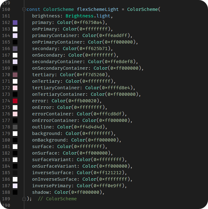
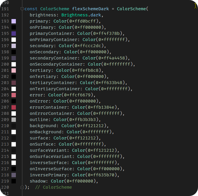
The used names flexSchemeLight and flexSchemeDark have nothing to do with FlexColorScheme, they are just instances of standard ColorScheme, that were named this way in these examples. They were produced by the Themes Playground app, it gives ColorSchemes you copy from it these names by default, but as can be seen they are just standard ColorScheme instances.
Used Swatch
Older ThemeData creation methods are ColorSwatch based, or actually MaterialColor based, a super class of ColorSwatch. We cannot use a ColorScheme to create themes with those ThemeData factories. For the above ColorScheme there is no built-in MaterialColor swatch that is directly similar to the purple based Material-3 baseline ColorScheme that we could use with those mehtods directly. We will need to create a matching older MaterialColor based swatch.
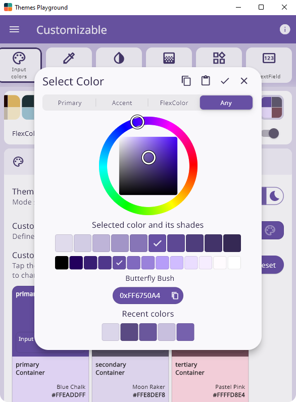
FlexColorScheme and FlexColorPicker both contain a helper that can create a MaterialColor swatch from a single input color. The used algorithm is simple, it is not the actual MaterialColor algorithm used to create the built-in MaterialColor colors. Its result depends a lot on the used input color. It assumes that the provided color is a useful mid-point 500 shade. We can use the light theme mode's primary color from the above ColorScheme and create a MaterialColor swatch from it.
  // Create a MaterialColor swatch from the same color value as the primary
  // color in the example flexSchemeLight ColorScheme.
  final MaterialColor flexSwatch =
    FlexColorScheme.createPrimarySwatch(const Color(0xff6750a4));
What does this custom MaterialColor look like? The FlexColorPicker in the Themes Playground app can show it to us. Copy the Material-3 purple theme to the customizable theme and then tap the input primary color, having color value 0xff6750a4. Tapping this color will open the color picker where the wheel picker will draw a Material Color swatch created using this color, using this same createPrimarySwatch function. Below it, you will also see the primary tonal palette for the same input color.
Swatch based ThemeData
Let's call this group of ThemeData themes Swatch based, since they all either directly or under the hood via defaults, use the old MaterialColor color swatches as base to create the ThemeData and its colors.
These methods are practically obsolete for defining nice looking ColorScheme based ThemeData. Some of them don't even accept a ColorScheme as input, nor do they produce an app with a very usable ColorScheme. The methods are not deprecated, but it is stated in code comments that these are not the preferred way to make a color correct ThemeData. Ideally they should all be deprecated, or fixed to produce better results. Let's find out why they are not recommended.
1. ThemeData.light/dark
Since these methods do not use a ColorScheme as input, we will use a MaterialColor swatch as input, and we will use our custom flexSwatch, in some comparisons too when possible.
We start with theme methods ThemeData.light() and ThemeData.dark(). These are just small Flutter SDK convenience factories based on this:
  /// A default light blue theme.
  factory ThemeData.light() => ThemeData(brightness: Brightness.light);
  /// A default dark theme with a teal secondary [ColorScheme] color.
  factory ThemeData.dark() => ThemeData(brightness: Brightness.dark);
These shortcuts are in fact only marginally shorter than using the syntax used for what they return. It is a bit unclear why they even exit, but they do. They are not very practical when you make a ThemeData object, since you cannot define any other properties for them directly. You would have to apply all of them with copyWith, if we create our ThemeData like this:
// 1a) TD.light
//     ThemeData.light() / ThemeData.light().dark()
title: '1a) TD.light',
theme: ThemeData.light(),
darkTheme: ThemeData.dark(),
All we can do with the above is to make a default MaterialColor swatch based theme, which is Colors.blue. Not very practical. This theme is, of course, going to be identical to this one:
// 1b) TD brightness
//     ThemeData(brightness: Brightness.light)
//     ThemeData(brightness: Brightness.dark)
title: '1b) TD brightness',
theme: ThemeData(brightness: Brightness.light),
darkTheme: ThemeData(brightness: Brightness.dark),
Except with the above syntax we could have specified any of ThemeData's myriad other properties, to actually make a usable ThemeData object.
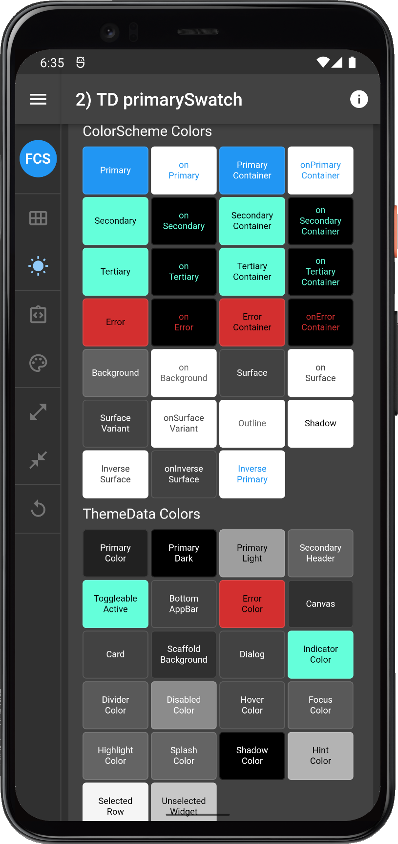
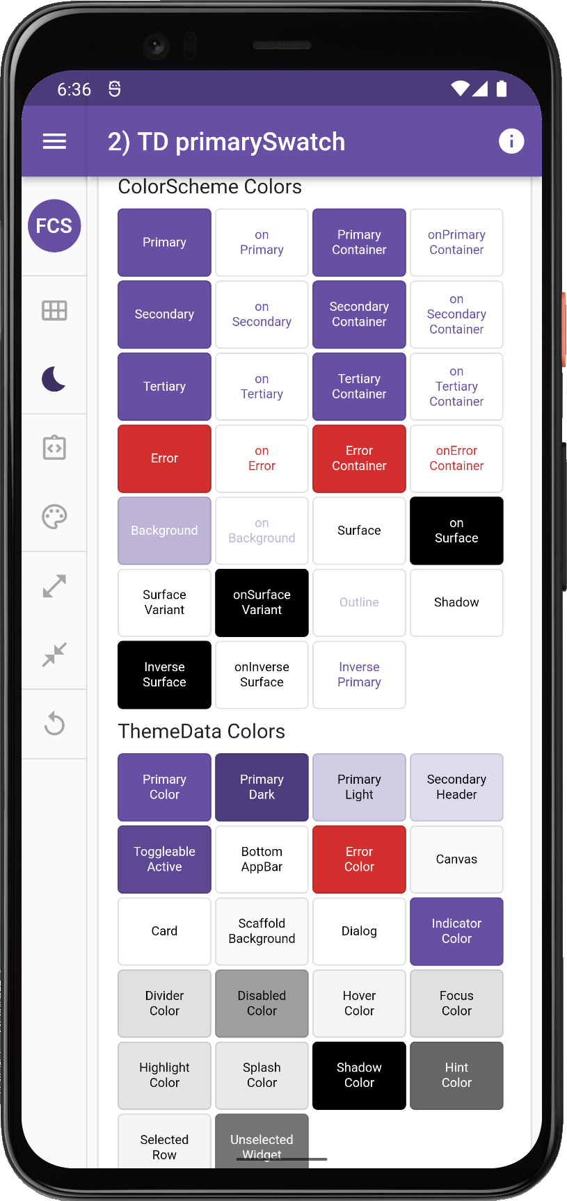
2. ThemeData primarySwatch
We could e.g., have specified a swatch. Let's do that, using both the above blue and our custom flexSwatch and see what that gives us.
// 2) TD primarySwatch
//    ThemeData(brightness: ..., primarySwatch: Colors.blue)
title: '3) TD primarySwatch',
theme: ThemeData(
  brightness: Brightness.light,
  primarySwatch: Colors.blue,
),
darkTheme: ThemeData(
  brightness: Brightness.dark,
  primarySwatch: Colors.blue,
),
If we use the Colors.blue as input it will still be identical to 1a and 1b. All using our flexSwatch as input will give us, is a variation with a different color, but let's do it anyway, so we can compare it later to its ColorScheme based versions.
// 2 flex) TD primarySwatch
//    ThemeData(brightness: ..., primarySwatch: flexSwatch)
title: '3) TD primarySwatch',
theme: ThemeData(
  brightness: Brightness.light,
  primarySwatch: flexSwatch,
),
darkTheme: ThemeData(
  brightness: Brightness.dark,
  primarySwatch: flexSwatch,
),
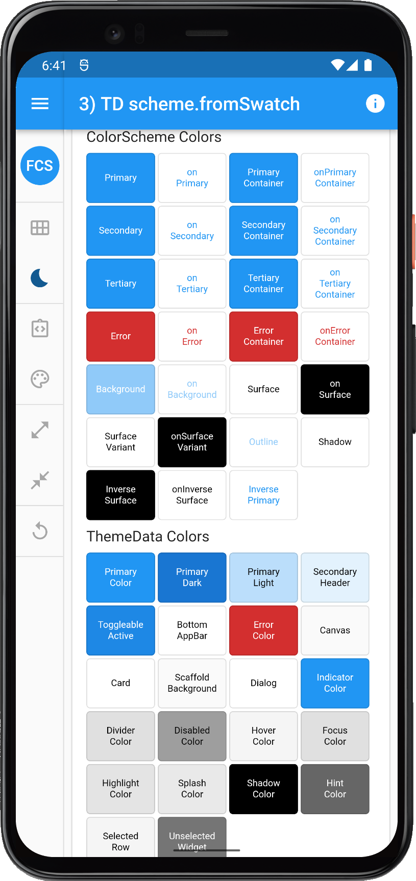
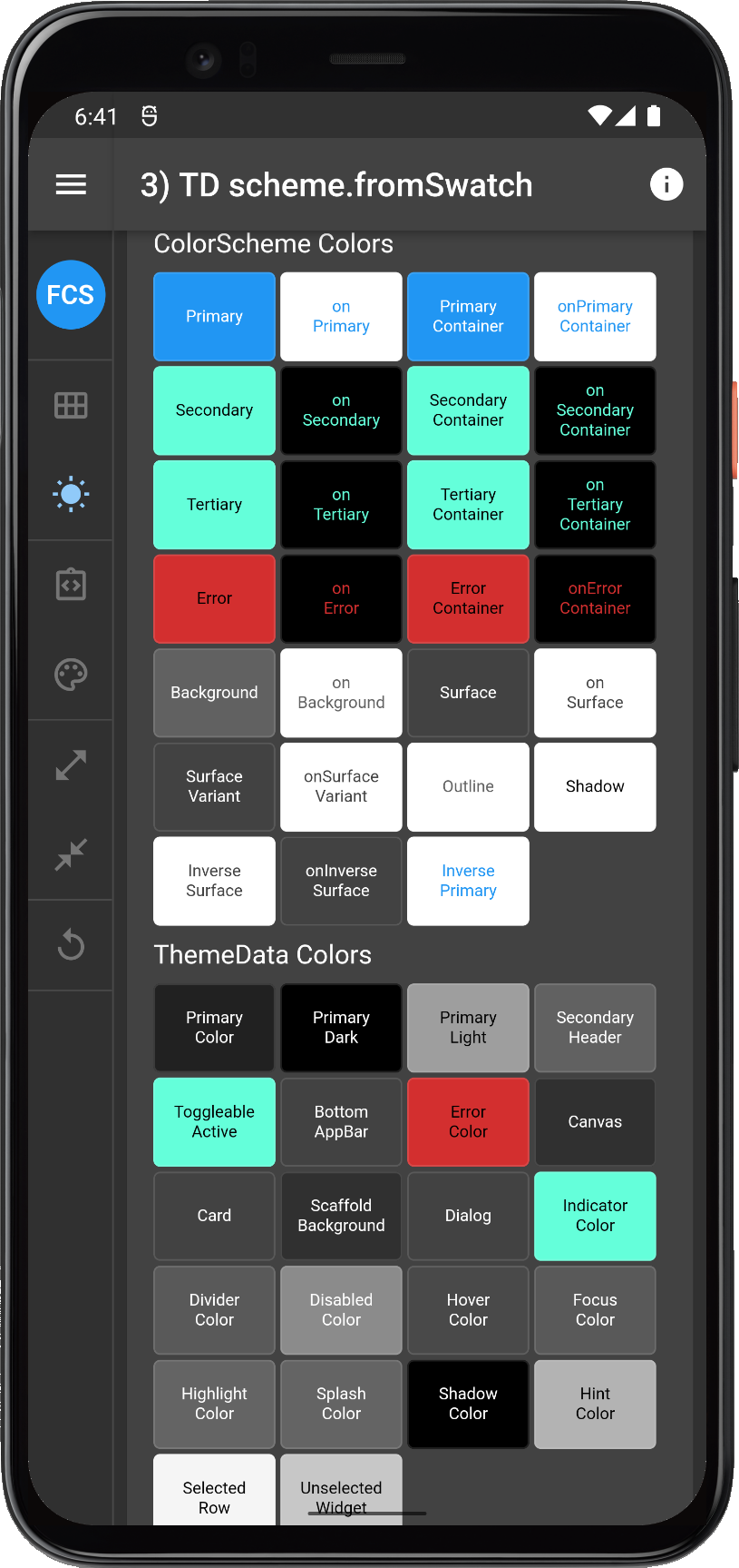
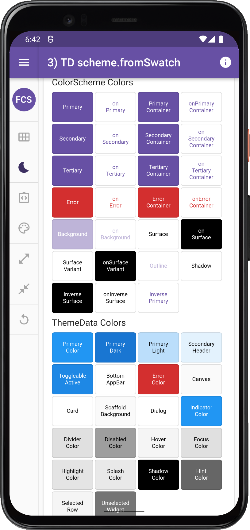
3. ThemeData colorScheme.fromSwatch
We can also make a ThemeData with a ColorScheme that is created from a MaterialColor swatch. Let's try this with Colors.blue and our flexSwatch as well, and see if we can spot any differences in the result.
// 3) TD colorScheme.fromSwatch
//    ThemeData(colorScheme: ColorScheme.fromSwatch(...))
//
title: '3) TD colorScheme.fromSwatch',
theme: ThemeData(
  colorScheme: ColorScheme.fromSwatch(
    primarySwatch: Colors.blue // or flexSwatch
    brightness: Brightness.light,
  ),
),
darkTheme: ThemeData(
  colorScheme: ColorScheme.fromSwatch(
    primarySwatch: Colors.blue // or flexSwatch
    brightness: Brightness.dark,
  ),
),
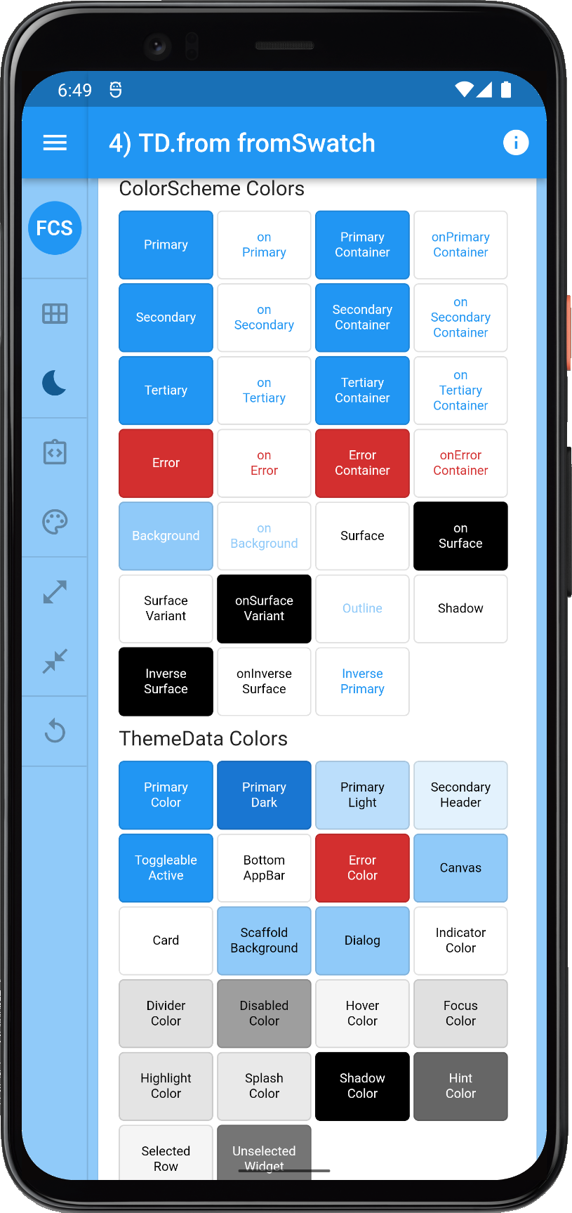
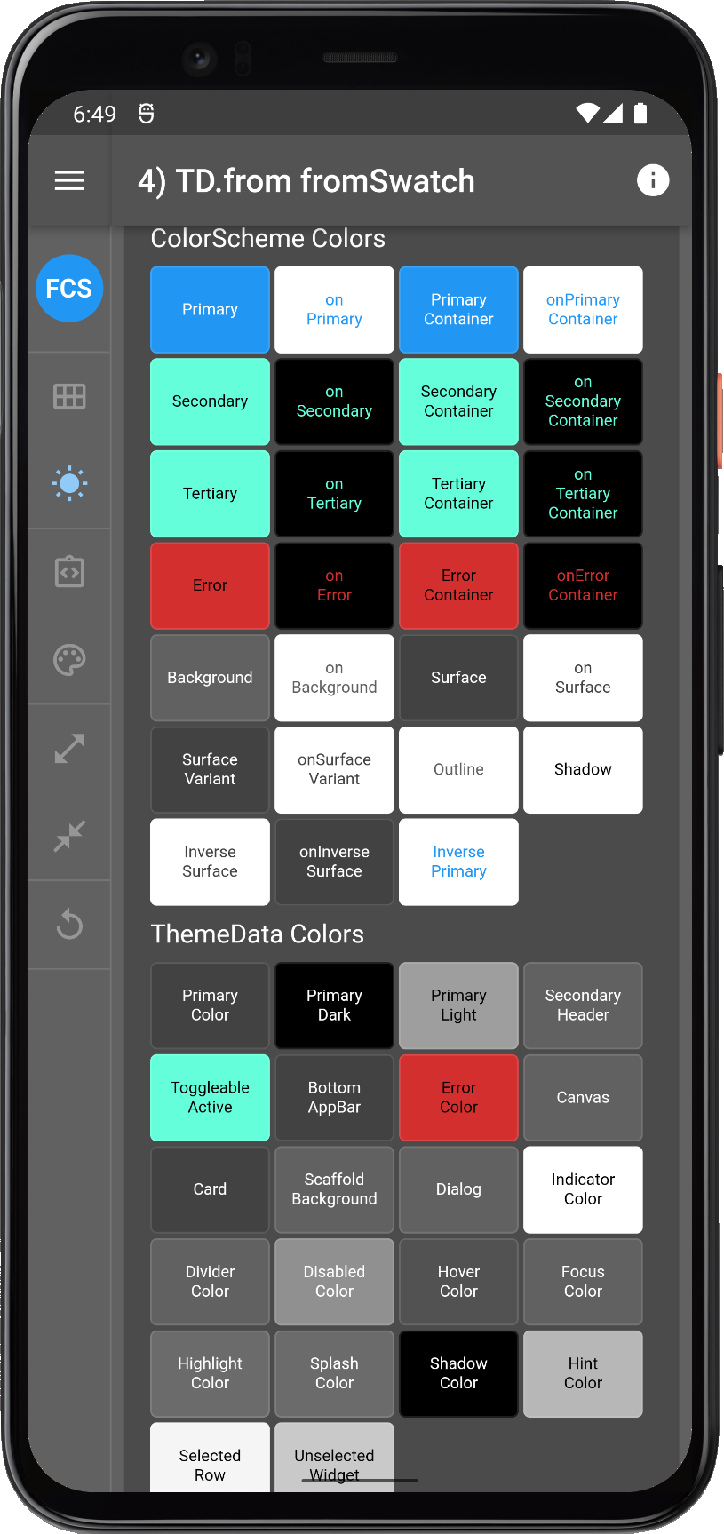
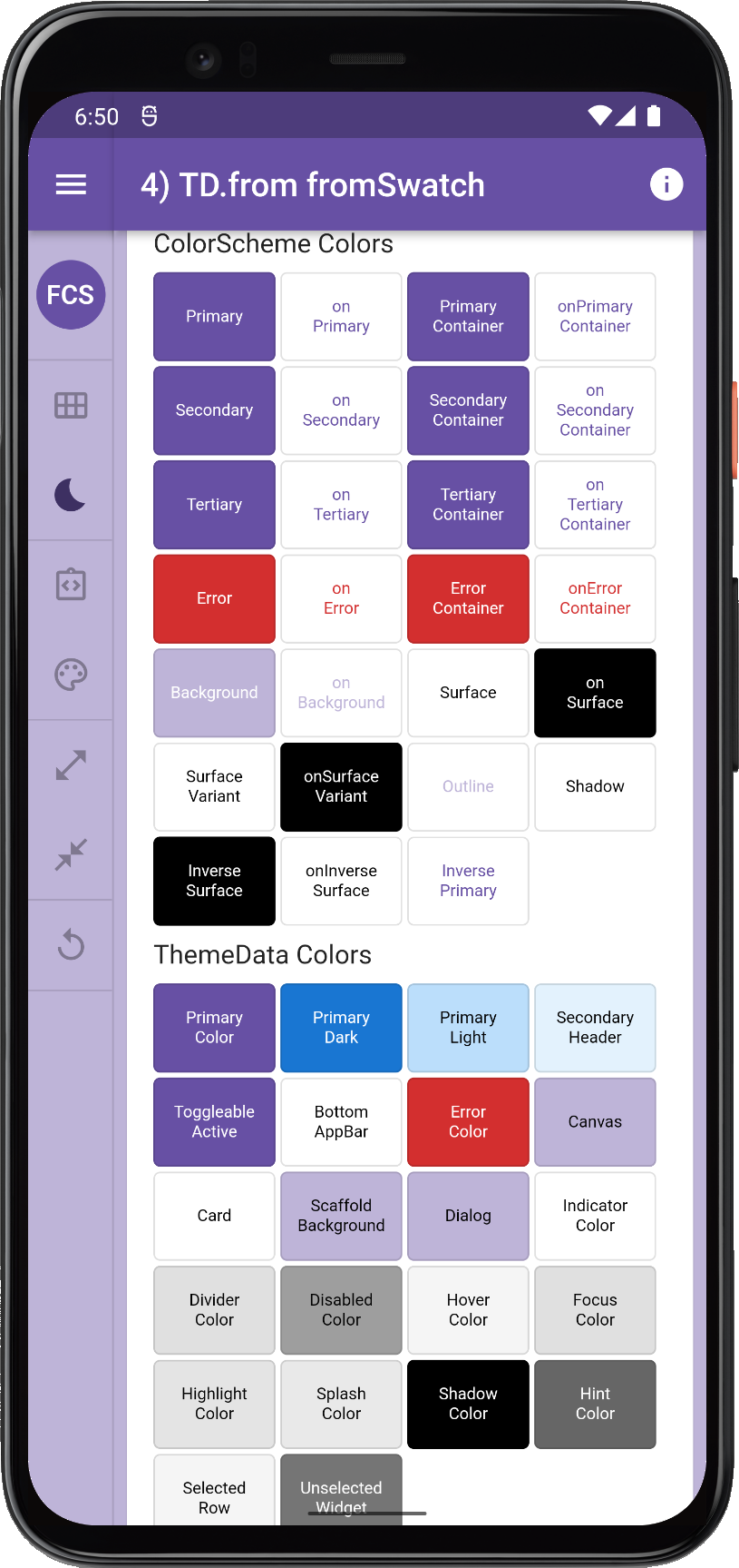
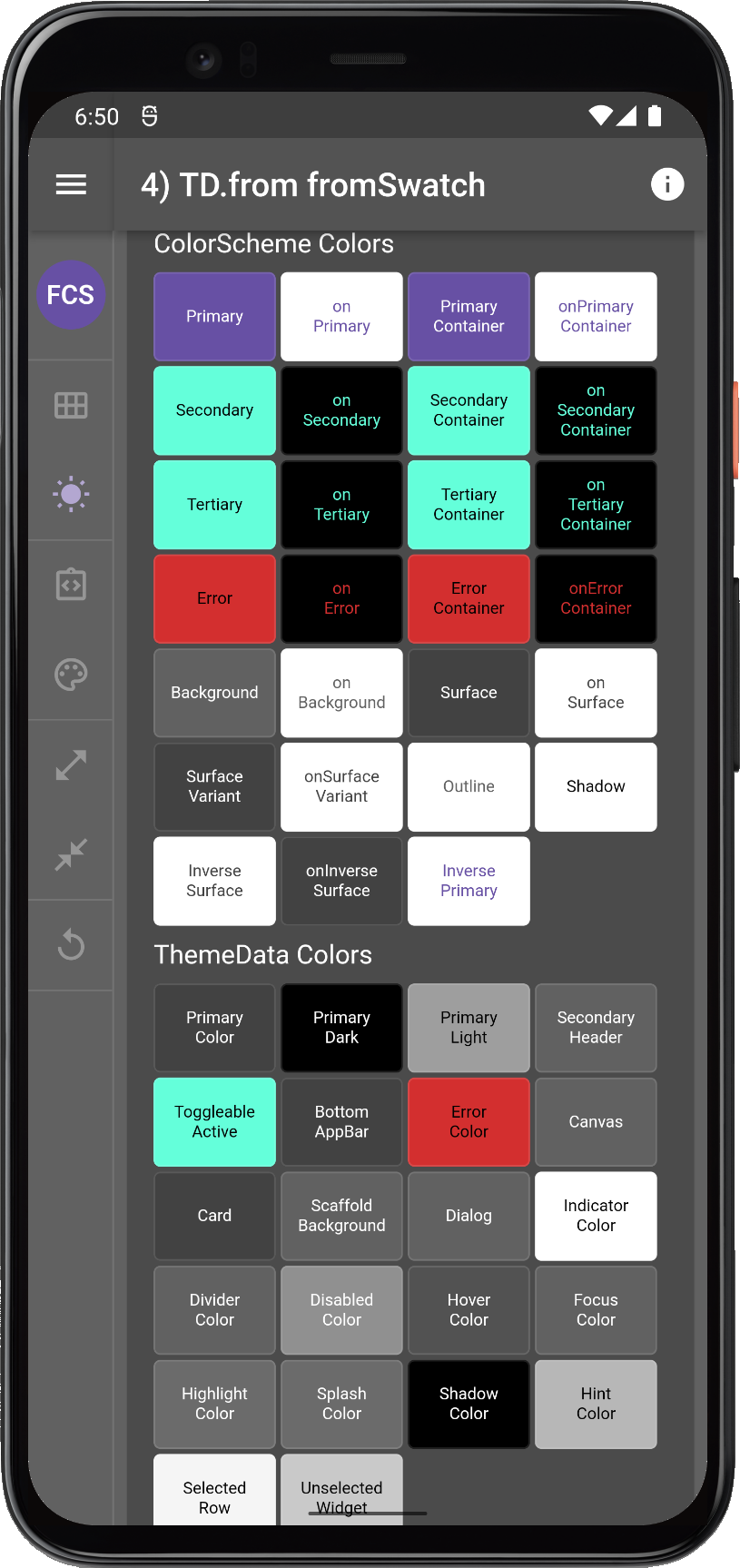
4. ThemeData.from colorScheme.fromSwatch
Here is a more complex combo, let's use factory ThemeData.from a ColorScheme that is created from a MaterialColor made with ColorScheme.fromSwatch.
Let's see this with Colors.blue and our flexSwatch as well, and see if we can now spot any differences in the result now, compared to the previous ones.
// 4) TD.from scheme.fromSwatch
//    ThemeData.from(colorScheme: ColorScheme.fromSwatch(...))
//
title: '4) TD.from fromSwatch',
theme: ThemeData.from(
  colorScheme: ColorScheme.fromSwatch(
    primarySwatch: Colors.blue, // or flexSwatch
    brightness: Brightness.light,
  ),
),
darkTheme: ThemeData.from(
  colorScheme: ColorScheme.fromSwatch(
    primarySwatch: Colors.blue, // or flexSwatch
    brightness: Brightness.dark,
  ),
),
Comparing 1 to 4
Let's now compare and analyze the different results.
| 1a/b) TD.light/dark | 2) TD primarySwatch | 3) TD fromSwatch | 4) TD.from fromSwatch |
 |
 |
 |
 | |||
 |
 |
 |
 | |||
Comparing old ThemeData ColorSWatch based ways to make ThemeData objects | ||||||
The results above show that options 1, 2 and 3 are all identical. They all also share the same problems:
- Main
ColorSchemecolors in light mode all have same blue-500 color. - In dark mode, we get a default magic teal color, that we did not specify, because it is the default. We are going to see this teal color stick around a lot in dark themes later too.
- The dark mode does not look very nice, it is grey, not really dark. This is because this Flutter dark mode implementation was made before there was a proper dark theme in the Material Design Guide.
- ColorScheme background in light theme mode color has the wrong contrasting onColor. This is bad, and probably a bug, or at least an oversight.
Why does onBackground get wrong color?
We can track the wrong onBackground from ThemeData and see that if we have not passed in a colorScheme to it, it will be created with colorScheme ??= ColorScheme.fromSwatch and in it, we find the issue, which is explained in the commented Flutter SDK code below:
// Create a color scheme from a [MaterialColor] swatch.
//
// This constructor is used by [ThemeData] to create its default
// color scheme.
factory ColorScheme.fromSwatch({
  MaterialColor primarySwatch = Colors.blue,
  Color? primaryColorDark,
  Color? accentColor,
  Color? cardColor,
  Color? backgroundColor,
  Color? errorColor,
  Brightness brightness = Brightness.light,
}) {
  assert(primarySwatch != null);
  assert(brightness != null);
  final bool isDark = brightness == Brightness.dark;
  // This is key for the issue, checking if primary needs white or black
  // onColor here is fine for index 500 and the actual primary color:
  final bool primaryIsDark = _brightnessFor(primarySwatch) == Brightness.dark;
  final Color secondary = accentColor ?? (isDark ? Colors.tealAccent[200]! : primarySwatch);
  final bool secondaryIsDark = _brightnessFor(secondary) == Brightness.dark;
  return ColorScheme(
    primary: primarySwatch,
    primaryVariant: primaryColorDark ?? (isDark ? Colors.black : primarySwatch[700]!),
    secondary: secondary,
    secondaryVariant: isDark ? Colors.tealAccent[700]! : primarySwatch[700]!,
    surface: cardColor ?? (isDark ? Colors.grey[800]! : Colors.white),
    // However, here primary swatch 200 is assigned to ColorScheme background.
    background: backgroundColor ?? (isDark ? Colors.grey[700]! : primarySwatch[200]!),
    error: errorColor ?? Colors.red[700]!,
    onPrimary: primaryIsDark ? Colors.white : Colors.black,
    onSecondary: secondaryIsDark ? Colors.white : Colors.black,
    onSurface: isDark ? Colors.white : Colors.black,
    // Here the onBackground gets white or black color, but that does not work
    // because the primaryIsDark boolean is used. That check was for
    // swatch color 500, the swatch color 200 that was used in light mode for
    // background typically does not have the same brightness as the 500 index,
    // so for most swatches we get the wrong contrasting color for onBackground
    // with all these .fromSwatch based ColorScheme creation methods. You would
    // have to know this and correct with a copyWith.
    //
    // Also the swatch does have a lot of nice shades that could be used to
    // set better colors for all the other ColorScheme container colors too
    // but it is chose not too, for backwards compatibility presumably.
    onBackground: primaryIsDark ? Colors.white : Colors.black,
    onError: isDark ? Colors.black : Colors.white,
    brightness: brightness,
  );
}
What about the 4th option, where we are using the recommended way of creating a ThemeData, by using ThemeData.from a ColorScheme.
This sounds good in theory, but since we are making the ColorScheme using the broken or at least fidelity wise very poor ColorScheme.fromSwatch factory, we will have the same issue with the background's onBackground color in light mode.
Now it gets even funkier, since ThemeData.from will assign many colors from the ColorScheme to theme colors in ThemeData, that are the ones still used on actual surfaces and background we get very "interesting" result. In it ColorScheme.surface is assigned to ThemeData.cardColor and both ThemeData.CanvasColor and scaffoldBackgroundColor get the ColorScheme.background, which is primarySwatch index 200 shade, it is a bit too much color on those surfaces, not even M3 puts this much color on background surfaces, nor any of FlexColorScheme's surface blends.
Comparing 2 to 4 with flexSwatch
Here are also the results of using our custom flexSwatch, comparing it to the default blue one. The results are naturally the same if we compare them to the corresponding method using the default blue swatch, it is just using another color for the swatch.
What is interesting to see in both cases, is that we get our swatch colors assigned to ThemeData colors primaryColorLight, primaryColorDark and secondaryHeaderColor in light theme mode only if we assign the swatch to ThemeData.primarySwatch when using the ThemeData factory.
| 2) TD primarySwatch | 2 flex) TD primarySwatch | 3 flex) TD fromSwatch | 4 flex) TD.from fromSwatch |
|
 |
 |
 | |||
|
 |
 |
 | |||
Comparing old ThemeData ColorSWatch based ways to make ThemeData objects, default swatch and custom swatch | ||||||
Let's move on to using ColorScheme to make ColorScheme based themes as we should. Then all will be perfect, right?
ColorScheme based ThemeData
Making ThemeData colors by defining a ColorScheme is the officially recommend way. But there are many ways to make ThemeData with ColorScheme as well.
What are their differences? Let's take a closer look.
Now we switch from using the MaterialColor swatch as input to the flexSchemeLight light and flexSchemeDark dark color schemes we defined based on the M3 baseline scheme.
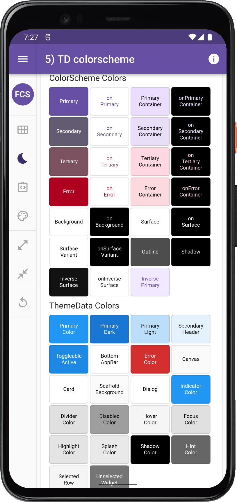
5. ThemeData colorscheme
The simplest way is to just use ThemeData with a fully specified ColorScheme, like so:
// 5) TD colorScheme
//    ThemeData(colorScheme: ColorScheme(...))
//
title: '5) TD colorscheme',
theme: ThemeData(colorScheme: flexSchemeLight),
darkTheme: ThemeData.from(colorScheme: flexSchemeDark),
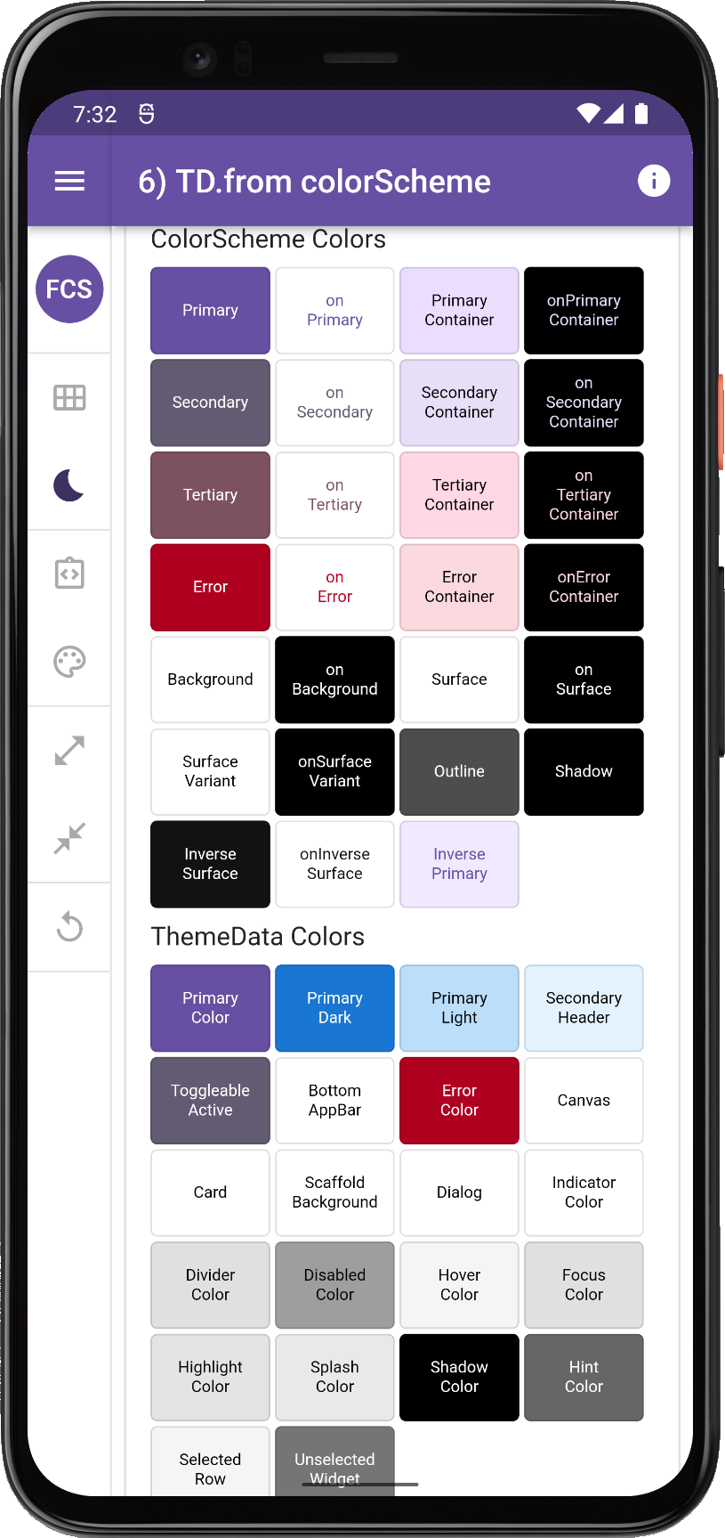
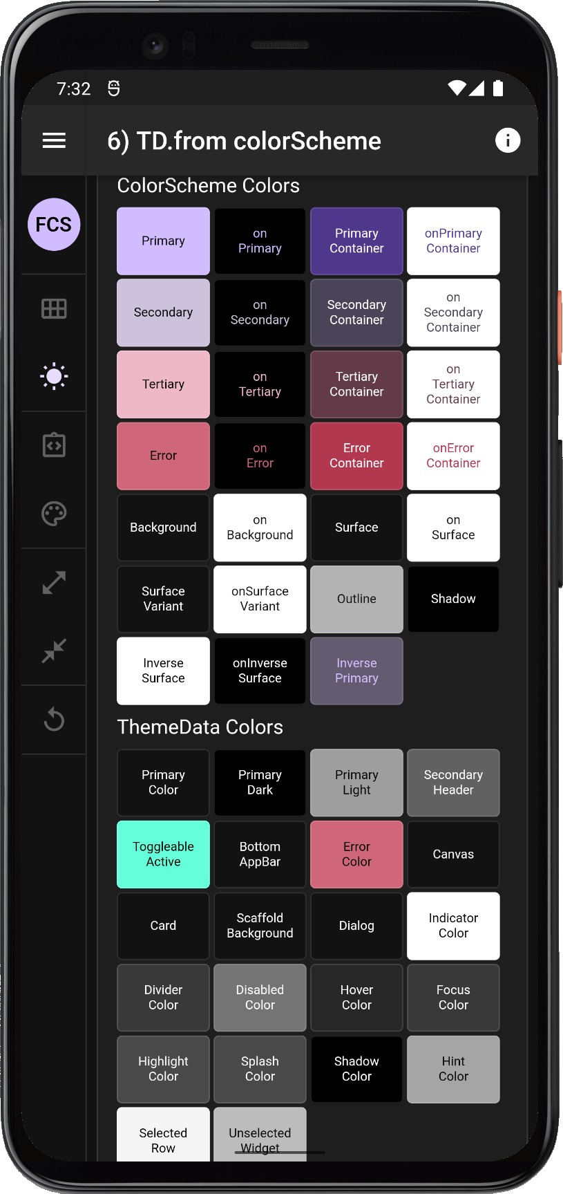
6. ThemeData.from colorScheme
Does it matter if we use the ThemeData.from a ColorScheme factory like so:
// 6) TD.from colorScheme
//    ThemeData.from(colorScheme: ColorScheme(...))
//
title: '6) TD.from colorScheme',
theme: ThemeData.from(colorScheme: flexSchemeLight),
darkTheme: ThemeData.from(colorScheme: flexSchemeDark),
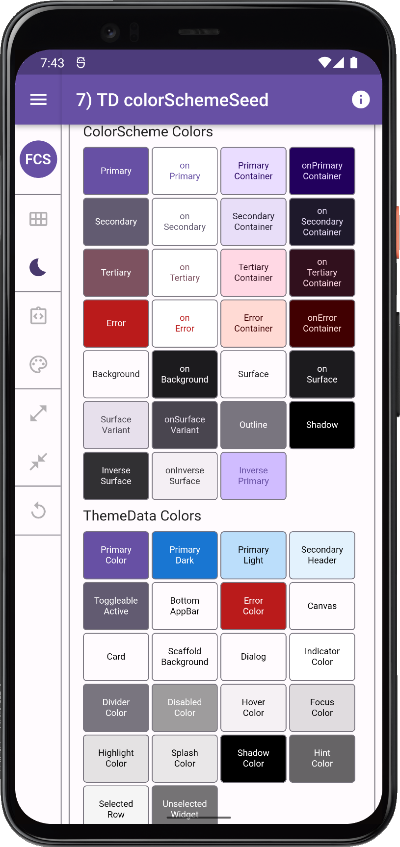
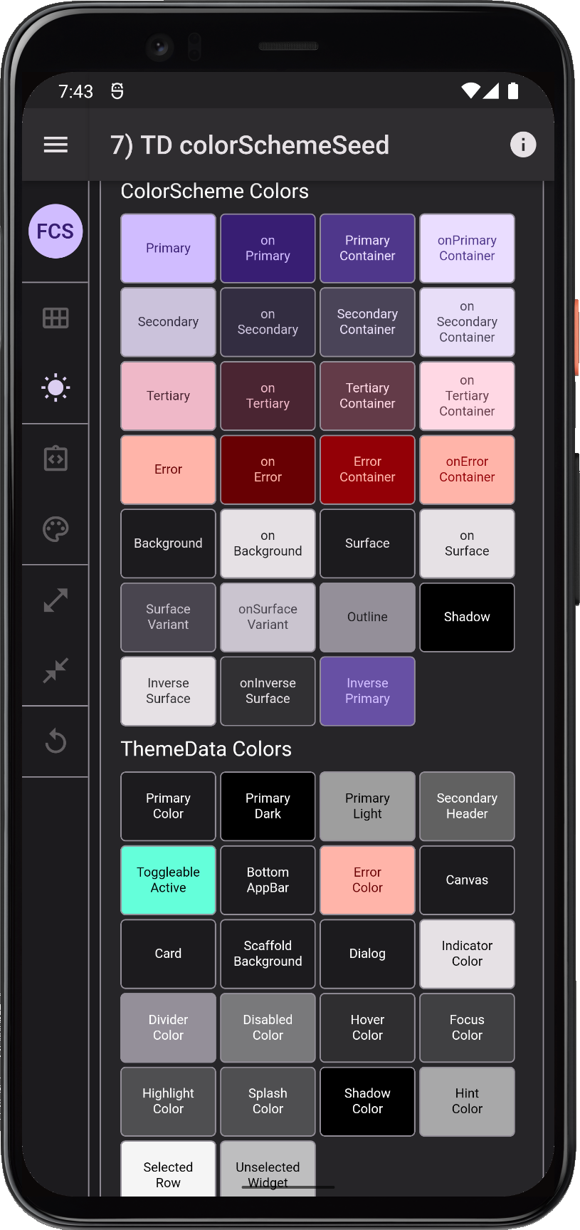
7. ThemeData colorSchemeSeed
If we want to make a seeded ColorScheme, we can use the ThemeData property colorSchemeSeed to do so. Here we are using the ColorScheme.primary color value from our flexSchemeLight scheme, as seed color for both the seed generated light and dart ColorScheme.
You should use the same seed color for your light and dark theme if you want the light and dark ColorScheme to use the identical generated tonal palettes, with the appropriate tones for light and dark themes mapped to the generated ColorScheme.
// 7) TD colorSchemeSeed
//    ThemeData(colorSchemeSeed: Color(...))
//
title: '7) TD colorSchemeSeed',
theme: ThemeData(
  brightness: Brightness.light,
  colorSchemeSeed: const Color(0xff6750a4),
),
darkTheme: ThemeData(
  brightness: Brightness.dark,
  colorSchemeSeed: const Color(0xff6750a4),
),
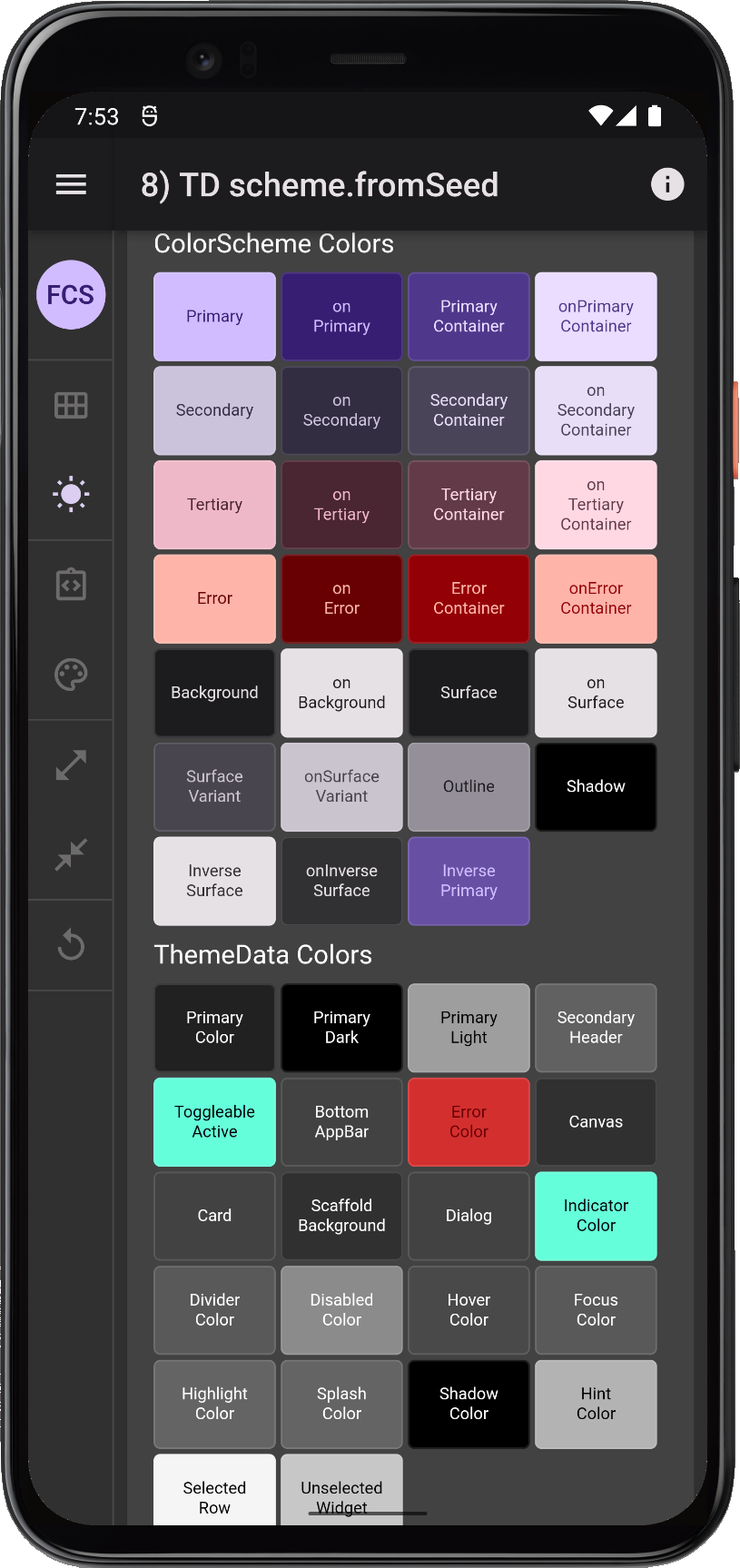
8) ThemeData ColorScheme.fromSeed
Is creating ThemeData that uses a colorScheme value created with ColorScheme.fromSeed any different from creating your ThemeData using a ColorScheme.fromSeed?
// 8) TD scheme.fromSeed
//    ThemeData(colorScheme: ColorScheme.fromSeed(...))
//
title: '8) TD scheme.fromSeed',
theme: ThemeData(
  colorScheme: ColorScheme.fromSeed(
    seedColor: const Color(0xff6750a4),
    brightness: Brightness.light,
  ),
),
darkTheme: ThemeData(
  colorScheme: ColorScheme.fromSeed(
    seedColor: const Color(0xff6750a4),
    brightness: Brightness.dark,
  ),
),
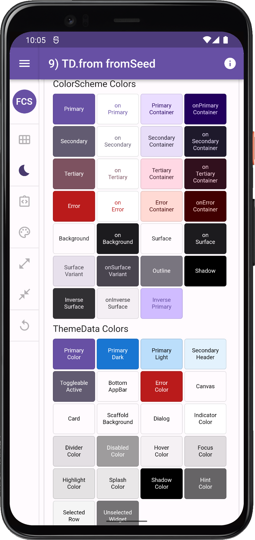
9) ThemeData.from fromSeed
Or what about using ThemeData.from with a ColorScheme.fromSeed, like so:
// 9) TD.from scheme.fromSeed
//    ThemeData(colorScheme: ColorScheme.fromSeed(...))
//
title: '9) TD.from fromSeed',
theme: ThemeData.from(
  colorScheme: ColorScheme.fromSeed(
    seedColor: const Color(0xff6750a4),
    brightness: Brightness.light,
  ),
),
darkTheme: ThemeData.from(
  colorScheme: ColorScheme.fromSeed(
    seedColor: const Color(0xff6750a4),
    brightness: Brightness.dark,
  ),
),
If all these options feel confusing, it is because they are.
To find out if any of it matters, let's look at the results from the above alternatives, excluding option 9, which we will look at in the next group of comparisons.
Comparing 5 to 8
Lots of differences here, let's look at them closer and analyze them one by one.
| 5) TD colorscheme | 6) TD.from colorScheme | 7) TD colorSchemeSeed | 8) TD scheme.fromSeed |
 |
 |
 |
 | |||
 |
 |
 |
 | |||
Comparing ThemeData and ColorScheme options 5 to 8 for defining ThemeData | ||||||
Analysis of ThemeData made with a ColorScheme (5)
Option 5 with a ThemeData from a full ColorScheme looks as can be expected, we have our ColorScheme in the scheme as given. However, none of the scheme colors has been assigned to any of the direct colors in our ThemeData, and since those colors are still used by a number UI elements it is more than "a bit" problematic.
Analysis of ThemeData.from a ColorScheme (6)
With option 6 using ThemeData.from with our full ColorScheme, things are as good as they will get in Flutter SDK when it comes to reasonable colors assigned to legacy colors in ThemeData.
We can see that in light mode primaryColor got the ColorScheme.primary color and ToggleableColor got the ColorScheme.secondary color, sure not a very nice color in this particular color scheme, but the assignment is appropriate and correct. We also see that the error color got copied over to ThemeData's error color. This applies to Canvas, Scaffold, Card and many other colors too. We can take a look into the ThemeData.from factory to get the full scoop of what it does:
factory ThemeData.from({
  required ColorScheme colorScheme,
  TextTheme? textTheme,
}) {
  final bool isDark = colorScheme.brightness == Brightness.dark;
  // For surfaces that use primary color in light themes and surface color in dark
  final Color primarySurfaceColor = isDark ? colorScheme.surface : colorScheme.primary;
  final Color onPrimarySurfaceColor = isDark ? colorScheme.onSurface : colorScheme.onPrimary;
  return ThemeData(
    colorScheme: colorScheme,
    brightness: colorScheme.brightness,
    primaryColor: primarySurfaceColor,
    primaryColorBrightness: ThemeData.estimateBrightnessForColor(primarySurfaceColor),
    canvasColor: colorScheme.background,
    accentColor: colorScheme.secondary,
    accentColorBrightness: ThemeData.estimateBrightnessForColor(colorScheme.secondary),
    scaffoldBackgroundColor: colorScheme.background,
    bottomAppBarColor: colorScheme.surface,
    cardColor: colorScheme.surface,
    dividerColor: colorScheme.onSurface.withOpacity(0.12),
    backgroundColor: colorScheme.background,
    dialogBackgroundColor: colorScheme.background,
    indicatorColor: onPrimarySurfaceColor,
    errorColor: colorScheme.error,
    textTheme: textTheme,
    applyElevationOverlayColor: isDark,
  );
}
We can see that the factory sets the accentColor, accentColorBrightness and primaryColorBrightness in ThemeData from its ColorScheme colors. These properties are all actually deprecated, unknown why they are still being set, they are not used by the SDK, but presumably set to provide legacy compatibility values to apps using the properties.
If we look further at the results, we see that in light theme mode we got colorScheme.secondary on the ThemeData.toggleableActiveColor, but not in dark mode. Does this matter?
Yes it does, because the toggleableActiveColor is still used as default theme color by on/off type UI switches and toggles. In dark theme mode that is now a teal color, so they will get a teal color that has nothing with our ColorScheme, unless we apply it a color from separately ourselves. But why did it get the secondary color in light theme mode and not in dark theme mode? After all it is not even assigned any value in ThemeData.from. This happens because ThemeData itself does this:
toggleableActiveColor ??= isDark ? Colors.tealAccent[200]!
                                 : (accentColor ?? primarySwatch[600]!);
It is understandable that this logic was kept for all the swatch based themes and their backwards compatibility, but why could ThemeData.from not include a line that set:
toggleableActiveColor: colorScheme.secondary,
If done along with setting accentColor back when it was introduced, it would have been fine, and we would have had a slightly less confusing ThemeData from a ColorScheme as a result. Perhaps it was an oversight, perhaps it was deliberate and done for unknown reasons.
Next we have to wonder about three colors that ThemeData.from happily ignores in light theme mode, and in dark theme mode makes them into something completely different. As can be seen primaryColorLight, primaryColorDark and secondaryHeaderColor are still the same blue in light theme mode, as when we used swatch colors. This is because in ThemeData they by default get colors from the swatch, that has not been assigned any value, so it in turn has defaulted to Colors.blue, and consequently we get the blue swatch color shades here:
  primaryColorLight ??= isDark ? Colors.grey[500]! : primarySwatch[100]!;
  primaryColorDark ??= isDark ? Colors.black : primarySwatch[700]!;
  secondaryHeaderColor ??= isDark ? Colors.grey[700]! : primarySwatch[50]!;
There are still some UI elements that use these colors as their default theme colors in Flutter SDK 2.10. This means they, like the switches in dark mode, now use colors that have nothing to do with the ColorScheme we wanted our application to use.
In dark mode we can see that all these colors are grey and even the ThemeData.primaryColor is grey. This might be a bit confusing, since these colors are not grey in our dark mode ColorScheme. Would it not be more consistent if these colors were different shades of the primary color in dark mode too? Like they are in light mode?
Why are they grey? My theory, in earlier versions of Flutter's AppBar. The only way to get the correct dark/grey color on it in dark theme mode, was if this oddity was added to the factory:
// For surfaces that use primary color in light themes and surface color in dark
final Color primarySurfaceColor = isDark ? colorScheme.surface : colorScheme.primary;
final Color onPrimarySurfaceColor = isDark ? colorScheme.onSurface : colorScheme.onPrimary;
Today this is not needed, at least not for that reason anymore, newer version of the AppBar has this behavior built-in without depending on ThemeData.primaryColor and its brightness. But this old logic has not been changed to make them consistent in relation the used ColorScheme, most likely due to legacy compatibility reasons.
I wrote a long analysis and review about these inconsistencies back in 2020. Back then, this peculiarity had already existed for about a year. If you are curious, you can read about it in issue 65782.
Some observations in the issue have since been addressed, via the still on going ThemeData rework, tracked in this umbrella issue 91772.
Other parts, like the primaryColorLight and primaryColorDark are quite new additions via #110848 to the upcoming deprecations in same umbrella issue.
The road forward is clear, and things will get more consistent out-of-the-box, once all the tasks in issue 91772 are done and have landed in the stable channel. As an example, toggleableActiveColor is being deprecated, see PR 95870 channel, there is even a migration document prepared here. This is not yet in stable channel 2.10, but it might arrive in the next stable release.
We are looking forward to the day when the entire ThemeData color confusion
is cleaned up. Until then, we will see further below that FlexColorScheme can help you with the inconsistencies and give you a coherent color theme now and give an example of how you can work around it manually too.
On a related note, if you are interested in how the support for Material-3 is coming along in Flutter, then this umbrella issue 91605 is the one to track for that.
ElevationOverlayColor
One thing the ThemeData.from factory has going for it in dark theme mode, is that it correctly uses the ElevationOverlayColor in dark mode by setting applyElevationOverlayColor to true when the theme brightness is dark:
applyElevationOverlayColor: true,
For dark themes, this is something one should do in Material-2 design. No other ThemeData factory turns this on by default, so if you are using them, you should make sure to set it to true for your dark theme.
The Material-3 color system uses a new elevation color overlay algorithm that is not yet available in Flutter 2.10 stable channel, see issue 91607. In Material-3 an elevation color overlay is used in both light and dark theme mode. We will return to looking at it when in lands in the stable channel. In this PR 100036 you can learn and see what it does. Surfaces get more colored tinted when they are elevated, and you can do elevation with tint, shadow or both.
When working with elevation overlays in Material-2, it is important to know that it should be applied to dark Material surfaces that might get elevated. These surfaces might actually be using the ColorScheme.surface color, which may even be in the form of ThemeData.cardColor on the surface or ColorScheme.background, which again might be in the form of ThemeData.canvasColor this all depends on how the actual Material surface UI elements implement their default surface/background color, and they do vary. However, surfaces will only get an elevation overlay color if the color value is equal to the ColorScheme.surface color value. An implementation oversight perhaps, in the sense that it assumes they are all equal.
When you are working with blended surfaces, where surface and background may differ, this matters. Typically, with default Flutter SDK values, these colors all share the same color value, so the issue won't be noticed. In FlexColorScheme they may be different. FlexColorScheme addresses this issue by mostly using ColorScheme.surface as the themed color for surfaces that will typically be elevated, like Card and Dialogs. Dialogs otherwise default to background color in Flutter SDK M2 default values.
If this is not enough, FlexColorScheme also offers blend modes where surface and background always get the same blend strength, keeping their color values identical. You can read more about this implementation oversight here in issue #90353. Where it is analyzed and a solution proposed that would remedy it. It is unlikely to ever be addressed, so the best thing to do is to be aware of it, and design around it when so needed for the dark theme design.
Analysis of ThemeData made with colorSchemeSeed color (7)
This one is surprising when it comes to the outline color. The new ColorScheme.outline color is intended to be used on UI elements having a design that calls for an outline. This is used e.g. on the new M3 Chips design, the Outlined button even Card comes with a new outlined option.
However, it is doubtful that this color should be applied directly as is to the current ThemeData.dividerColor. Most likely, it should indeed be this color, but with same or similar opacity as before. Which we get when we use options 8 and 9. The reason why this demo started looking very strange with this theme, is because the divider color is used for dividers on the custom rail and the rail and menu edge side border, and also used for what was a very faint border around the color boxes.
The divider color is not mentioned in the Material-3 guide, not yet at least, but e.g. on the menu design we can see a divider. It is not using the outline color directly, as it would be much stronger. It is perhaps the same color, but with the same alpha as before in M2 (0x1F), it could be some new opacity/alpha value too. This current divider color is perhaps an oversight with this theme creation method. If you use it you should consider adding alpha 0x1F to ThemeData.dividerColor.
When it comes to the ThemeData colors, primaryColor, primaryColorLight and primaryColorDark, plus the toggleableActiveColor in dark mode, things are as poorly supported as mentioned in previous analysis of them.
Analysis of ThemeData made with a ColorScheme.fromSeed (8)
As with the previous case, where a ThemeData is made from a ColorScheme the scheme is fine, it is just that we do not get any sensible color assignments from it on our direct ThemeData colors. It is the same situation of course, just another way to make a ColorScheme, a fancy way. The colors we get in the ColorScheme are quite pretty, although the dull and grey like secondary color is not so good on switches, but that is just this particular scheme.
FlexColoScheme Based
Next we will compare all the above to what FlexColoScheme produces with same ColorScheme setup. A little-known feature, we can use a fully specified ColorScheme as input to FlexColorScheme to create custom theme based on it too.
This can be used instead of the colors property. The colors property is convenient, since we do not have to specify all the colors in a ColorScheme.
When using colors, FlexColorScheme will handle the nuances of making a ColorScheme, based on other properties we specify in the factory, like blends, app bar setup, etc. I then uses defaults and computational colors to make its own version of a fully specified ColorScheme when it produces its ThemeData. Using key colors for seed generated ColorScheme is another computational ColorScheme generation method.
Using FlexColorScheme with a custom ColorScheme as input, is possible and very useful when we already have a fully specified ColorScheme, like we do in this study.
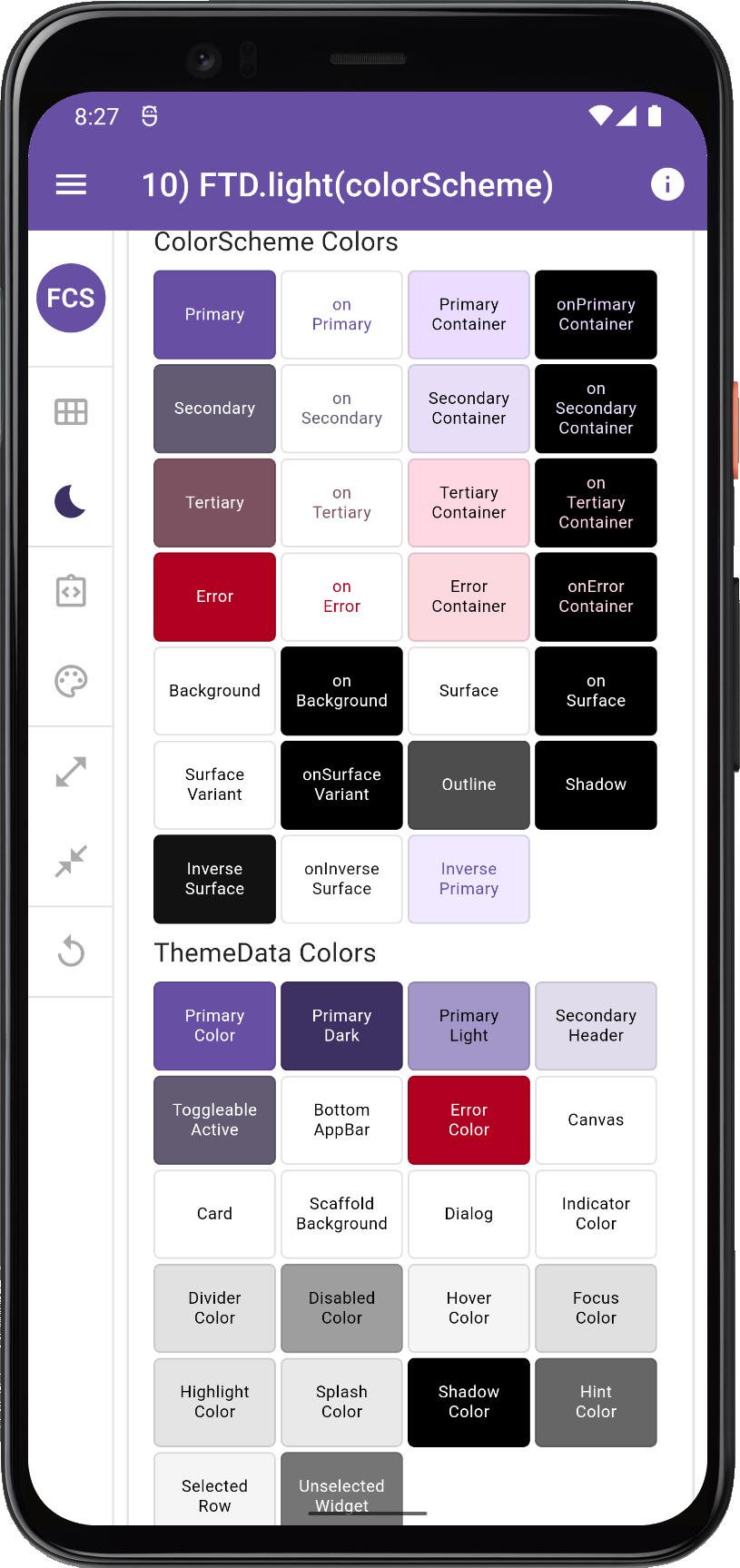
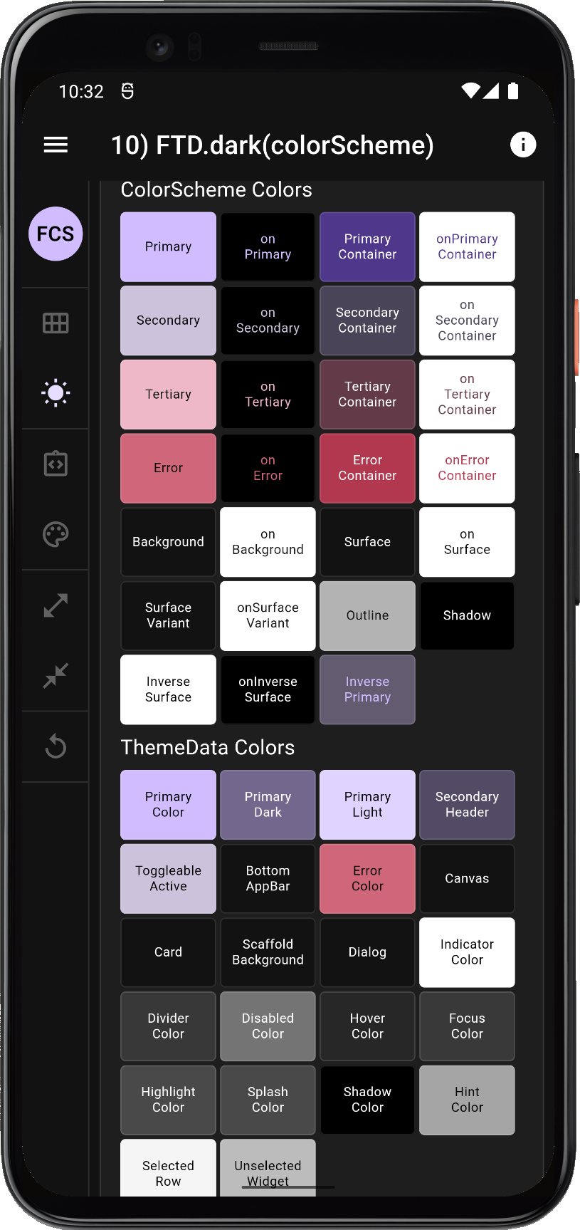
10. FlexThemeData.light colorScheme
In this case we want to use the exact same input ColorScheme as before, so we can compare the results with the standard ColorScheme based ThemeData creation methods we used earlier.
We can do that by using the same ColorScheme as input to FlexColorScheme. We again use the flexSchemeLight and flexSchemeDark we defined earlier, but now in our FlexColorScheme setup:
// 10) FlexThemeData.light(colorScheme)
//    FlexThemeData.light(colorScheme:...),
//    FlexThemeData.dark(colorScheme:...),
//
title: '10) FlexThemeData.light(colorScheme)',
theme: FlexThemeData.light(colorScheme: flexSchemeLight),
darkTheme: FlexThemeData.dark(colorScheme: flexSchemeDark),
In case it was not obvious, earlier in previous cases TD was used as short for ThemeData to fit on the AppBar and here we use FTD as short for FlexThemeData.
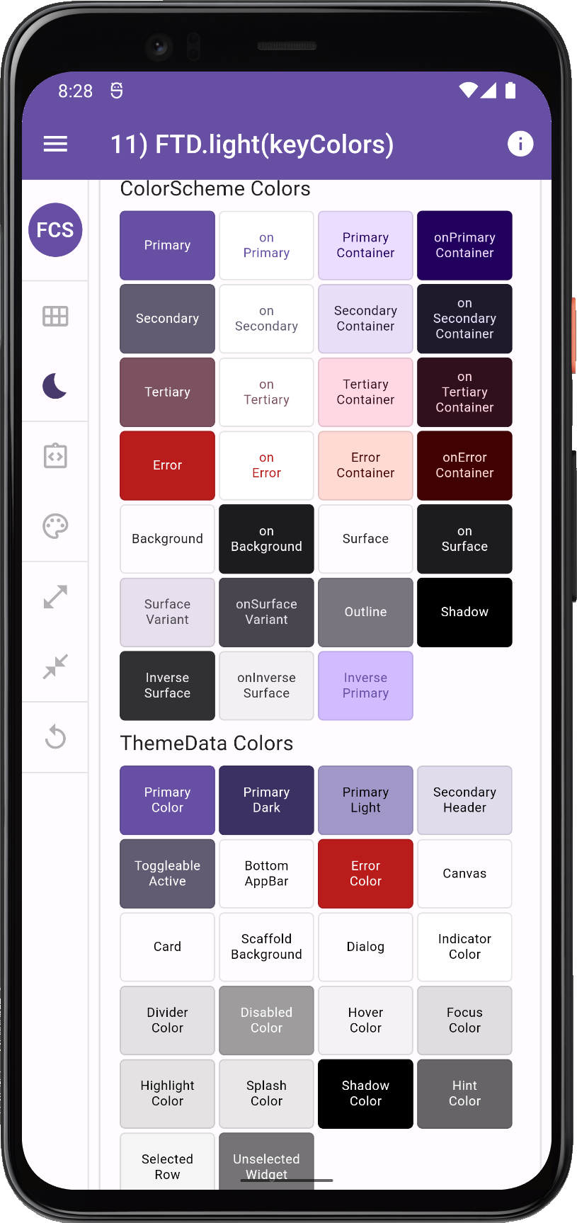
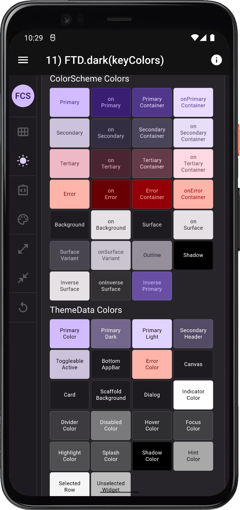
11. FlexThemeData.light keyColors
Next, we make the identical seed generated ColorScheme as above, when we used ColorScheme.fromSeed. We do that by turning on using keyColors, we just pass in the default config constructor, which by default uses the primary color and the same algorithm that the ColorScheme.fromSeed used when we used it with the primary color from our ColorScheme.
// 11) FlexThemeData.light(keyColors)
//    FlexThemeData.light(colorScheme:..., keyColors: ...),
//    FlexThemeData.dark(colorScheme:..., keyColors: ...),
//
title: '11) FlexThemeData.light(keyColors)',
theme: FlexThemeData.light(
  colorScheme: flexSchemeLight,
  keyColors: const FlexKeyColors(),
),
darkTheme: FlexThemeData.dark(
  colorScheme: flexSchemeDark,
  keyColors: const FlexKeyColors(),
),
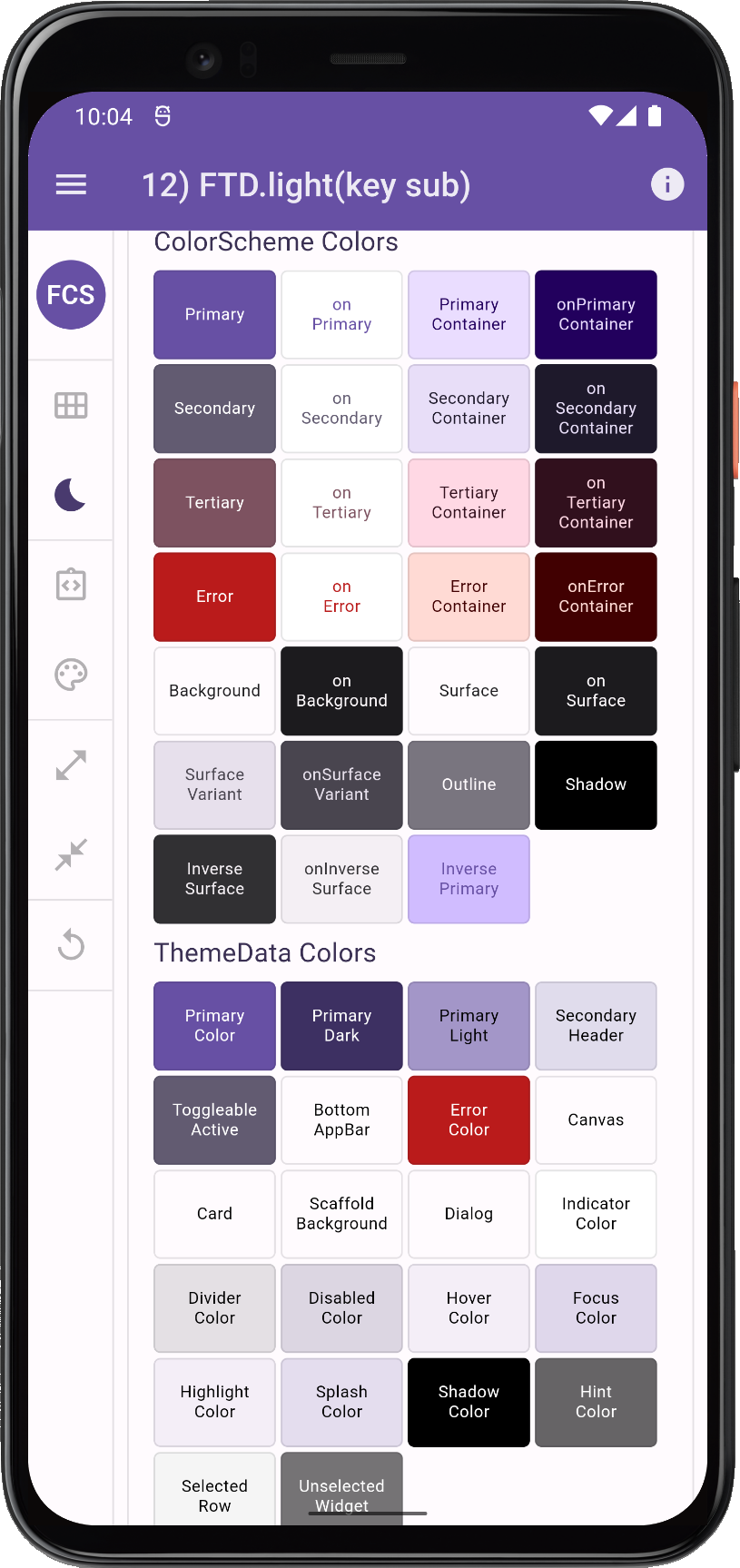
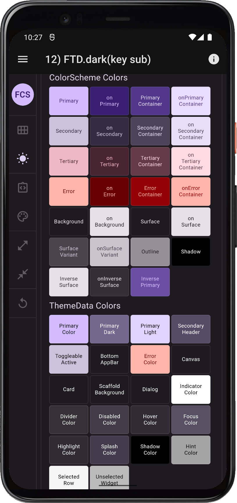
12. FlexThemeData.light (key sub)
Finally, we will enable the opinionated component sub-themes, however to not get stuck on the differences in border radius and shape of the FAB, and custom text theme, let's make it look like Material-2 for this comparison.
// 12) FlexThemeData.light(key sub)
//    FlexThemeData.light(colorScheme:..., keyColors: ...),
//    FlexThemeData.dark(colorScheme:..., keyColors: ...),
//
title: '12) FlexThemeData.light(key sub)',
theme: FlexThemeData.light(
  colorScheme: flexSchemeLight,
  keyColors: const FlexKeyColors(),
  subThemesData: const FlexSubThemesData(
    defaultRadius: 4,
    fabUseShape: false,
    useTextTheme: false,
  ),
),
darkTheme: FlexThemeData.dark(
  colorScheme: flexSchemeDark,
  keyColors: const FlexKeyColors(),
  subThemesData: const FlexSubThemesData(
    defaultRadius: 4,
    fabUseShape: false,
    useTextTheme: false,
  ),
),
Compare 9 to 12
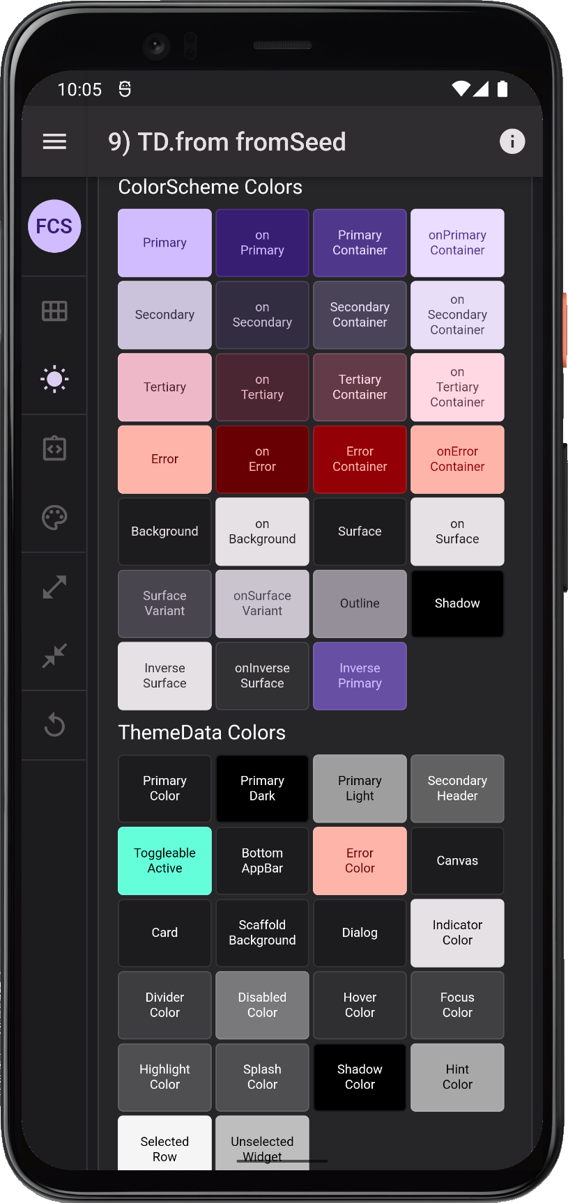
Let us now compare the Flutter SDK option 9) ThemeData.from(colorScheme: ColorScheme.fromSeed(...)) method, with the above three FlexColorScheme based methods.
| 9) TD.from fromSeed | 10) FTD.light(scheme) | 11) FTD.light(key) | 12) FTD.dark(key sub) |
 |
 |
 |
 | |||
 |
 |
 |
 | |||
Comparing ThemeData and ColorScheme option 9 and FlexColorScheme ways to define ThemeData objects | ||||||
Analysis of ThemeData.from a ColorScheme.fromSeed (9)
This is the best result we will get with Flutter's current built-in theming. As with previous cases we get a ThemeData that is mostly well-made from a ColorScheme, where the scheme is fine, but as before we do not get any scheme based color assignments on the ThemeData colors primaryColorLight, primaryColorDark and secondaryHeaderColor in light theme mode.
As can be seen primaryColorLight, primaryColorDark and secondaryHeaderColor are still the same blue in light theme mode, as when we used swatch colors, because in ThemeData they by default get colors from the swatch, that has not been assigned any value, so it in turn has defaulted to Colors.blue hence their blue shades.
In dark theme mode, the peculiar grey-scales on primaryColor, primaryColorLight, primaryColorDark and secondaryHeaderColor prevail. As does the teal color on the toggleableActiveColor, instead of the colorScheme.secondary that we should have in a ColorScheme based theme by default.
If you use this theming method and plan to use the above colors, you may prefer to give the ColorScheme appropriate override values using copyWith.
Analysis of FlexThemeData.light/dark(colorScheme) (10)
This FlexColorScheme based theme, is made from the same ColorScheme as used in the Flutter SDK examples earlier, and it has the closest equivalent in Flutter SDK method 6.
We can see that it has no legacy ThemeData direct color properties that do not follow the color design in the used ColorScheme, this applies to both light and dark theme mode. The ColorScheme impacts all color properties in a consistent manner.
Analysis of FlexThemeData.light/dark((colorScheme, keyColors) (11))
This FlexColorScheme based theme is made from the same ColorScheme as used in the Flutter SDK examples above, and using its primary key as seed color to generate a ColorScheme from tonal palettes. Using the same algorithm setup as the only one offered out of the box by Flutter. It has its closest equivalent in Flutter SDK method 9 above.
Again we can observe that it has no odd legacy ThemeData direct color properties that do not follow the color design in the used ColorScheme, and that it applies to both light and dark theme mode.
This scheme also makes a Material-3 seed generated ColorScheme that is identical to the one produced by Flutter's only directly supported M3 ColorScheme generation algorithm. FlexColorScheme offers many ways to modify and tune ColorScheme seed generation algorithm, that go beyond what is available directly in the Flutter SDK.
Analysis of FlexThemeData.light/dark(colorScheme, keyColors, subThemesData) (12)
The produced ColorScheme from this setup is identical to method 11 above.
Again we can observe that it has no odd legacy ThemeData direct color properties that do not follow the color design in the used ColorScheme, this applies to both light and dark theme mode.
We can however see a difference in ThemeData colors disabledColor, focusColor, hoverColor, highlightColor and splashColor. They all have a hint of ColorScheme.primary color in them as well.
This is an opinionated default that came when we enabled and opted-in on using FlexSubThemesData. It can be turned OFF and reverting it to ThemeData defaults, even when using the sub-themes. This is done by setting its interactionEffects to false.
subThemesData: const FlexSubThemesData(interactionEffects: false),
Many sub-themes have their own state theming that define the hover, disabled, ink etc. effects, when using the sub-themes, like e.g. all the Material buttons do, and even ToggleButtons does.
The interaction and state effects colors in ThemeData are the default ones used by widgets when their own theme does not define them. These ThemeData colors are also on the previously mentioned deprecation path in Flutter. They will eventually be moved into a component theme, or several component themes, if so needed.
Recommendations
How should we create our theme when using vanilla Flutter theming to get a modern ColorScheme based theme?
ThemeData.from
As shown above, the simplest approach is to use the ThemeData.from factory, with whatever ColorScheme we have defined.
The drawback with this method is that not all colors in ThemeData will get colors matching our ColorScheme. Additionally, we cannot define any component themes in the same theme definition, nor adjust any of the direct color properties in ThemeData that we may want to modify from their defaults where ThemeData.from leaves gaps. We can of course apply all of these using copyWith. When using ThemeData.from we should definitively do that.
ThemeData
The second option is to just use the big ThemeData factory. This gives us access to all the properties in it, and we can set and define them as we please. As long as we are familiar with all its inner workings, this is fine and not so difficult. I recommend starting with a setup that replicates what the ThemeData.from factory does and adjusting it a bit to improve it by defining the ThemeData colors it ignores or sets in poor ways.
We can copy ThemeData.from, it is quite small, and make a modified version of it, to define our ThemeData. Let us make a separate version for our light a dark theme mode, again using our already defined flexSchemeLight and flexSchemeLight as input color schemes. By making separate setups for light and dark, we keep it simple, and we can easily define it a bit differently for our light and dark theme.
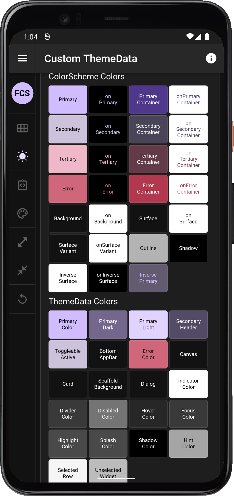
title: 'Custom ThemeData',
theme: ThemeData(
  colorScheme: flexSchemeLight,
  brightness: flexSchemeLight.brightness,
  primaryColor: flexSchemeLight.primary,
  // These we have to compute based based on our colorScheme primary color,
  // if we want to give them color scheme matching values. Here is an example that
  // happens to be what FlexColorScheme does, but feel free to use what you prefer:
  primaryColorLight: Color.alphaBlend(
      Colors.white.withAlpha(0x66), flexSchemeLight.primary),
  primaryColorDark: Color.alphaBlend(
      Colors.black.withAlpha(0x66), flexSchemeLight.primary),
  secondaryHeaderColor: Color.alphaBlend(
      Colors.white.withAlpha(0xCC), flexSchemeLight.primary),
  // These are deprecated in Flutter, we can skip defining them:
  //   primaryColorBrightness: ThemeData.estimateBrightnessForColor(colorScheme.primary),
  //   accentColor: colorScheme.secondary,
  //   accentColorBrightness: ThemeData.estimateBrightnessForColor(colorScheme.secondary),

  // As long as `toggleableActiveColor` exists in ThemeData, consider adding this one:
  toggleableActiveColor: flexSchemeLight.secondary,
  scaffoldBackgroundColor: flexSchemeLight.background,
  canvasColor: flexSchemeLight.background,
  backgroundColor: flexSchemeLight.background,
  cardColor: flexSchemeLight.surface,
  bottomAppBarColor: flexSchemeLight.surface,

  // For dialog prefer surface if your scheme background color is different from
  // its surface, this ensures elevation color in dark mode on dialogs, when
  // applyElevationOverlayColor is true in dark mode.
  dialogBackgroundColor: flexSchemeLight.surface,
  // In light mode the indicator is assumed to be used in a TabBar used
  // on an AppBar that is primary colored by default, so onPrimary is right
  // default. If you adjust your AppBar theme to something needing other
  // contrast color, or use TabBar on a light surface you need to adjust
  // this e.g. to onBackground.
  indicatorColor: flexSchemeLight.onPrimary,
  dividerColor: flexSchemeLight.onSurface.withOpacity(0.12),
  errorColor: flexSchemeLight.error,
  // Keep false in light mode.
  applyElevationOverlayColor: false,
  // Add your app's text theme here, or skip if default is OK.
  textTheme: myTextTheme,
  // Add all your custom component themes, as many as needed...
  appBarTheme: myAppBarTheme,
  tabBarTheme: myTabBarTheme,
),
// We repeat the above for our dark theme mode with our dark color schemes,
// with a few modifications mentioned below.
darkTheme: ThemeData(
  colorScheme: flexSchemeDark,
  brightness: flexSchemeDark.brightness,
  // Prefer primary for the `ThemeData.primaryColor` in dark mode too.
  primaryColor: flexSchemeDark.primary,
  // Same computation as above, just tuned a bit differently, adjust as needed.
  primaryColorLight: Color.alphaBlend(
      Colors.white.withAlpha(0x59), flexSchemeDark.primary),
  primaryColorDark: Color.alphaBlend(
      Colors.black.withAlpha(0x72), flexSchemeDark.primary),
  secondaryHeaderColor: Color.alphaBlend(
      Colors.black.withAlpha(0x99), flexSchemeDark.primary),
  // Don't forget this one in dark mode too.
  toggleableActiveColor: flexSchemeDark.secondary,
  scaffoldBackgroundColor: flexSchemeDark.background,
  canvasColor: flexSchemeDark.background,
  backgroundColor: flexSchemeDark.background,
  cardColor: flexSchemeDark.surface,
  bottomAppBarColor: flexSchemeDark.surface,
  // Use surface instead of background this ensures elevation color on dialogs,
  // when applyElevationOverlayColor is true.
  dialogBackgroundColor: flexSchemeDark.surface,
  // The AppBar will be dark, almost black, so this is correct for indicator
  // contrast on it, typically used by a TabBar in the AppBar.
  indicatorColor: flexSchemeDark.onBackground,
  dividerColor: flexSchemeDark.onSurface.withOpacity(0.12),
  errorColor: flexSchemeDark.error,
  // Set to true in dark mode.
  applyElevationOverlayColor: true,
  // Add your app's text theme here, or skip if default is OK.
  textTheme: myTextTheme,
  // Add all your custom component themes, as many as needed...
  appBarTheme: myAppBarTheme,
  tabBarTheme: myTabBarTheme,
),
Below we compare this custom setup to FlexColorScheme case 10, which it with respect to ColorScheme and ThemeData colors is equal to. FlexColorScheme has no elevation by default on the AppBar, so it will be darker in dark theme mode, since it is less elevated, but otherwise the colors are the same.
| 10) FTD.light(scheme) | Custom TD light | 10) FTD.dark(scheme) | Custom TD dark |
|
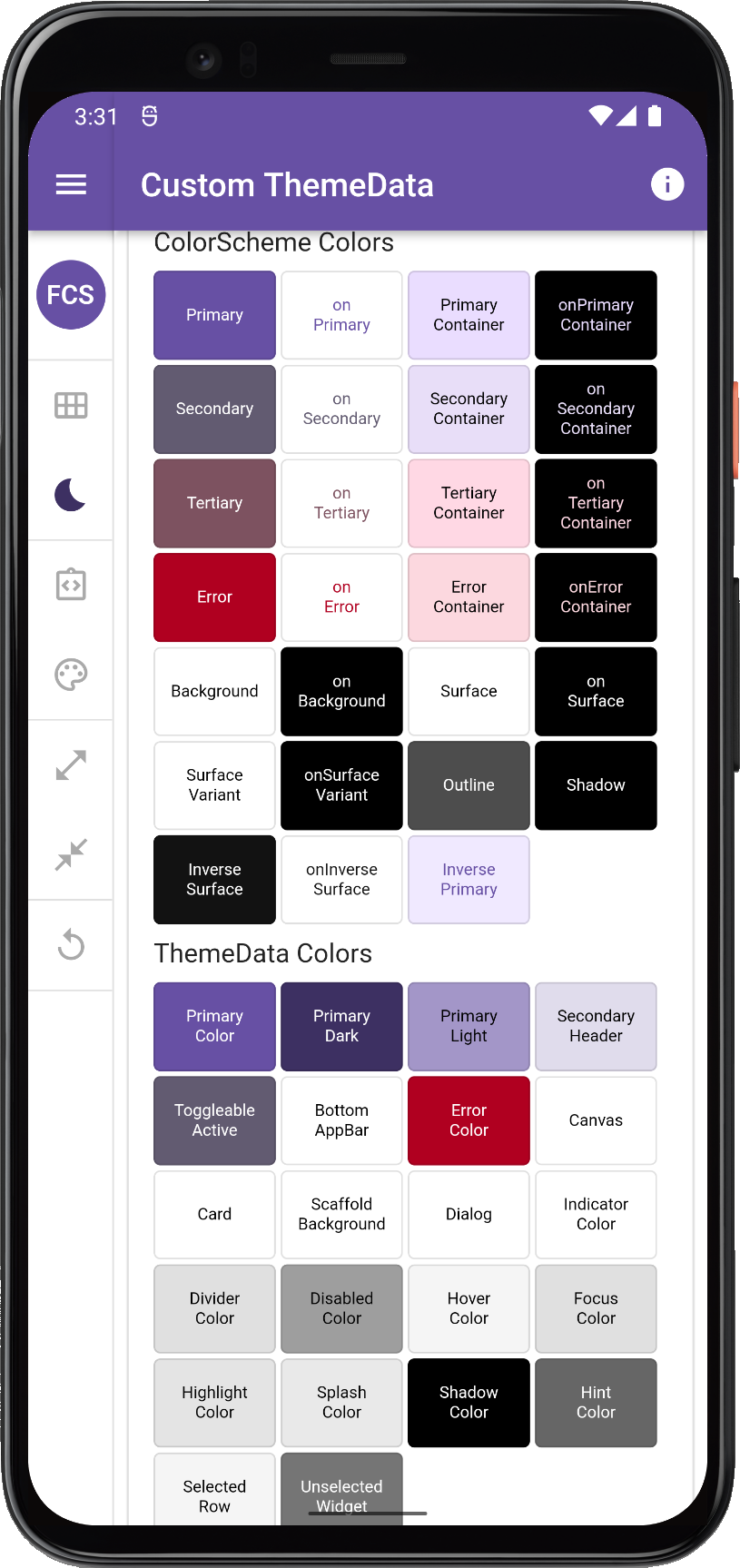 |
|
 | |||
| Comparing custom ThemeData+ColorScheme to FlexColorScheme option 10 produced ThemeData colors | ||||||
This kind of setup will ensure that all built-in widgets will get and use colors that match your ColorScheme by default, not just the ones that have already been migrated to use defaults from ThemeData.colorScheme.
As the migration and deprecation of ThemeData colors in Flutter SDK progresses, the importance of doing this will become less important. However, in Flutter 2.10 stable and all previous versions, some widgets still depend e.g. on primaryColorLight and primaryColorDark as their default colors, for example CircleAvatar. If you don't give them ColorScheme derived values, the colors will use the default swatch theme based colors, and so will CircleAvatar.
Setting colors on all the background and surface colors from your ColorScheme, in a similar manner to what ThemeData.from does, is still very important. If you do not, you may get some background color defaults in dark theme that are not the ones from your ColorScheme.
For the background and surface colors to be nice in both light and dark mode, it of course requires that your ColorScheme uses correct background colors and onColors. Use the built-in ColorScheme.light and ColorScheme.dark factories for that, or even a ColorScheme.fromSeed as a base, and define your custom colors in them as needed to make your custom light and dark ColorScheme.
Another take on the current confusing state of ThemeData can be seen in this issue 19089, where I added a brief version of above findings as well, but using red as the theme color base.
What happens in the next new stable release of Flutter regarding all this remains to be seen. Looking at all the work in the master channel, I see a lot of improvements, but it remains to be seen what lands in the stable channel and when.
A Simpler Way
If all the above felt a bit verbose and complicated, then FlexColorScheme will do all the above color setups for you. Plus it has adjustable primary color surface blending, a more versatile seed generated ColorScheme, and many built-in color schemes that can be nice theme starting points, or used as they are if they fit your needs. To top it all off, it can help you with component theming as well.