Tutorial
In this tutorial we go through all the bundled examples and explain main used FlexColorScheme features in each example. It starts simple, with increasing complexity and ends with the complete Themes Playground app included as tutorial example 5.
The key part, for each example, is always in the used MaterialApp, where the FlexColorScheme setup for the light and dark themes are made. The rest of the content in the examples is mainly there to make a visual presentation of the resulting theme from the used theme settings, and to allow you to control all settings interactively.
1. Basic Theme
The first and simplest example shows how you can use a predefined color scheme in FlexColorScheme as your applications light and dark themes. It demonstrates how to turn it into ThemeData that is used by your application and then switch between its light and dark theme modes.
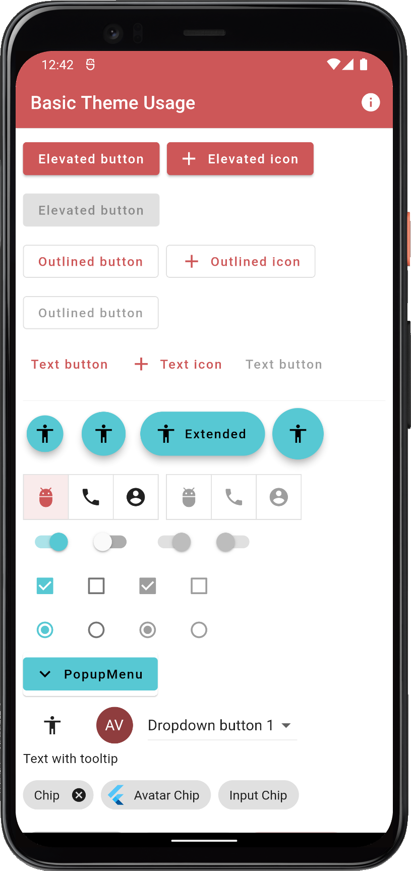
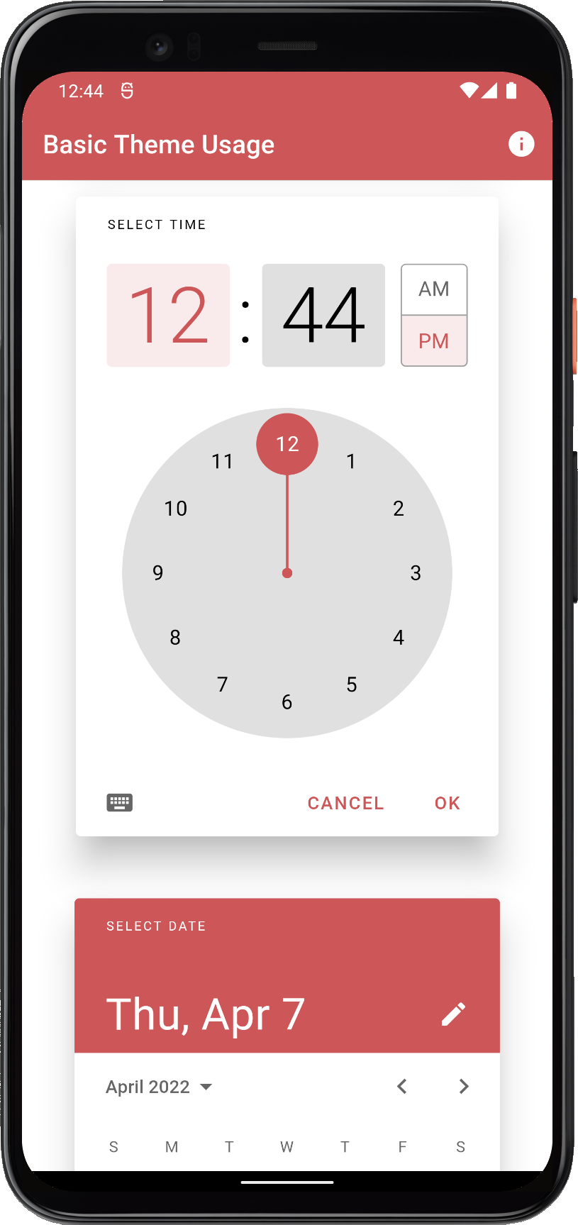
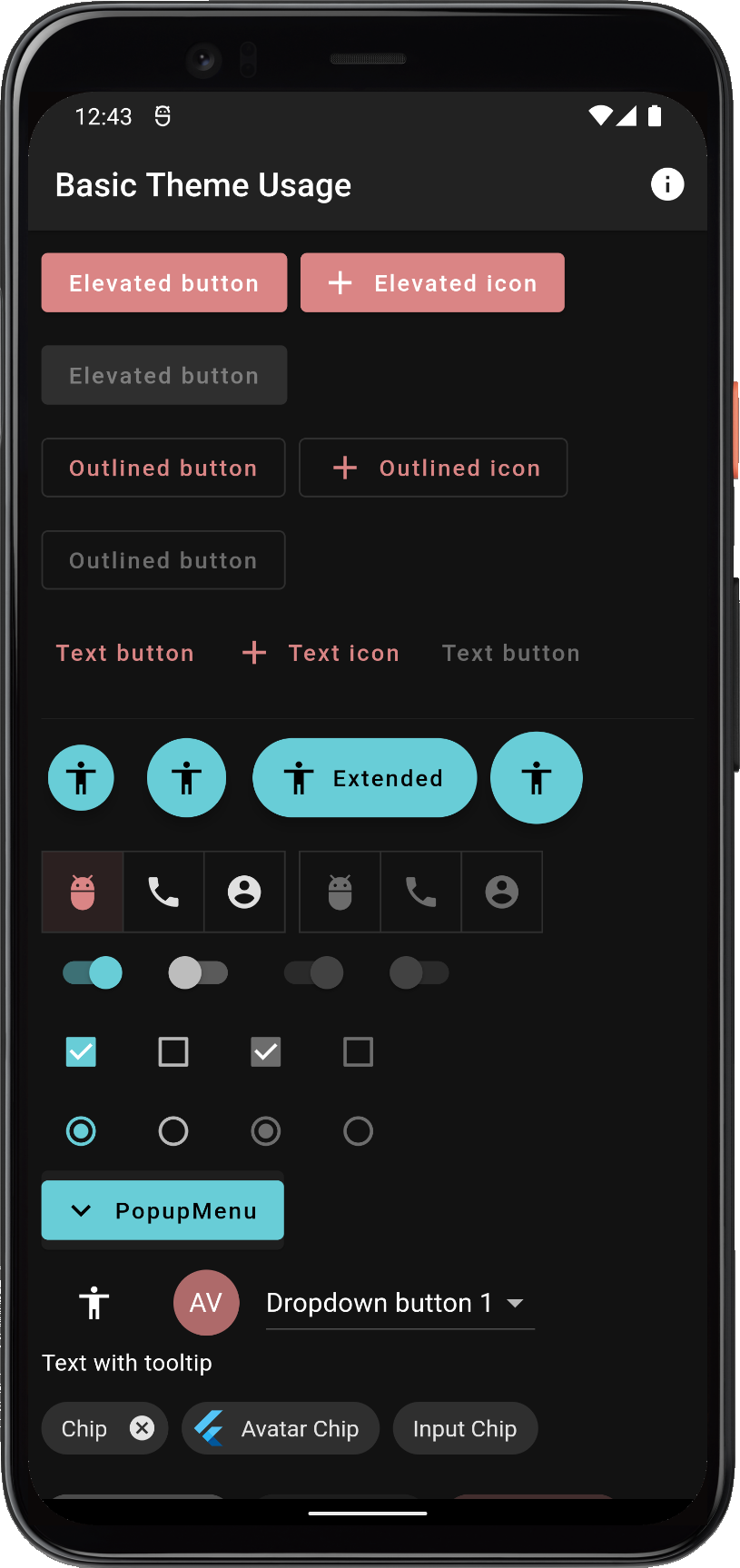
A theme showcase widget shows the theme's effect on several common Material UI component widgets.
Only code highlights might be shown below. The complete code of this example can be found here.
void main() => runApp(const DemoApp());

class DemoApp extends StatefulWidget {
 const DemoApp({super.key});

 @override
 State<DemoApp> createState() => _DemoAppState();
}

class _DemoAppState extends State<DemoApp> {
 // Used to select if we use the dark or light theme, start with system mode.
 ThemeMode themeMode = ThemeMode.system;
 // Opt in/out on Material-3
 bool useMaterial3 = true;

 @override
 Widget build(BuildContext context) {
   // Select the predefined FlexScheme color scheme to use. Modify the
   // used FlexScheme enum value below to try other pre-made color schemes.
   const FlexScheme usedScheme = FlexScheme.mandyRed;

   return MaterialApp(
     debugShowCheckedModeBanner: false,
     title: 'Basic Theme Usage',
     // Use a predefined FlexThemeData.light() theme for the light theme.
     theme: FlexThemeData.light(
       scheme: usedScheme,
       // Use very subtly themed app bar elevation in light mode.
       appBarElevation: 0.5,
       useMaterial3: useMaterial3,
       // We use the nicer Material-3 Typography in both M2 and M3 mode.
       typography: Typography.material2021(platform: defaultTargetPlatform),
     ),
     // Same definition for the dark theme, but using FlexThemeData.dark().
     darkTheme: FlexThemeData.dark(
       scheme: usedScheme,
       // Use a bit more themed elevated app bar in dark mode.
       appBarElevation: 2,
       useMaterial3: useMaterial3,
       // We use the nicer Material-3 Typography in both M2 and M3 mode.
       typography: Typography.material2021(platform: defaultTargetPlatform),
     ),
     // Use the above dark or light theme based on active themeMode.
     themeMode: themeMode,
     home: HomePage(
       // We pass it the current theme mode.
       themeMode: themeMode,
       // On the home page we can toggle theme mode between light and dark.
       onThemeModeChanged: (ThemeMode mode) {
         setState(() {
           themeMode = mode;
         });
       },
       useMaterial3: useMaterial3,
       // On the home page we can toggle theme Material 2/3 mode.
       onUseMaterial3Changed: (bool material3) {
         setState(() {
           useMaterial3 = material3;
         });
       },
       flexSchemeData: FlexColor.schemes[usedScheme]!,
     ),
   );
 }
}
To the HomePage we pass in the current value of the themeMode and use a simple callback to get back its changed value. We then use it to update themeMode in a standard setState to make the app rebuild using the new value. We also pass in the FlexSchemeData for the usedScheme we selected as our custom theme to the HomePage. Not really needed, but we use it on the home page to show the active theme's name, description and colors in a theme mode switch.
The key part to notice above is that FlexThemeData.light and FlexThemeData.dark return a standard Flutter ThemeData object to your application's MaterialApp theme and darkTheme properties. The ThemeData content returned is however highly refined, can be customized using a simple API, that creates very elaborate ThemeData objects.
This also puts limits on what FlexColorScheme can do, it can only modify your application's theme in ways that is supported by Flutter's ThemeData. This can also be reassuring, since you can be sure that all it does is help you define a fancy ThemeData object for your application, and that everything it does, you can do directly with ThemeData too, it might just be very verbose and time-consuming to do so.
Since FlexColorScheme at the end of the day returns a ThemeData object, you can also further modify and customize anything it has done, by using ThemeData's own copyWith property.
Result
When you build and run example 1, you get an application that looks like this in light theme mode, when you toggle it to Material-2 mode:
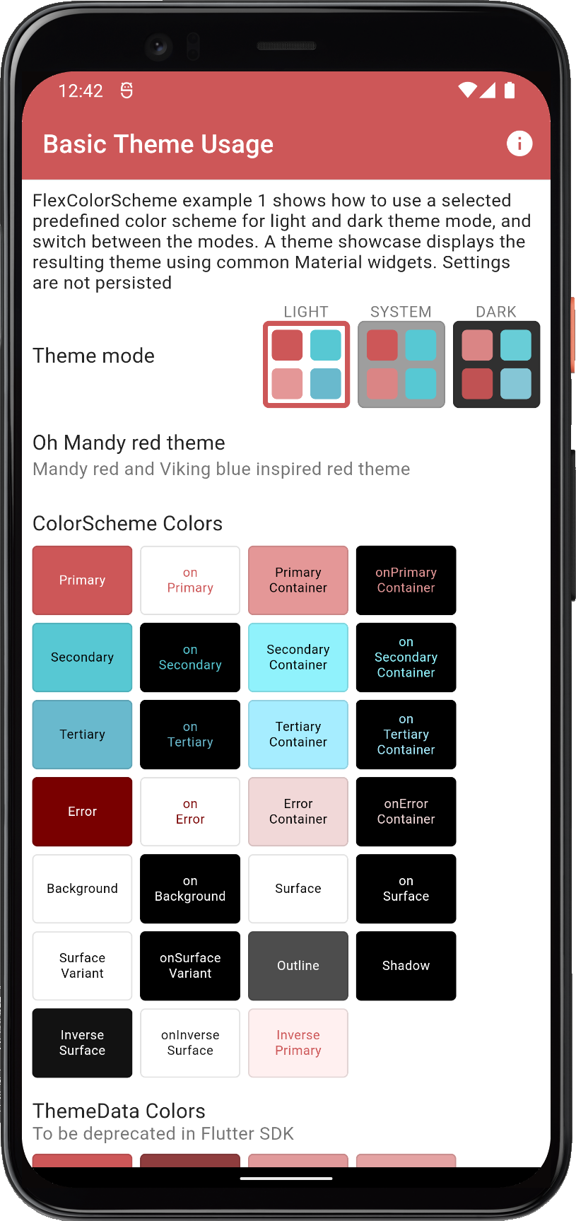 |  |  | ||
| Using a built-in FlexColorScheme color scheme as application light theme in Material-2 mode | ||||
And in dark theme mode:
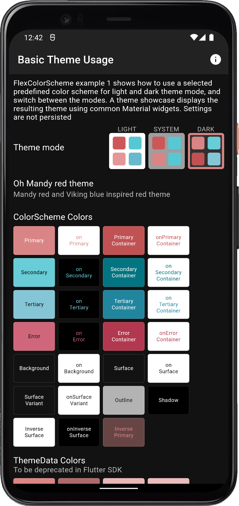 |  | 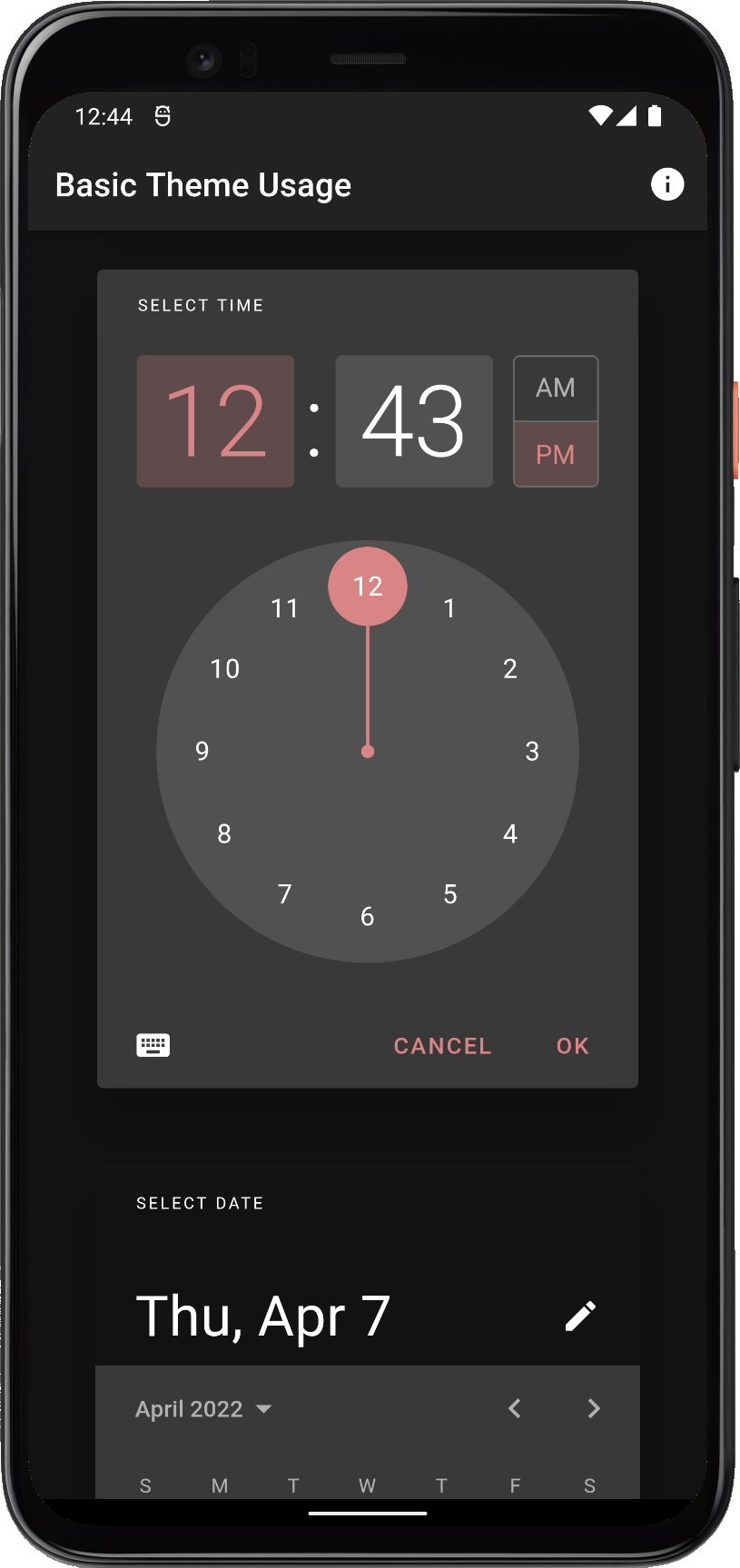 | ||
| Using a built-in FlexColorScheme color scheme as application dark theme in Material-2 mode | ||||
Did you manage to toggle it to Material-2 mode to get this look? A recent update added a Material-2 / Material-3 mode toggle to this app. It now defaults to starting in Material-3 mode, which looks quite different. Hint: There is an icon in the AppBar of the newer version of it that allows you to toggle the mode. Go ahead and try it out.
Scroll down to see the theme showcase further below. It presents the theme with common Material UI widgets. You can try this example as a Flutter web app here.