2. Custom Theme
This example shows how you can define your own color schemes using FlexSchemeColor and FlexSchemeData, to create FlexColorScheme based application themes from them.
Only code highlights might be shown below. The complete code of this example can be found here.
Skeleton Template
In this example, and the ones after it, we use a ThemeService and ThemeController to manage our theme settings. This follows the example architecture you get when you create a Flutter template application architecture with:
> flutter create -t skeleton my_flutter_app
You can find a good article on GSkinner site blogs, doing a deep dive into the Flutter skeleton template architecture here.
These examples do not use all parts of the skeleton architecture, only the theme service part and using the ListenableBuilder as a listenable builder.
ThemeServiceMem
This example uses a theme service with only memory storage and no persistence. In later examples, we will use locally persisting theme services.
Future<void> main() async {
  WidgetsFlutterBinding.ensureInitialized();
  // The used memory only theme service.
  final ThemeService themeService = ThemeServiceMem();
  // Initialize the theme service.
  await themeService.init();
  // Create a ThemeController that uses the ThemeService.
  final ThemeController themeController = ThemeController(themeService);
  // Load preferred theme settings, while the app is loading, before MaterialApp
  // is created, this prevents a theme change when the app is first displayed.
  await themeController.loadAll();
  // Run the app and pass in the ThemeController. The app listens to the
  // ThemeController for changes.
  runApp(DemoApp(themeController: themeController));
}
Above we use the theme controller to change the themeMode and to toggle opting in and out of using FlexColorScheme's opinionated component sub-themes.
Custom Colors
To make a custom color scheme, we for simplicity define it as a local constant in this example. We make a FlexSchemeData object with a name, description and all required FlexSchemeColor colors defined for light and matching dark schemes.
const FlexSchemeData _myFlexScheme = FlexSchemeData(
  name: 'Midnight blue',
  description: 'Midnight blue theme, custom definition of all colors',
  light: FlexSchemeColor(
    primary: Color(0xFF00296B),
    primaryContainer: Color(0xFFA0C2ED),
    secondary: Color(0xFFD26900),
    secondaryContainer: Color(0xFFFFD270),
    tertiary: Color(0xFF5C5C95),
    tertiaryContainer: Color(0xFFC8DBF8),
  ),
  dark: FlexSchemeColor(
    primary: Color(0xFFB1CFF5),
    primaryContainer: Color(0xFF3873BA),
    secondary: Color(0xFFFFD270),
    secondaryContainer: Color(0xFFD26900),
    tertiary: Color(0xFFC9CBFC),
    tertiaryContainer: Color(0xFF535393),
  ),
);
We could also have stored the light and dark scheme only in their own FlexSchemeColor objects, and added them directly in their respective colors property in FlexThemeData.light and FlexThemeData.dark. However, we will also use this information on the HomePage for the theme switch widget and to display the scheme name and description. Putting them in a FlexSchemeData object that bundles the light and dark scheme color FlexSchemeColor, plus a name and description, is a convenient way to pass it along and re-use the information on the HomePage.
We use the FlexSchemeData instance _myFlexScheme instance light and dark properties, as the colors value for our FlexThemeData.light and FlexThemeData.dark, that we then assign to the MaterialApp light theme property theme and darkTheme property respectively.
The setup is similar to how we used one of the built-in predefined FlexSchemeData objects in example 1 via its enum selection property, but in this case we defined our own custom FlexSchemeData in _myFlexScheme and used the colors property in FlexSchemeData to tell it to use those colors instead of a built-in scheme.
Theme Setup
Based on the Flutter Skeleton template architecture we glue the ThemeController to the MaterialApp. The Flutter standard AnimatedBuilder Widget listens to the ThemeController for changes.
The Flutter AnimatedBuilder is a bit oddly named for this use case. Here it serves the purpose of functioning as a "ListenableBuilder", that rebuilds its child once, when its Listenable value, the animation changes. Which it does whenever our ThemeController calls notifyListeners, when we update any of its properties. We call notifyListeners in the ThemeController class when we have new updated data that requires the theme to update. The ThemeController values are typically changed by user interface widgets on the HomePage.
ListenableBuilder or AnimatedBuilder
Previously the skeleton architecture used the AnimatedBuilder, so did these tutorial apps. The usage of the AnimatedBuilder did not have anything to do with the fact that the theme change animates from current ThemeData and colors in it, to the new values and colors it changes to. This is a built-in feature in ThemeData and its inherited Theme in Flutter SDK. You can change the ThemeData with call-backs or other state management solutions too, and still get the nice theme change lerp animation from previous property values to new ones.
The AnimatedBuilder was a poor name when used here as a ListenableBuilder, but it did not use to exist in Flutter SDK with that name. Flutter 3.10 brought same functionality as the AnimatedBuilder, but with the ListenableBuilder name, making it easier to discover the feature. The ListenableBuilder was added via PR #116543.
The result of this ListenableBuilder setup is that whenever you update any theme settings managed by the ThemeController, the MaterialApp is rebuilt with the new ThemeData that depends on the ThemeController's property values.
The entire application tree is actually rebuilt when any value in the ThemeController trigger a change via a notifyListeners call. This is reasonably fine in this use case, since all properties we use in the ThemeController are of the nature that the entire application UI needs to be redrawn anyway when they change, since they modify our ThemeData for the entire application.
This approach works well for this particular use case, but may not work as well for some use cases as it is a bit suboptimal to always rebuild the entire subtree whenever anything bound to the same ChangeNotifier controller changes. You could of course use the same idea to add more/other controllers and in StatefulWidgets at right levels in the widget tree use e.g. otherController.addListener(() => setState((){})). Then you do not need an ListenableBuilder and you get a basic MVC like state management, where you bind a ChangeNotifier to the tree and trigger rebuilds in a simple way.
Theming Code
This was a lot of explanations, no need to worry about most it for your theme definition, as shown below, it is simple.
class DemoApp extends StatelessWidget {
  const DemoApp({Key? key, required this.themeController}) : super(key: key);
  final ThemeController themeController;

  @override
  Widget build(BuildContext context) {
    // Whenever the theme controller notifies the listener in the
    // ListenableBuilder, the MaterialApp is rebuilt.
    return ListenableBuilder(
        listenable: themeController,
        builder: (BuildContext context, Widget? child) {
          return MaterialApp(
            debugShowCheckedModeBanner: false,
            scrollBehavior: const AppScrollBehavior(),
            title: 'Custom Theme',
            theme: FlexThemeData.light(
              useMaterial3: themeController.useMaterial3,
              colors: _myFlexScheme.light,
              // Opt in/out on using FlexColorScheme sub-themes.
              subThemesData: themeController.useSubThemes
                  ? const FlexSubThemesData()
                  : null,
              appBarElevation: 0.5,
              visualDensity: VisualDensity.standard,
              fontFamily: GoogleFonts.notoSans().fontFamily,
              // We use the nicer Material-3 Typography in both M2 and M3 mode.
              typography: Typography.material2021(platform: defaultTargetPlatform),
            ),
            // Same setup for the dark theme, but using FlexThemeData.dark().
            darkTheme: FlexThemeData.dark(
              useMaterial3: themeController.useMaterial3,
              colors: _myFlexScheme.dark,
              subThemesData: themeController.useSubThemes
                  ? const FlexSubThemesData()
                  : null,
              appBarElevation: 1,
              visualDensity: VisualDensity.standard,
              fontFamily: GoogleFonts.notoSans().fontFamily,
              typography: Typography.material2021(platform: defaultTargetPlatform),
            ),
            themeMode: themeController.themeMode,
            home: HomePage(
              flexSchemeData: _myFlexScheme,
              // Pass in the theme controller to the home page.
              controller: themeController,
            ),
          );
        });
  }
}
Component Themes
In this example above, we also use a boolean theme controller setting used as toggle to decide if we opt in our out of using FlexColorScheme opinionated component sub-themes. When the opt-in is true via themeController.useSubThemes we pass in a default FlexSubThemesData() constructor, otherwise null, to not use the sub-themes at all. Later we will explore sub-theme options that we can configure with FlexSubThemesData().
  // Opt in/out on using FlexColorScheme sub-themes.
  subThemesData: themeController.useSubThemes
      ? const FlexSubThemesData()
      : null,
Google Fonts
We also added a custom font by assigning one to fontFamily from Google fonts by using GoogleFonts.notoSans().fontFamily. The Noto Sans font is a nice alternative to the default Roboto font.
For better and more fine controlled results over your custom TextTheme, prefer defining complete TextThemes, using a font and its different styles. You can then use more than one font for your text theme. Then assign the TextTheme to the textTheme and primaryTextTheme properties in FlexThemeData. Both options work just as you would use them with ThemeData.
The themeController is also passed to the HomePage where we use it in UI widgets to change the theme mode, and to opt in and out of using the opinionated component theming features also offered by FlexColorScheme.
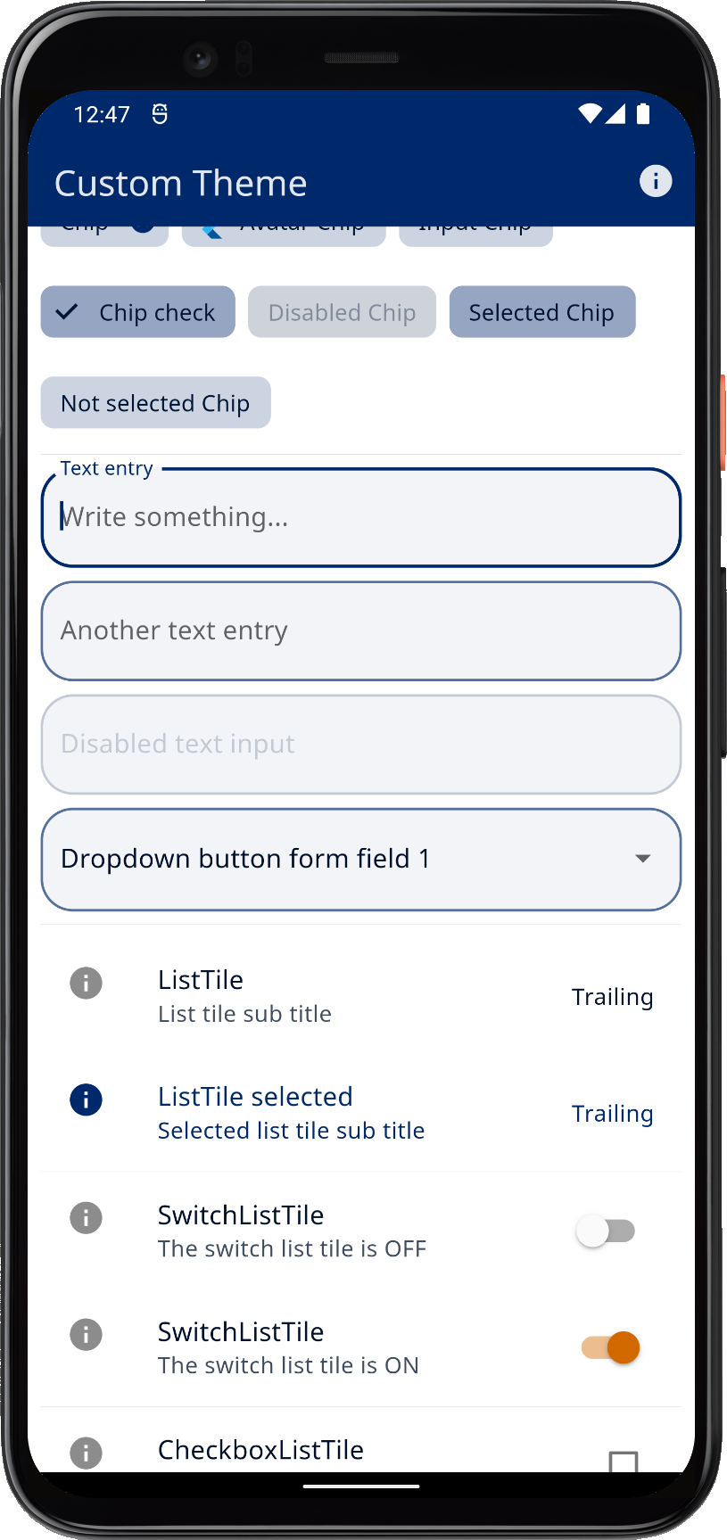
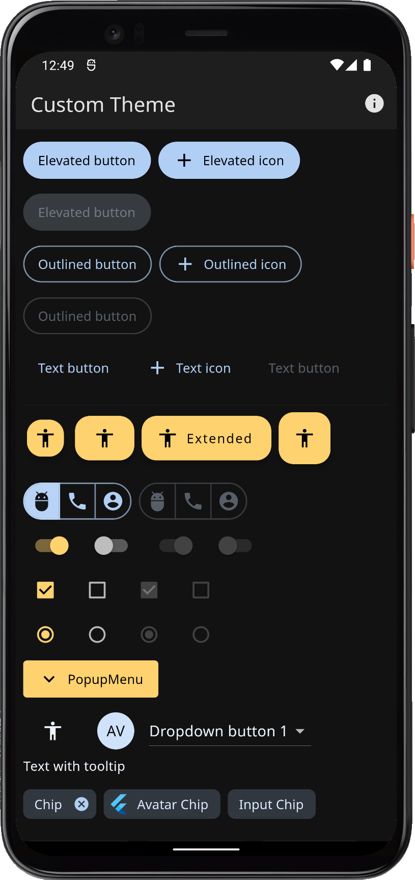
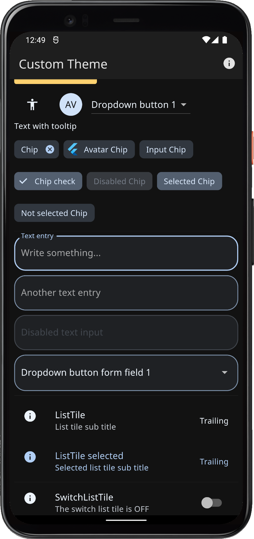
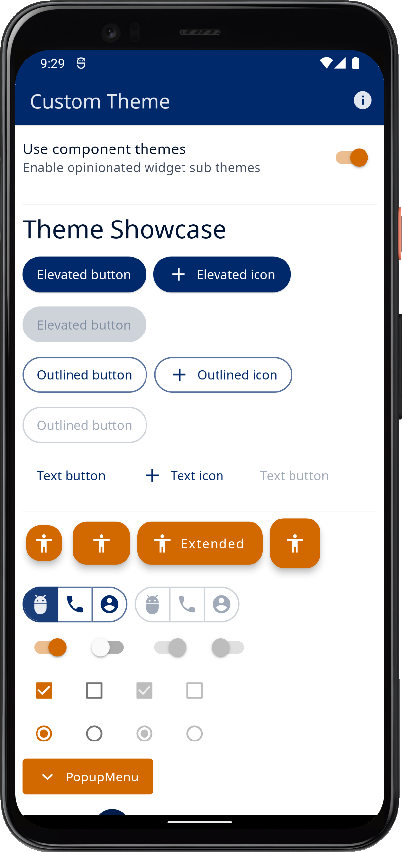
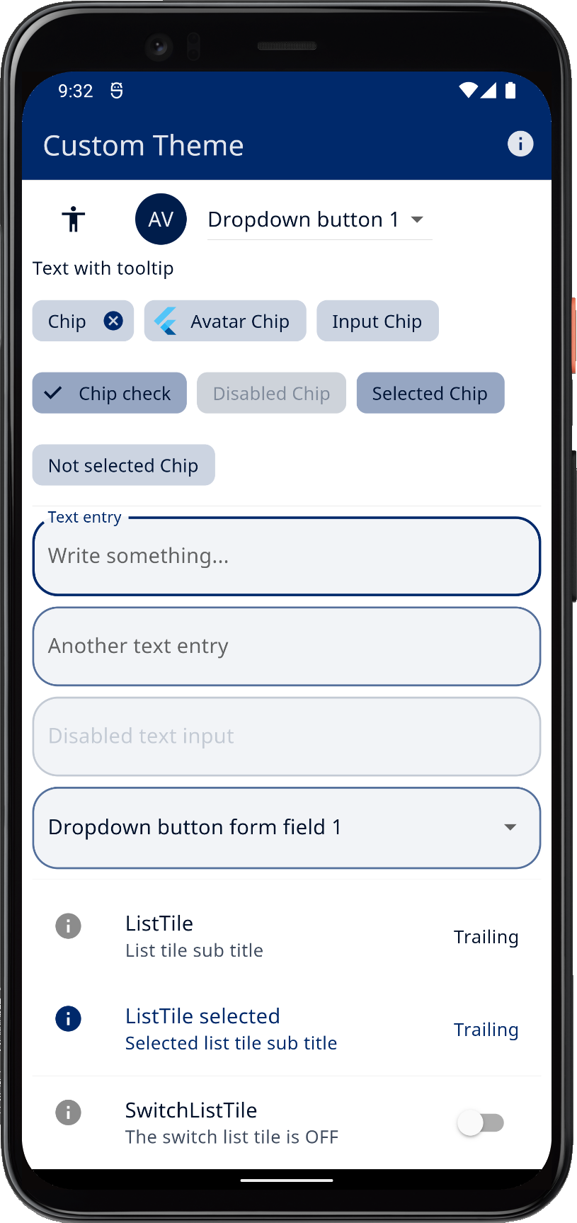
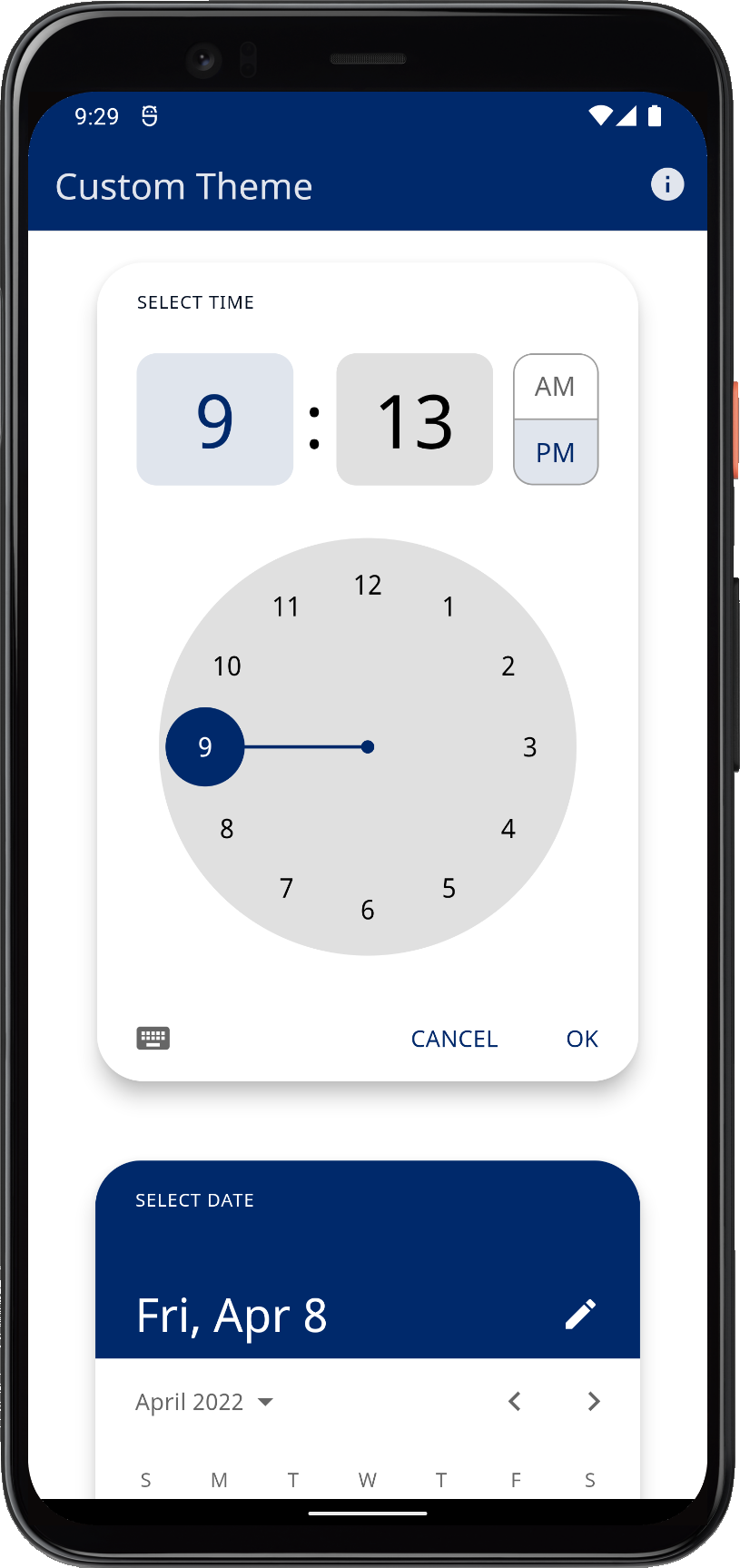
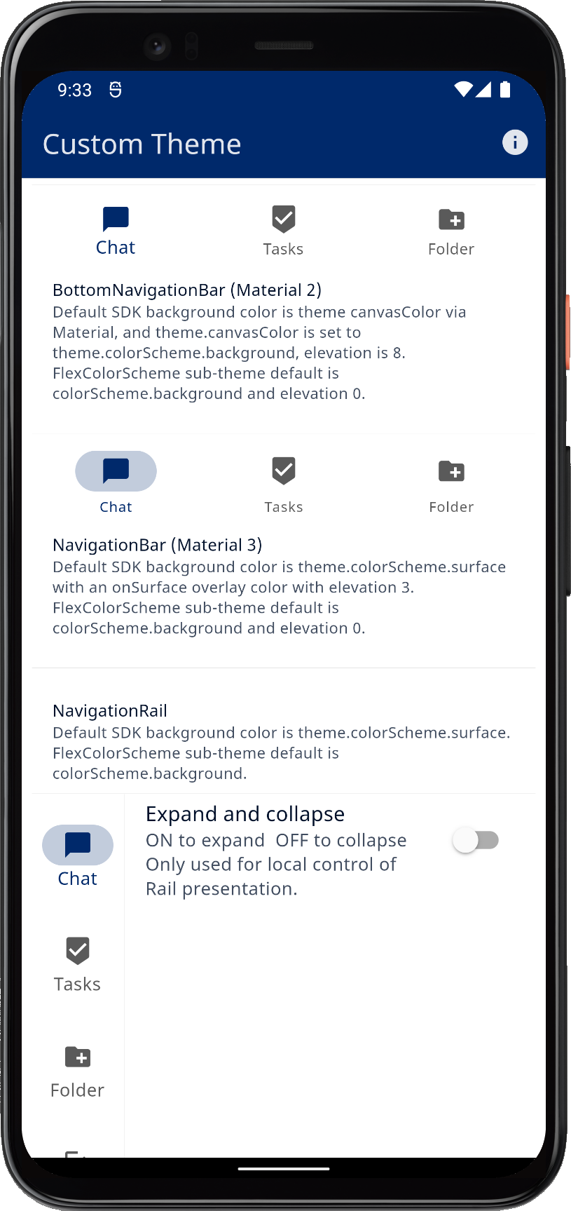
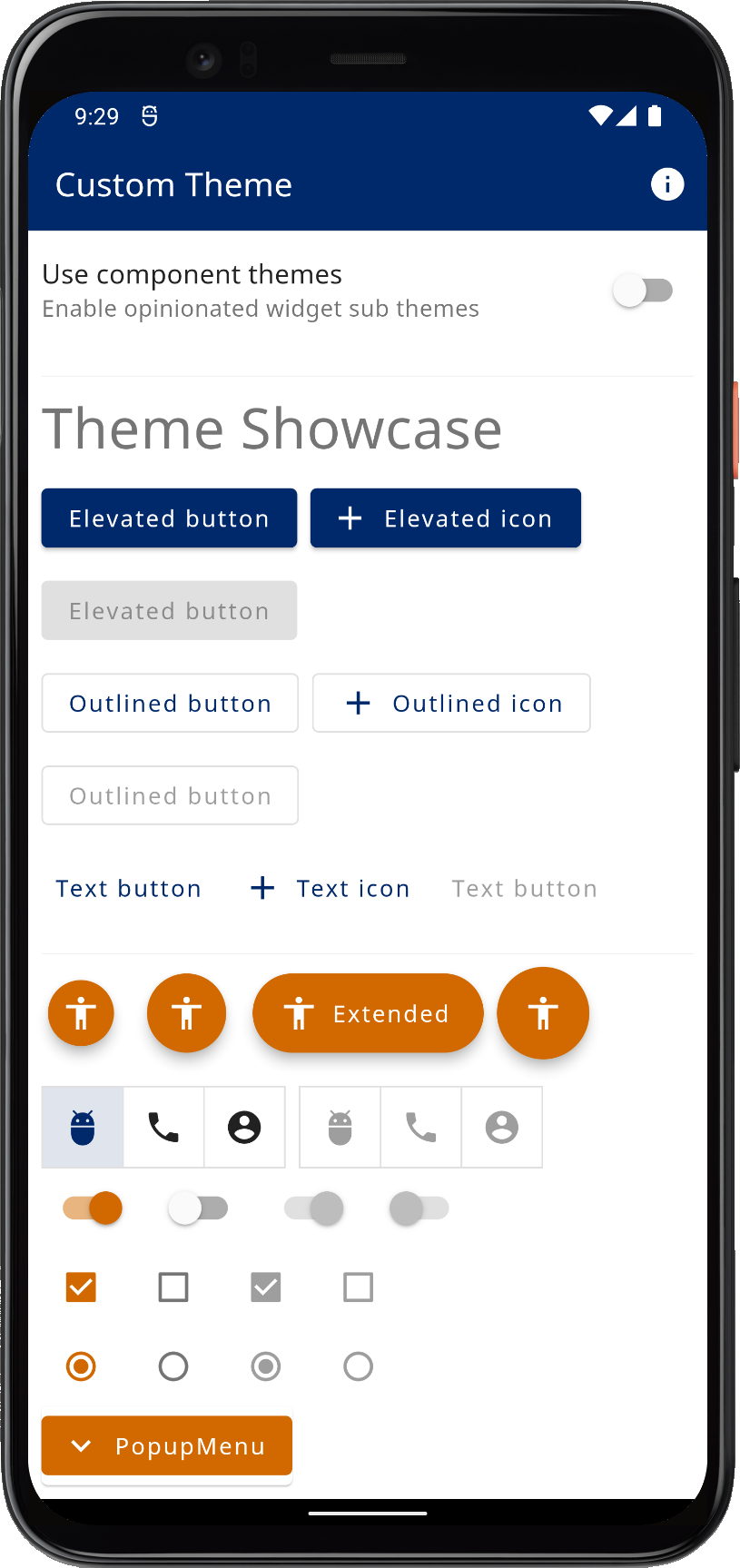
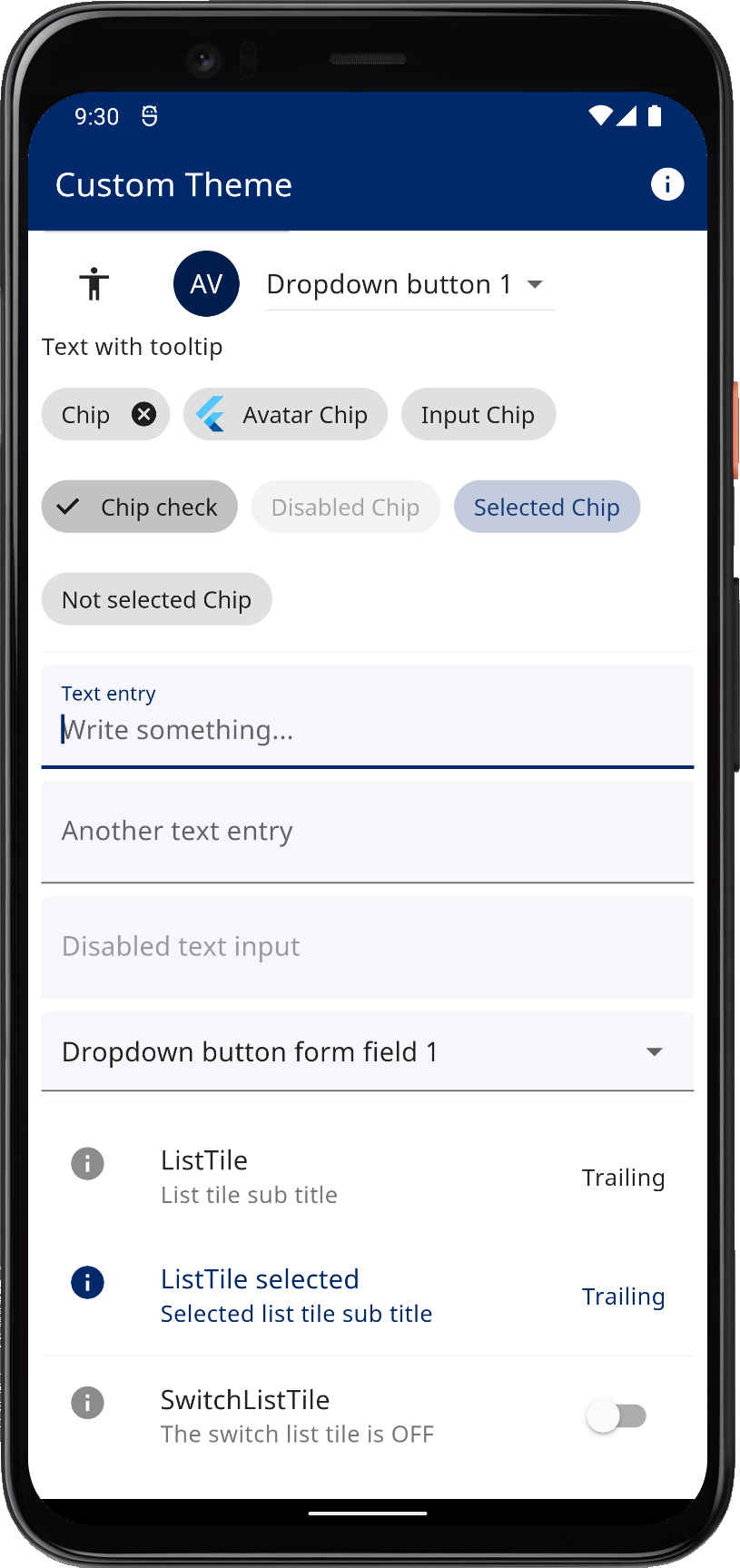
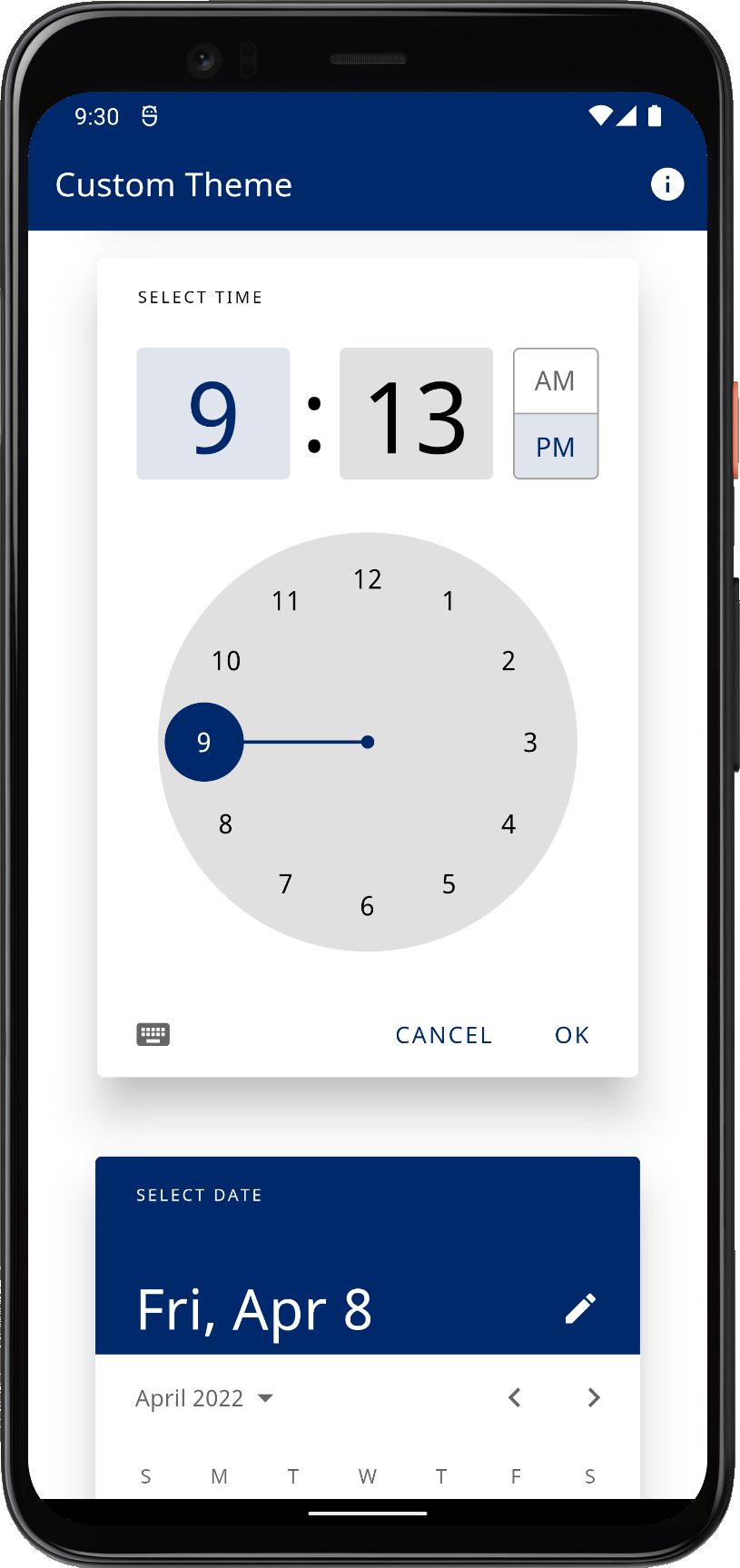
Result
When we build this example, we can see our custom colors being used on all widgets. We also notice that the widget components look a lot different compared to example 1. This is because we enabled using the FlexColorScheme opinionated component sub-themes by default when we used the themeController.useSubThemes value.
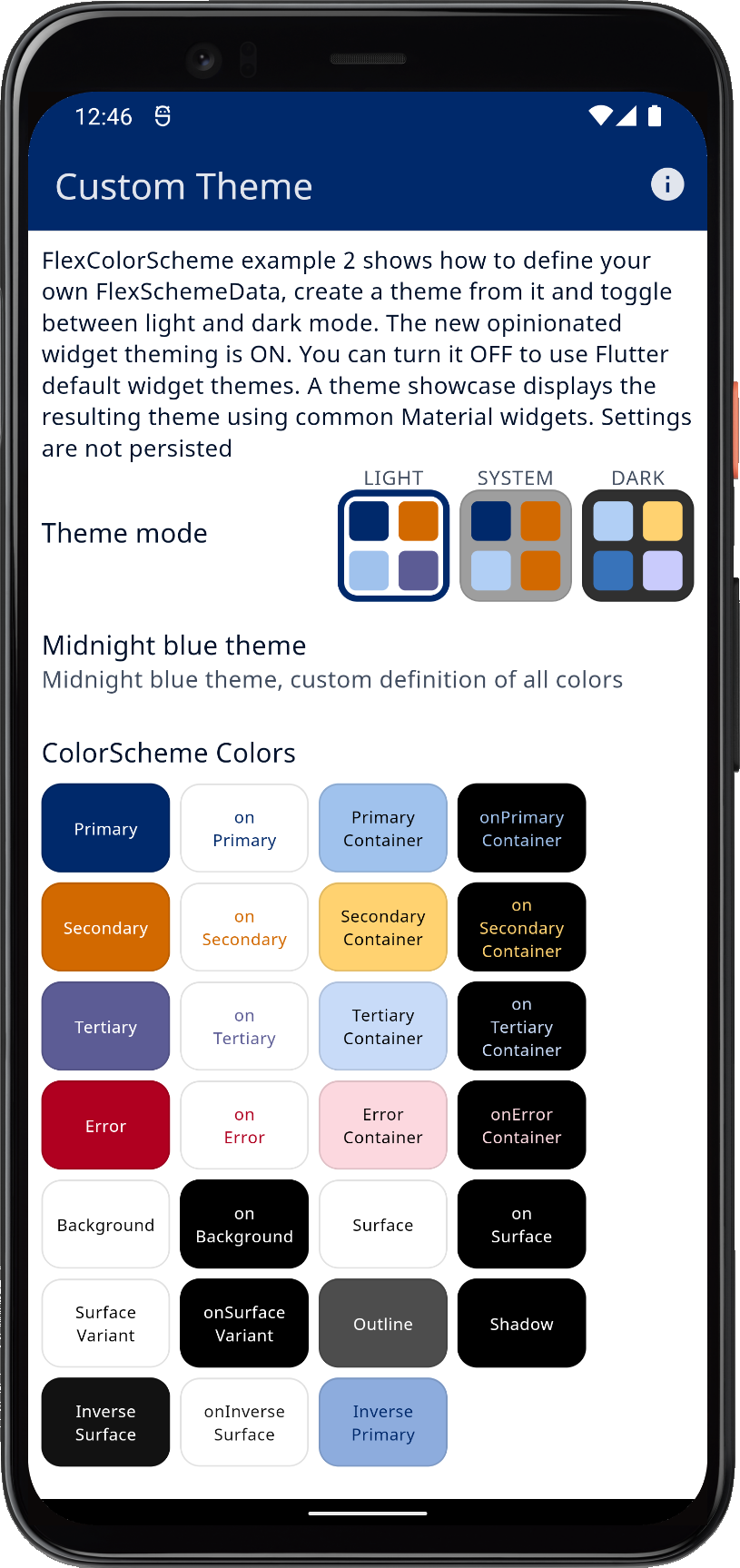 | 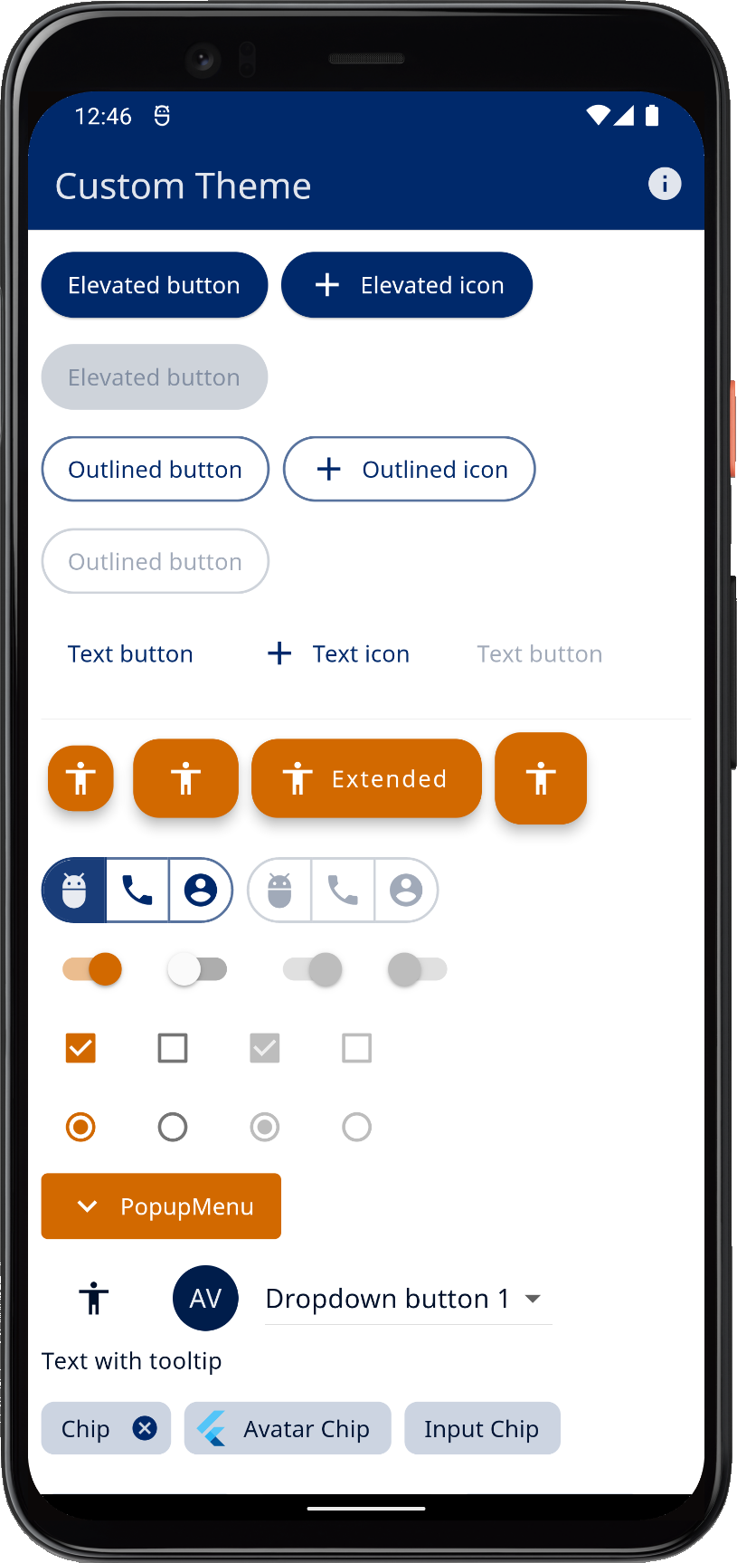 |  | ||
| Using custom colors with FlexColorScheme component themes, in a M2 mode light theme | ||||
In dark theme mode, it looks like this:
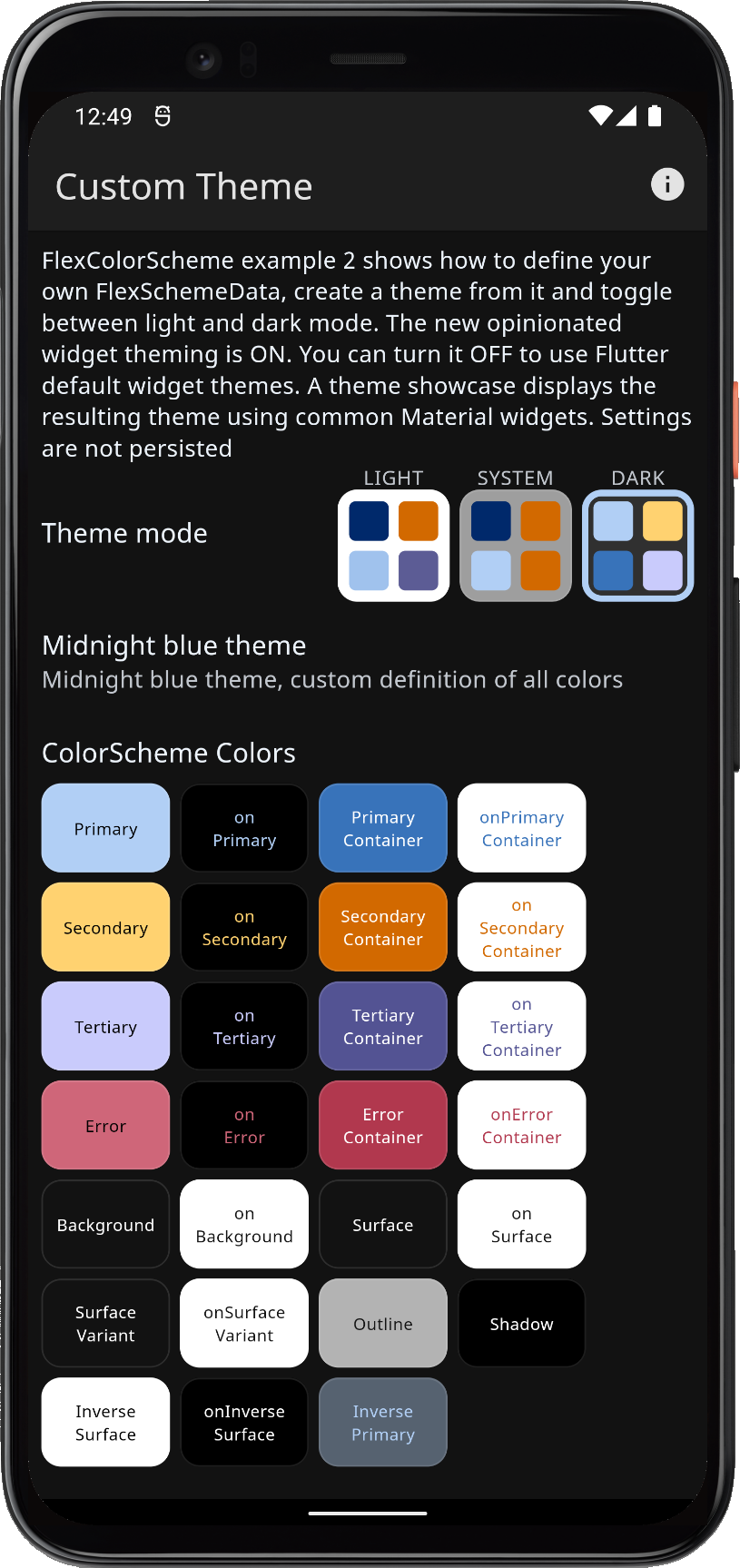 |  |  | ||
| Using custom colors with FlexColorScheme component themes, in a M2 mode dark theme | ||||
We can compare the difference between using the FlexColorScheme opinionated component sub-themes and just default widget theming by toggling the switch for it.
The settings for opinionated component themes in Material-2 mode, use rounded corners on widgets that default to the Material-3 design guide specified values. In Material-3 design, the border radius varies per widget type. In the Flutter's current Material-2 design defaults, it is 4 dp on almost all widgets, this per the Material-2 design specification. Later we will see how we can easily customize the border radius on all components, as well as by component.
 |  |  |  | |||
| Custom colors M2 theme with component sub-themes enabled | ||||||
If we keep Material-2 mode OFF and also turn OFF using the FlexColorScheme Material-2 mode component theming, we can see that the Flutter Material-2 defaults look very different. The FlexColorScheme Material-2 mode component themes are on purposed very opinionated, they draw inspiration from Material-3, but made in Material-2 mode, as far as that is possible in Flutter.
 |  |  |  | |||
| Custom colors M2 theme with component sub-themes disabled | ||||||
Scroll down to see the theme showcase further below. It presents the theme with common Material UI widgets. You can try this example as a Flutter web app here.