5. Themes Playground
This last tutorial is actually the complete Themes Playground application. For more info on the Themes Playground application and what it does, please refer to its own Themes Playground chapter in the documentation.
The same custom color schemes as in example 4 are also used here, please see example 4 for more details on their setup.
If you tried the previous examples on an Android device, you might have noticed that the system navigation bar on Android devices does not change. It is not themed to have a matching tinted background, or even a theme mode appropriate one that matches the active application theme as it changes. This example uses Flutter's AnnotatedRegion, with a helper called FlexColorScheme.themedSystemNavigationBar to make a SystemUiOverlayStyle, that adjusts the look of the Android system navigation bar as the theme is modified. You can read more about this in the API guide's deep dive into themedSystemNavigationBar.
Only code highlights are shown below. The complete code of this example can be found here.
ThemeServiceHive#
The main function of the app is identical to example 4, please see it for more details. We again use package Hive to persist the theme settings with ThemeServiceHive instead of using the ThemeServicePrefs service.
Future<void> main() async {
  WidgetsFlutterBinding.ensureInitialized();
  // The ThemeServiceHive constructor requires a box name, the others do not.
  // The box name is just a file name for the file that stores the settings.
  final ThemeService themeService = ThemeServiceHive('flex_color_scheme_v5_box_5');
  // Initialize the theme service.
  await themeService.init();
  // Create a ThemeController that uses the ThemeService.
  final ThemeController themeController = ThemeController(themeService);
  // Load preferred theme settings, while the app is loading, before MaterialApp
  // is created, this prevents a theme change when the app is first displayed.
  await themeController.loadAll();
  // Run the app and pass in the ThemeController. The app listens to the
  // ThemeController for changes. The same ThemeController as used in example 4
  // controls all the myriad of Theme settings and the ThemeService also
  // persists the settings with the injected ThemeServiceHive.
runApp(PlaygroundApp(controller: themeController));
}
MaterialApp Setup#
The setup of the application itself is in this case even simpler than we used in example 4. This is because getting the controller driven ThemeData configuration for the light and dark theme got so unwieldy large, that we moved them to their own ThemeData functions. This gives a very compact StatelessWidget as our PlaygroundApp that uses MaterialApp and the FlexColorScheme produced ThemeData.
In this example we also added a bool controller value called controller.useFlexColorScheme that we can use to toggle using FlexColorScheme OFF completely, when we turn it OFF we use another function to return the ThemeData. Let's look at both these functions.
class PlaygroundApp extends StatelessWidget {
  const PlaygroundApp({super.key, required this.controller});
  final ThemeController controller;

  @override
  Widget build(BuildContext context) {
    // Whenever the theme controller notifies the listenable in the
    // ListenableBuilder, the MaterialApp is rebuilt.
    return ListenableBuilder(
      listenable: controller,
      builder: (BuildContext context, Widget? child) {
        return MaterialApp(
          debugShowCheckedModeBanner: false,
          title: 'Themes Playground',
          // The Theme controller controls if we use FlexColorScheme made
          // ThemeData or standard SDK ThemeData. It also
          // controls all the configuration parameters used to define the
          // FlexColorScheme object that produces the ThemeData object.
          theme: controller.useFlexColorScheme
              ? flexThemeLight(controller)
              : themeDataLight(controller),
          darkTheme: controller.useFlexColorScheme
              ? flexThemeDark(controller)
              : themeDataDark(controller),
          // Use the dark/light theme based on controller setting.
          themeMode: controller.themeMode,
          home: GestureDetector(
            // This allows us to un-focus a widget, typically a TextField
            // with focus by tapping somewhere outside it. It is no longer
            // needed on desktop builds, it is done automatically there for
            // TextField, but not on tablet and phone app. In this app we
            // want it on them too and to unfocus other widgets with focus
            // on desktop too.
            onTap: () => FocusScope.of(context).unfocus(),
            // Pass the controller to the HomePage where we use it to change
            // the theme settings that will cause themes above to change and
            // rebuild the entire look of the app based on modified theme.
            //
            // There are more than 270 properties in the controller that can
            // be used to control the two light and dark mode themes.
            // Every time one of them is modified, the themed app is rebuilt
            // with the new ThemeData applied.
            // The code that one need to use the same theme is also updated
            // interactively for each change when the code gen panel is
            // in view.
            child: HomePage(controller: controller),
          ),
        );
      },
    );
  }
}
FlexColorScheme ThemeData#
There is actually nothing new in how we make our ThemeData with FlexColorScheme in the Themes Playground application compared to previous example 4, All Themes. There is just a lot more of it.
We did switch to using the FlexColorScheme namesake class in this example, instead of FlexThemeData. In the API guide chapter in topic FlexColorScheme or FlexThemeData we presented when you might prefer to use FlexColorScheme over FlexThemeData. This setup in the Themes Playground is a case where we can get some additional benefits by using FlexColorScheme instead. Let's find out why.
Above in our MaterialApp the flexThemeLight and flexThemeDark are equivalent, thus we only study flexThemeLight function, here is what it does:
ThemeData flexThemeLight(ThemeController controller) =>
    flexColorSchemeLight(controller).toTheme;
Well that was not a lot, it only calls flexColorSchemeLight passing along our ThemeController, the controller to the flexColorSchemeLight function, that returns a FlexColorScheme object, and it then returns its ThemeData using the toTheme method. This is then used as ThemeData by the theme property in our MaterialApp. Theme done! Well almost, let's open up the details and see why we did it like this.
We do it this way and not directly, or by setting it up via FlexThemeData.light, because for the none FlexColorScheme use case, when we create a standard Flutter SDK theme with ThemeData.from a ColorScheme, we use the same flexColorSchemeLight function to return the ColorScheme it represents with its toScheme method.
All the interesting FlexColorScheme setups for the entire Themes Playground app is in the flexColorSchemeLight function for our light theme mode, where we use FlexColorScheme. Here is what it looks like:
FlexColorScheme flexColorSchemeLight(ThemeController controller) {
  // Using a built-in scheme or one of the custom colors in the demo?
  final bool useBuiltIn = controller.schemeIndex > 2 &&
      controller.schemeIndex < AppColor.schemes.length - 1;
  // Get the enum index of scheme
  final int flexScheme = controller.schemeIndex - 3;
  return FlexColorScheme.light(
    // Use controller to get current scheme colors, use custom "colors"
    // property only if we use an index where we have custom colors in use.
    colors: !useBuiltIn ? AppColor.scheme(controller).light : null,
    // Otherwise use built-in scheme based property. We could
    // use only the colors property, but then we do not get the
    // correct keyColor behavior in dark mode, with built-in.
    // Also a good test of that factory works as designed.
    // The source code gen also uses this logic.
    scheme: useBuiltIn ? FlexScheme.values[flexScheme] : null,
    // Used number of colors from the selected input FlexColorScheme based theme
    usedColors: controller.usedColors,
    // Use controller to select surface mode
    surfaceMode: controller.surfaceModeLight,
    // Integer used to control the level of primary color
    // surface blends applied to surfaces and backgrounds.
    blendLevel: controller.blendLevel,
    // Enum used to select what AppBar style we use.
    appBarStyle: controller.appBarStyleLight,
    // Set background opacity on app bar.
    appBarOpacity: controller.appBarOpacityLight,
    // Used to control if we use one or two toned status bar.
    transparentStatusBar: controller.transparentStatusBar,
    // Used to modify the themed AppBar elevation.
    appBarElevation: controller.appBarElevationLight,
    // Enum used to select what TabBar style we use.
    tabBarStyle: controller.tabBarStyle,
    // Keep scaffold plain white in all blend modes.
    lightIsWhite: controller.lightIsWhite,
    // Swap primary and secondary colors.
    swapColors: controller.swapLightColors,

    : <snip>

    // Many, many, many additional controller controlled properties...

    : <snip>

    // Use key color based M3 ColorScheme.
    keyColors: FlexKeyColors(
      useKeyColors: controller.useKeyColors,
      useSecondary: controller.useSecondary,
      useTertiary: controller.useTertiary,
      keepPrimary: controller.keepPrimary,
      keepSecondary: controller.keepSecondary,
      keepTertiary: controller.keepTertiary,
      keepPrimaryContainer: controller.keepPrimaryContainer,
      keepSecondaryContainer: controller.keepSecondaryContainer,
      keepTertiaryContainer: controller.keepTertiaryContainer,
    ),
    // Use Material3 error colors with Material2 themes.
    useMaterial3ErrorColors: controller.useM3ErrorColors,
    // Use predefined [FlexTones] setups for the generated
    // [TonalPalette] and it's usage in [ColorScheme] config.
    // You can make your custom [FlexTones] object right here
    // and apps it it, this just uses an int value to select
    // between a few pre-configured ones.
    tones: AppColor.flexTonesConfig(
        Brightness.light, controller.usedFlexToneSetup),
    // ThemeData properties passed along directly to ThemeData.
    //
    // Modify the value in the AppData class to change it.
    visualDensity: AppData.visualDensity,
    // Custom font, modify in AppData class to change it.
    fontFamily: controller.useAppFont ? AppData.font : null,
    // The platform can be toggled in the app, but not saved.
    platform: controller.platform,
    // Opt-in/out of using Flutter SDK Material3 based theming
    // features. In Flutter SDK 2.10 and earlier it has almost no
    // effect, but it will later and then we can use this toggle
    // with FlexColorScheme too, and in this demo we can see its
    // impact easily.
    useMaterial3: controller.useMaterial3,
  );
}
For presentation reasons the complete code for the flexColorSchemeLight function has to be cut considerably. You can find its complete code in the repo here.
What the code does is create the FlexColorScheme object represented by our current ThemeController configuration. This setup may seem complex, but all the controller does, is represent configuration values selected in the UI, that are input to a large number of properties in FlexColorScheme. This enables us to dynamically produce the configured and selected theme.
Normally, you would probably only have a few properties offered as possible theming features the user can change. Since this is a feature demo of almost everything in FlexColorScheme it is a bit wild. The basic principle is still the same one that we used already in example 2, we have just scaled the configuration options to pretty silly proportions, it still works well enough though, at least for this demo app.
No FlexColorScheme Theme#
Let's take a look at what we do for the case when we turn OFF the usage of FlexColorScheme. In the Roads to ThemeData, we demonstrated the ThemeData.from a ColorScheme option. We use what it recommends here too.
What we want to do is to produce ThemeData that will use all relevant ColorScheme generation selection and settings from the FlexColorScheme setup. Use this ColorScheme as input with a ThemeData.from "like" factory, so we can get a Flutter's default ThemeData using the identical ColorScheme.
ThemeData themeDataLight(ThemeController controller) {
  final ColorScheme colorScheme =
      flexColorSchemeLight(controller, Colors.black).toScheme;

  return ThemeData(
    brightness: Brightness.light,
    fontFamily: controller.useAppFont ? App.font : null,
    textTheme: controller.useAppFont ? App.textTheme : null,
    primaryTextTheme: controller.useAppFont ? App.textTheme : null,
    // The ColorScheme we get here is the same one you can also generate
    // Copy/paste code for in the ThemesPlayground UI, and it represent the
    // effective scheme in the Playground app.
    colorScheme: colorScheme,
    // Use the colorScheme to make a nicer light theme.
    primaryColor: colorScheme.primary,
    canvasColor: colorScheme.background,
    scaffoldBackgroundColor: colorScheme.background,
    cardColor: colorScheme.surface,
    dividerColor: colorScheme.outlineVariant,
    dialogBackgroundColor: colorScheme.background,
    indicatorColor: colorScheme.onPrimary,

    // To our ThemeData we also apply the visual density, typography, selected
    // platform and useMaterial3 flag, that we used in FlexColorScheme created
    // ThemeData. We do this so created theme will be using the same features
    // in the Playground app
    visualDensity: controller.usedVisualDensity?.setting(controller.platform) ??
        VisualDensityEnum.platform.setting(controller.platform),
    platform: controller.platform,
    useMaterial3: controller.useMaterial3,
    typography: controller.useMaterial3
        ? Typography.material2021(
        platform: controller.platform ?? defaultTargetPlatform)
        : Typography.material2018(
        platform: controller.platform ?? defaultTargetPlatform),
    // Add a custom theme extension with light mode code highlight colors and
    // light mode topic colors.
    extensions: <ThemeExtension<dynamic>>{
      CodeTheme.harmonized(colorScheme.surfaceTint, Brightness.light),
      TopicTheme.harmonized(colorScheme.surfaceTint, Brightness.light),
    },
    // This is a fix to avoid the Flutter Drawer width bug and overflow bug
    // when it animates via zero width in null default to widget default.
    // See: https://github.com/flutter/flutter/issues/123507
    drawerTheme: const DrawerThemeData(width: 304),
  );
}
We ge the active ColorScheme by grabbing it from current FlexColorScheme configuration and using its toScheme method. Which gives us a standard ColorScheme that we can use with Flutter SDK factory ThemeData.from to create the ThemeData for the exact same colors.
The ColorScheme it creates also contains the blends, M3 seeded color etc. However, as ColorScheme, only contains surface and background colors and is missing FlexColorScheme customized Scaffold and dialog colors, it cannot use those colors when it creates its ThemeData.
Result#
This concludes the review of FlexColorScheme used features in the Themes Playground app. Naturally, the Playground app contains many other details that may be of interest.
At its core, the Themes Playground app is just a collection of simple UI controls. The UI controls are used to modify the theme controller values, that are used as inputs to properties in FlexColorScheme, that creates our ThemeData and the MaterialApp is rebuilt every time the applications ThemeData is modified.
In case you somehow missed it, you can try the FlexColorScheme Themes Playground example as a Flutter web app here.
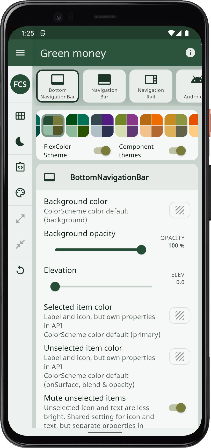
You can also build it as a native device app if you like. It is responsive and works great on phones too, both the masonry style grid view and the custom scroll page view work well. The side command menu turns into a rail, and prefers to stay auto hidden as a drawer on phones, but can with the menu button be toggled into a thin rail also in vertical phone layout.
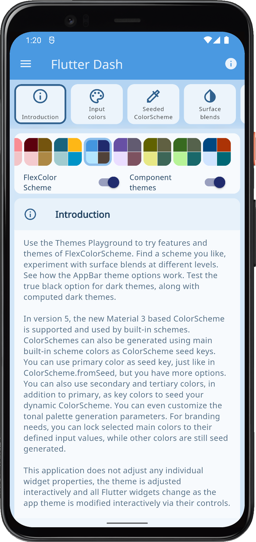 |  |  |  | |||
| Example 5, the Themes Playground app built on a phone device | ||||||
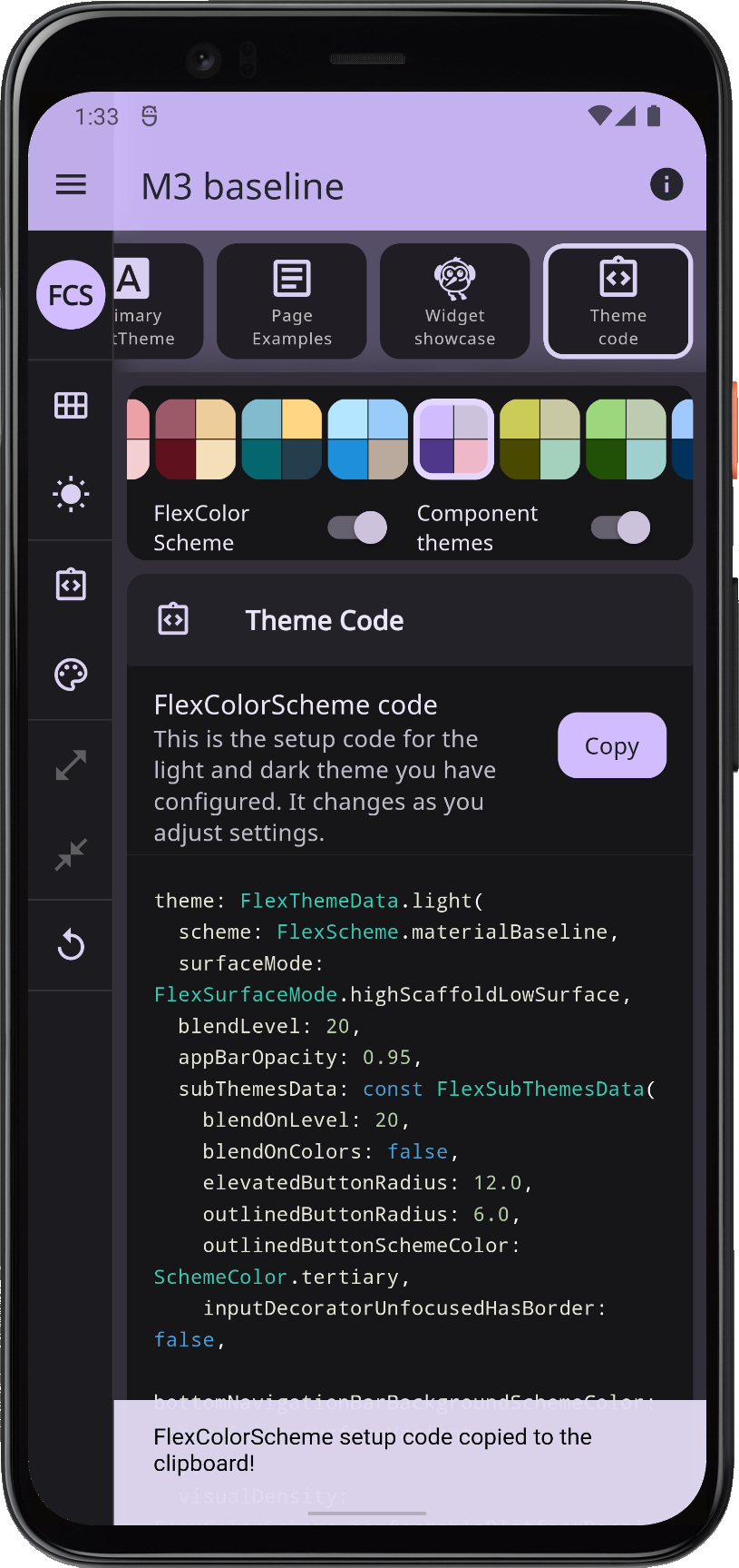
The page view is more practical on a phone, and is even more delightful on a tablet in landscape mode, when you can see the setup code being generated and changed in a side-by-side view as you toggle settings.
It is all just one app for all platforms and sizes, with two different main layouts, that are both very responsive and change with media size. Icon sizes vary, gutters expand/shrink, in page view the page/panel selector scrolls away and snaps back on small devices, but stays put on larger ones.
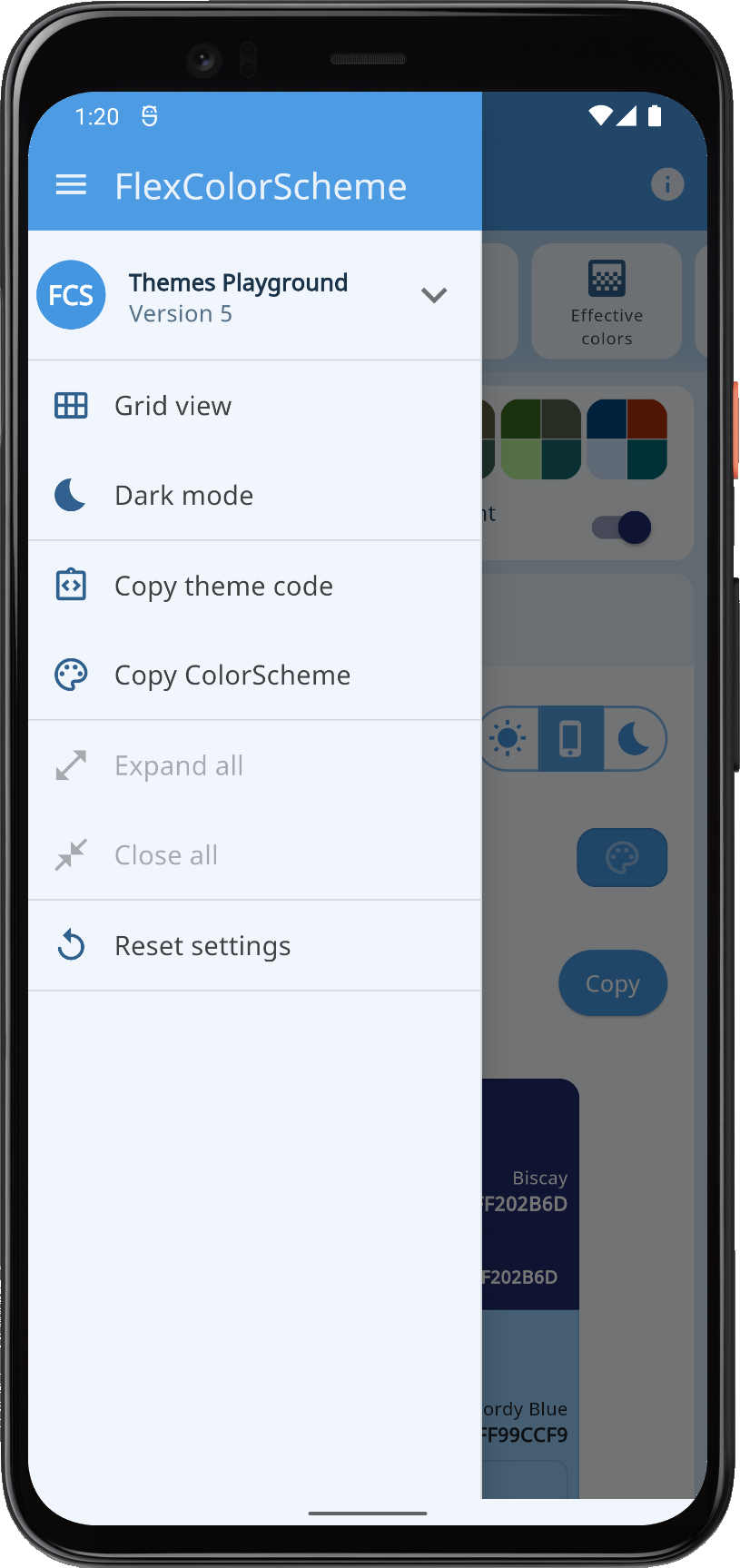
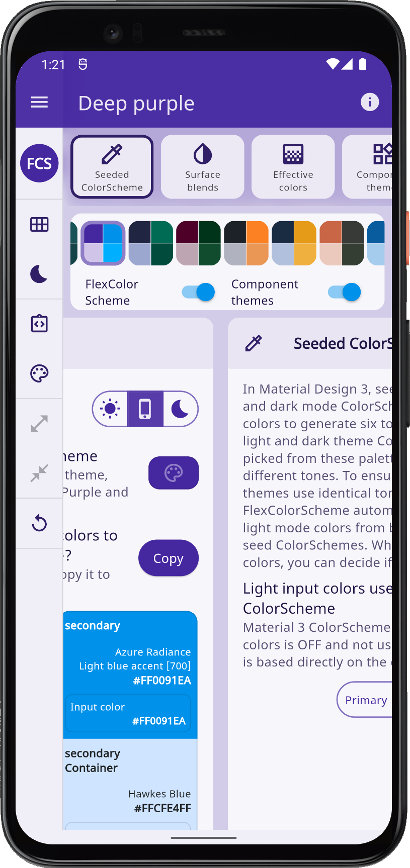
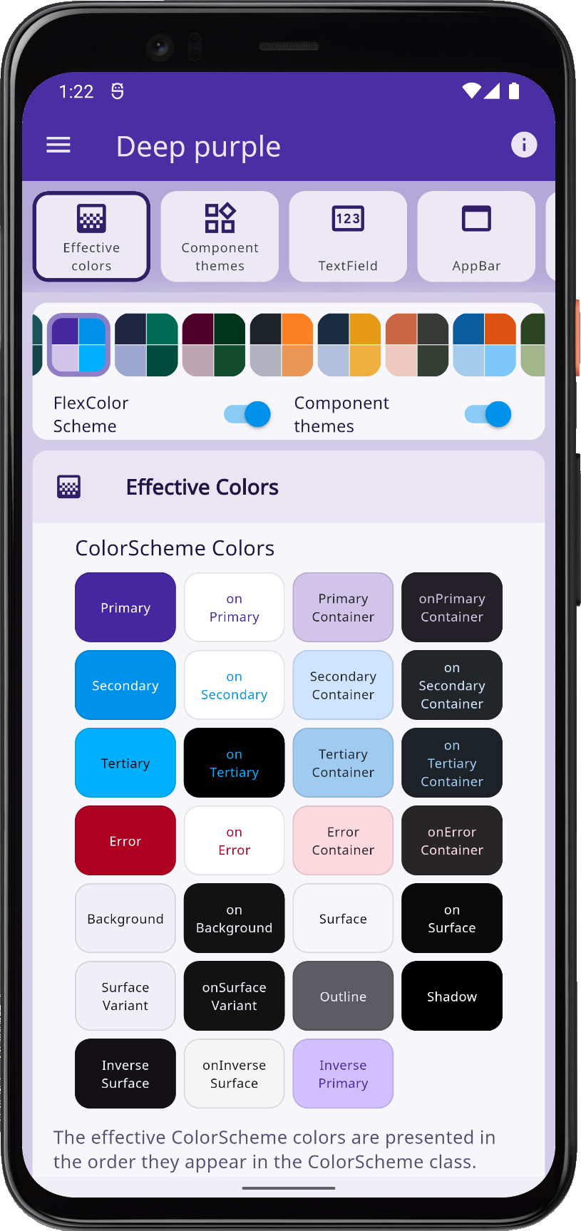
 | 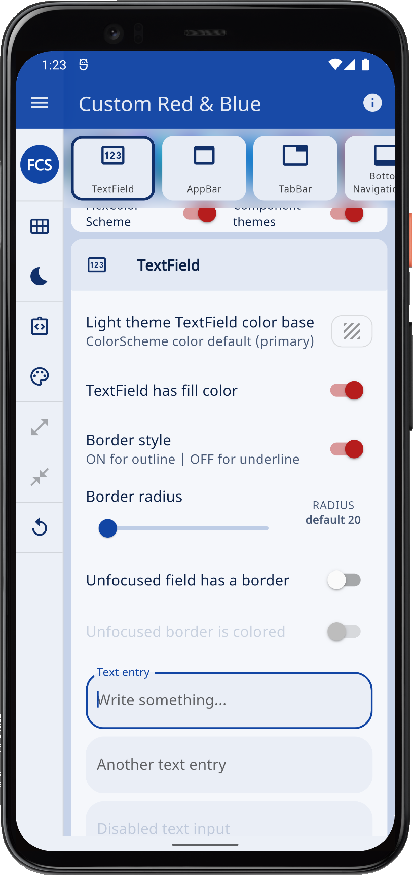 | 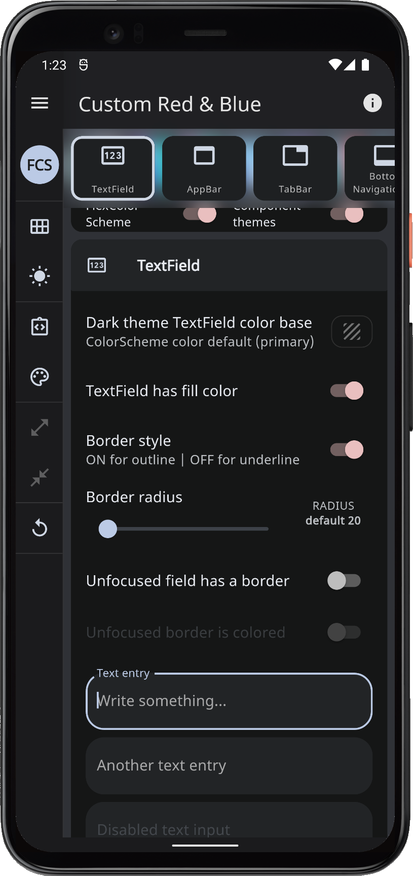 |  | |||
| Example 5, more screens from the Themes Playground app built on a phone device | ||||||
By resizing the window on the web version slowly, you can discover the available different responsive designs.
ThemeController#
Before we wrap up, a few more words about the ThemeController and used persistence model. This is not relevant for FlexColorScheme usage, but might be of general interest.
The ThemeController is used by many Widgets that users can interact with. The same controller is even shared among examples 2 ... 5 to simplify making these demos. Widgets can read the user theme settings, set theme user settings and listen to user's theme changes. The controller glues data Services to Flutter Widgets. The ThemeController uses the ThemeService to save and load theme settings.
This setup on purpose demonstrates persisting each theme property value as its own string key and value pair. With this large number of values, bundling them all up in a data class and persisting them all as one big serialized JSON string, with just one key, would certainly be more convenient. This setup is more file resource efficient. It gives us faster saves of persisted values. This is useful on sliders that can be dragged around quickly in the UI.
Some theme changes can be a bit taxing calculation wise. While some changes that appear to be lagging behind, do so only due to the theme change animation. The MaterialApp always lerp animates a theme change from all its previous ThemeData property values, to its new ThemeData property values. So when you drag sliders to change border radius, this triggers an animation from a complete ThemeData based on the previous slider value to the next one, based on the new slider value, for every rapid slider value change.
This animation can be seen as a slight delay in the manifestation of the latest value, as the theme is animating to the last slider value. This can certainly be avoided by not triggering a theme change until the slider change is complete, but in this case we preferred to show the change as the slider is being adjusted.
In this tutorial, and all its examples, each managed property in the controller follows this simple pattern:
  // Private value, getter and setter for the ThemeMode
  late ThemeMode _themeMode;
  // Getter for the current ThemeMode.
  ThemeMode get themeMode => _themeMode;
  // Set and persist new ThemeMode value.
  Future<void> setThemeMode(ThemeMode? value, [bool notify = true]) async {
    // No work if null value passed.
    if (value == null) return;
    // Do not perform any work if new and old value are identical.
    if (value == _themeMode) return;
    // Otherwise, assign new value to private property.
    _themeMode = value;
    // Inform all listeners a change has occurred, if notify flag is true.
    if (notify) notifyListeners();
    // Persist the change to whatever storage is used with the ThemeService.
    await _themeService.save(Store.keyThemeMode, value);
  }
In cases where we use nullable values that also need to be persisted, we obviously skip the null check in the setter above. The logic ensures that we do not do any work not needed.
The flag to not notify listeners is used in the resetAllToDefaults() function, that calls the setter for every controller property with its Store.default"Property" value using notify set to false. The resetAllToDefaults() then calls notifyListeners itself only once when it has reset all properties to their default values. Thus triggering only one update, and not one for every set call.
Making the above setup for all the properties in the Themes Playground was a bit tedious, even if it is simple and mechanical.
You would not normally have this many settings properties in an app that you want to persist locally (or remotely). In those cases, this approach is quite simple and convenient. In this use case, maybe it is not so convenient due to the large number of used properties. There are 294 individual theming property key-value pairs, managed by the same controller. This is a large number of controlled properties. The setup is still simple to make, even if it is quite repetitive. It did not start with this many properties and was never intended to be used with this many properties. However, as the Themes Playground app grew, the same simplistic approach was kept, since the Playground is really only an extended version of example 4. The Playground might be rewritten as a separate and stand-alone application. You can read more about that in future plans.
It works surprisingly well, despite the large number of controller properties, even if the values all share the same listener that rebuilds the app when something changes. This is of course because every property in the controller is of the nature that if we change it, then something in ThemeData changed, and we need to rebuild the entire app with the new ThemeData anyway.
This does not mean that Flutter always redraws every widget when we change something. If the change is local to just one widget type, like input decorator used only in one panel, we can with rainbow paints, even with the big masonry grid view, observe that often only it is being redrawn. Naturally, if we change theme colors, everything needs to be redrawn with the new colors. The nature of this app being what it is, this of course happens a lot.
Persisting "null" Choice#
For many theme properties, "null" represents the default undefined theming behavior. In the theme settings, this is also a deliberate choice and option that we may choose and want to persist. Whereas a missing key, in our persisted key-value pair, means we have no value for it yet and that we should get the app default value for the property. Which is available as const value in the app via Store.defaultPropertyName like values. The default might not be null in the app defaults, but it may be so for some properties.
This was quite simple to accomplish with the ThemeServiceHive implementation, but for the ThemeServicePrefs version we had to make a bit more involved implementation. If you are interested in this detail, you can take a peek at the code for ThemeServiceHive and ThemeServicePrefs and compare them.
No State Management?#
The interactive theme manipulation done in the Themes Playground is very fancy, but the app itself is still quite simple. So I thought this case would be suitable to still implement using the simple Flutter skeleton architecture using ChangeNotifier and a listenable builder in the form of the ListenableBuilder.
This then avoids the state management debate, and there is no need to focus on it in the examples. The usage of the ListenableBuilder is explained more in tutorial 2 here.
Could the Themes Playground be made more efficient using Provider, Riverpod, Flutter Bloc, MobX etc.?
Yes, most likely. Things can also be improved with the current solution, by e.g. breaking things up in even smaller widgets, as well as taking out a few properties that I just tucked into the same controller, even if they were not really related to the theme being changed. They could and should be given their own controller, or maybe an inherited widget to mix it up a bit. If the Themes Playground app needs to get even wilder and fancier than it already is, I might split it out to its own repo, and migrate it to Riverpod, but probably not in the near future.
More Topics#
In future updates to this tutorial, or as separate blog posts, I could go a bit deeper into general interest topics in the Themes Playground app, concerning how certain details were made. Topics might cover:
- The used custom responsive menu/rail/drawer in
ResponsiveScaffold. - The
LargeGridViewmasonry layout, with itsCustomScrollViewusing aSliverPersistentHeaderwith a customSliverPersistentHeaderDelegate. - The
PanelViewthat uses aNestedScrollViewwith aSliverPersistentHeaderand another customSliverPersistentHeaderDelegateand aPageView.builder. - Maybe a study of the
FlexSeedSchemepackage that FlexColorScheme uses for seed generated ColorSchemes, instead if Flutter SDK'sColorScheme.fromSeed.
Drop me a note in the repo discussion if there is something in the example apps or in FlexColorScheme in general that you would like more in-depth info on. I might add a chapter about it here if suitable, or in a separate blog post.