👌 Awesome built-in UI
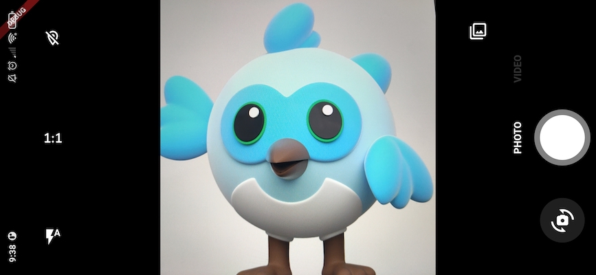
CamerAwesome comes with a full built UI that you can use as is.
Use CameraAwesomeBuilder.awesome() to get a complete ready-to-use camera experience within your app.
Here is a concrete example using better_open_file to display the last media captured:
CameraAwesomeBuilder.awesome(
  saveConfig: SaveConfig.photoAndVideo(),
  onMediaTap: (mediaCapture) {
    OpenFile.open(mediaCapture.filePath);
  },
)
📁 Camera captures configuration
CameraAwesomeBuilder requires a SaveConfig parameter.
You can create one with one of the following factories:
SaveConfig.photo()if you only want to take photosSaveConfig.video()to only take videosSaveConfig.photoAndVideo()if you want to switch between photo and video modes.
These factories don't require additional parameters, but you might want to customize a few things, like where to save your files.
Here is a complete example to overwrite the default behaviors:
SaveConfig.photoAndVideo(
  // 1.
  initialCaptureMode: CaptureMode.photo,
  // 2.
  photoPathBuilder: (sensors) async {
    ...
  },
  // 3.
  videoPathBuilder: (sensors) async {
    ...
  },
  // 4.
  videoOptions: VideoOptions(
    enableAudio: true,
    ios: CupertinoVideoOptions(
      fps: 10,
      // TODODOC Add other possble params
    ),
    android: AndroidVideoOptions(
      bitrate: 6000000,
      quality: VideoRecordingQuality.fhd,
      fallbackStrategy: QualityFallbackStrategy.lower,
    ),
  ),
  // 5.
  exifPreferences: ExifPreferences(saveGPSLocation: true),
  // 6.
  mirrorFrontCamera: true,
)
Let's break it down:
- When using
photoAndVideomode, you can choose which mode to start with. Here we start with photo mode (default). - You can customize the path where your photos will be saved.
- You can also customize where to save your videos.
- The video recording can be customized using
VideoOptions. Note that each platform has its own settings. - You can also enable or disable the GPS location in the EXIF data of your photos.
- Set if you want the front camera pictures & videos to be mirrored like in the preview.
A photoPathBuilder could look like this:
SaveConfig.photoAndVideo(
  photoPathBuilder: (sensors) async {
    // 1.
    final Directory extDir = await getTemporaryDirectory();
    final testDir = await Directory('${extDir.path}/camerawesome').create(recursive: true);

    // 2.
    if (sensors.length == 1) {
      final String filePath =
          '${testDir.path}/${DateTime.now().millisecondsSinceEpoch}.jpg';
      // 3.
      return SingleCaptureRequest(filePath, sensors.first);
    } else {
      // 4.
      return MultipleCaptureRequest(
        {
          for (final sensor in sensors)
            sensor:
                '${testDir.path}/${sensor.position == SensorPosition.front ? 'front_' : "back_"}${DateTime.now().millisecondsSinceEpoch}.jpg',
        },
      );
    }
  },
  // Other params
  ...
)
There are 4 steps in this code:
- Create a directory where photos will be saved (here we use the temporary directory, using
path_provider). - Since
CamerAwesomesupports taking pictures with both front and back cameras at the same time, we need to detect if there is only one picture to take or several ones. - If there is only one sensor used, we can build a
SingleCaptureRequestwith the file path and the sensor. - If there are several sensors, we need to build a
MultipleCaptureRequestwith a map of file paths and sensors. In this case, we create a different path based on wether it's the front or back sensor that takes the picture.
The same logic goes for videos but we replace the .jpg extension with .mp4.
📷 Initial camera configuration
You can set the initial camera configuration using a SensorConfig.
CameraAwesomeBuilder.awesome(
  sensorConfig: SensorConfig.single(
    aspectRatio: CameraAspectRatios.ratio_4_3,
    flashMode: FlashMode.auto,
    sensor: Sensor.position(SensorPosition.back),
    zoom: 0.0,
  ),
)
| Parameter | Description |
|---|---|
| aspectRatio | Initial aspect ratio of photos and videos taken |
| flashMode | The initial flash mode |
| sensor | The initial camera sensor (Back or Front) |
| zoom | A value between 0.0 (no zoom) and 1.0 (max zoom) |
Note: you might also notice the SensorConfig.multiple() constructor which lets you specify several sensors.
This feature is in beta, but you can take a look at the dedicated documentation.
CameraAwesomeBuilder also provides a few more parameters:
enablePhysicalButtonto enable the volume buttons to take pictures or record videosfilterto set an initial filter to the pictures
Theming
You can customize the look and feel of CamerAwesome's built-in UI by setting your own theme.
For example, buttons are black with a white icon and they bounce when you tap them.
You can completely change them with AwesomeTheme:
Example:
CameraAwesomeBuilder.awesome(
  theme: AwesomeTheme(
    // Background color of the bottom actions
    bottomActionsBackgroundColor: Colors.deepPurple.withValues(alpha: 0.5),
    // Buttons theme
    buttonTheme: AwesomeButtonTheme(
      // Background color of the button
      backgroundColor: Colors.deepPurple.withValues(alpha: 0.5),
      // Size of the icon
      iconSize: 32,
      // Padding around the icon
      padding: const EdgeInsets.all(18),
      // Color of the icon
      foregroundColor: Colors.lightBlue,
      // Tap visual feedback (ripple, bounce...)
      buttonBuilder: (child, onTap) {
        return ClipOval(
          child: Material(
            color: Colors.transparent,
            shape: const CircleBorder(),
            child: InkWell(
              splashColor: Colors.deepPurple,
              highlightColor: Colors.deepPurpleAccent.withValues(alpha: 0.5),
              onTap: onTap,
              child: child,
            ),
          ),
        );
      },
    ),
  ),
);
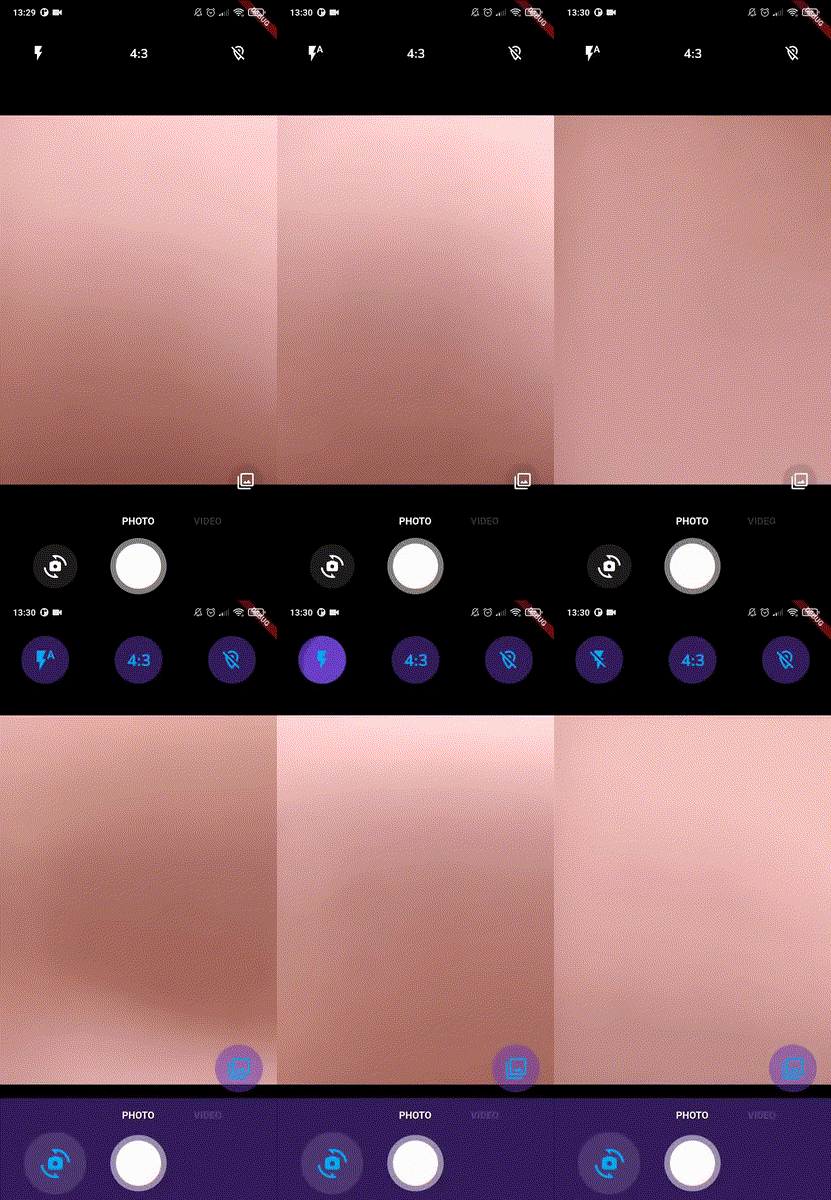
Let's see what happens in the above animation:
- In the first part, the default theme of CamerAwesome is used. Note that the Flash button bounces when tapped.
- Then, the code is changed to show the custom theme above with a hot reload.
- Finally, the UI is updated with the new purple theme and you can see that even the Flash button has a different tap effect: it is now a ripple.
If you are using the built-in UI - even partially, it is recommended to use AwesomeTheme in the rest of your Camera UI to stay consistent.
You can access the current AwesomeTheme by using AwesomeThemeProvider:
final myTheme = AwesomeThemeProvider.of(context).theme
Tip: If you don't have a BuildContext to access the parent's AwesomeTheme, wrap your widget within a Builder widget.
See also Theming and custom_theme.dart for an example with a custom theme.
Place widgets in your UI
The built-in UI is separated in 3 areas:
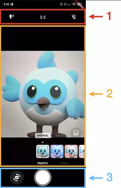
- Top actions built with
topActionsBuilder - Middle content built with
middleContentBuilder - Bottom actions built with
bottomActionsBuilder
You can customize each builder to return the elements that you want in each part. Feel free to reuse the included build-in widgets (aspect ratio button, flash button...).
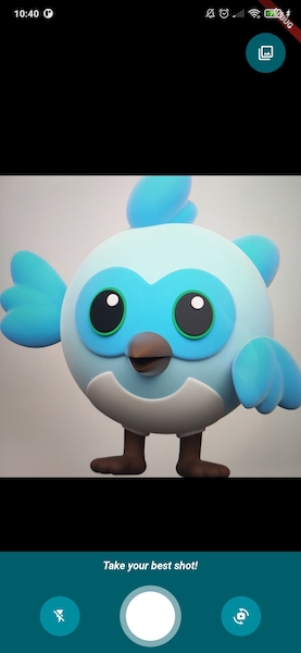
Here is an example of what you can do:
CameraAwesomeBuilder.awesome(
  // Other parameters
  ...
  // Set an AwesomeTheme that you might reuse in your UI
  theme: AwesomeTheme(
    bottomActionsBackgroundColor: Colors.cyan.withValues(alpha: 0.5),
    buttonTheme: AwesomeButtonTheme(
      backgroundColor: Colors.cyan.withValues(alpha: 0.5),
      iconSize: 20,
      foregroundColor: Colors.white,
      padding: const EdgeInsets.all(16),
      // Tap visual feedback (ripple, bounce...)
      buttonBuilder: (child, onTap) {
        return ClipOval(
          child: Material(
            color: Colors.transparent,
            shape: const CircleBorder(),
            child: InkWell(
              splashColor: Colors.cyan,
              highlightColor: Colors.cyan.withValues(alpha: 0.5),
              onTap: onTap,
              child: child,
            ),
          ),
        );
      },
    ),
  ),
  // Show the filter button on the top part of the screen
  topActionsBuilder: (state) => AwesomeTopActions(
    padding: EdgeInsets.zero,
    state: state,
    children: [
      Expanded(
        child: AwesomeFilterWidget(
          state: state,
          filterListPosition: FilterListPosition.aboveButton,
          filterListPadding: const EdgeInsets.only(top: 8),
        ),
      ),
    ],
  ),
  // Show some Text with same background as the bottom part
  middleContentBuilder: (state) {
    return Column(
      children: [
        const Spacer(),
        // Use a Builder to get a BuildContext below AwesomeThemeProvider widget
        Builder(builder: (context) {
          return Container(
            // Retrieve your AwesomeTheme's background color
            color: AwesomeThemeProvider.of(context)
                .theme
                .bottomActionsBackgroundColor,
            child: const Align(
              alignment: Alignment.bottomCenter,
              child: Padding(
                padding: EdgeInsets.only(bottom: 10, top: 10),
                child: Text(
                  "Take your best shot!",
                  style: TextStyle(
                    color: Colors.white,
                    fontWeight: FontWeight.bold,
                    fontStyle: FontStyle.italic,
                  ),
                ),
              ),
            ),
          );
        }),
      ],
    );
  },
  // Show Flash button on the left and Camera switch button on the right
  bottomActionsBuilder: (state) => AwesomeBottomActions(
    state: state,
    left: AwesomeFlashButton(
      state: state,
    ),
    right: AwesomeCameraSwitchButton(
      state: state,
      scale: 1.0,
      onSwitchTap: (state) {
        state.switchCameraSensor(
          aspectRatio: state.sensorConfig.aspectRatio,
        );
      },
    ),
  ),
)
| Parameter | Description |
|---|---|
| topActionsBuilder | Top part of the built-in UI |
| middleContentBuilder | Content between top and bottom parts of the built-in UI |
| bottomActionsBuilder | Bottom part of the built-in UI |
See custom_awesome_ui.dart for an example using these parameters.
Camera preview positioning
Use these parameters to adjust where you want to place the camera preview in your UI.
CameraAwesomeBuilder.awesome(
  previewPadding: const EdgeInsets.all(20),
  previewAlignment: Alignment.center,
  // Other parameters
  ...
)
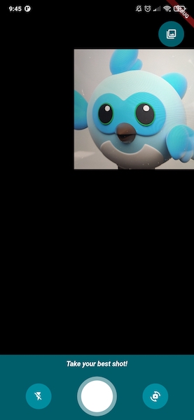
By default, preview is centered with no padding.
| Parameter | Description |
|---|---|
| previewPadding | Add padding around the preview |
| previewAlignment | Align the preview |
You can see these parameters in use in custom_awesome_ui.dart example.
Add additional content on top of the preview
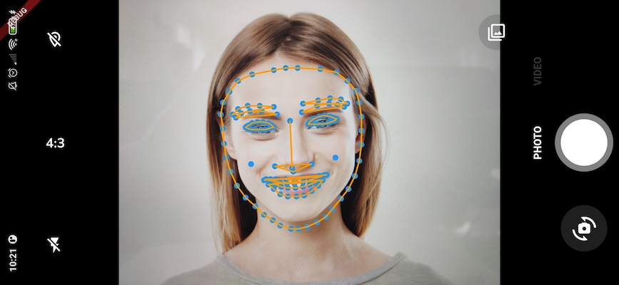
If you'd like to place elements on top of the preview, like you would do it in a Stack, use the previewDecoratorBuilder.
This feature can be used combined with image analysis to show face filters (like snapchat ones) for example:
| Parameter | Description |
|---|---|
| previewDecoratorBuilder | Add a widget on top of the preview |
That's what is used in ai_analysis_faces.dart to draw contours of the detected face.
📝 Complete example
Here is an example showing the complete list of parameters you can set to customize your camera experience:
CameraAwesomeBuilder.awesome(
  // Bottom actions (take photo, switch camera...)
  bottomActionsBuilder: (state) {
    return AwesomeBottomActions(
      state: state,
      onMediaTap: _handleMediaTap,
    );
  },
  // Clicking on volume buttons will capture photo/video depending on the current mode
  enablePhysicalButton: true,
  // Filter to apply on the preview
  filter: AwesomeFilter.AddictiveRed,
   // Image analysis configuration
  imageAnalysisConfig: AnalysisConfig(
        androidOptions: const AndroidAnalysisOptions.nv21(
            width: 1024,
        ),
        autoStart: true,
  ),
  // Middle content (filters, photo/video switcher...)
  middleContentBuilder: (state) {
    // Use this to add widgets on the middle of the preview
    return Column(
      children: [
        const Spacer(),
        AwesomeFilterWidget(state: state),
        Builder(
          builder: (context) => Container(
            color: AwesomeThemeProvider.of(context)
                .theme
                .bottomActionsBackgroundColor,
            height: 8,
          ),
        ),
        AwesomeCameraModeSelector(state: state),
      ],
    );
  },
  // Handle image analysis
  onImageForAnalysis: (analysisImage) {
    // Do some stuff with the image (see example)
    return processImage(analysisImage);
  },
  onMediaTap: (mediaCapture) {
    // Hande tap on the preview of the last media captured
    print('Tap on ${mediaCapture.filePath}');
  },
  // Handle gestures on the preview, such as tap to focus or scale to zoom
  onPreviewTapBuilder: (state) => OnPreviewTap(
    onTap: (position, flutterPreviewSize, pixelPreviewSize) {
      // Handle tap to focus (default) or take a photo for instance
      // ...
    },
    onTapPainter: (position) {
      // Tap feedback, here we just show a circle
      return Positioned(
        left: position.dx - 25,
        top: position.dy - 25,
        child: IgnorePointer(
          child: Container(
            decoration: BoxDecoration(
              shape: BoxShape.circle,
              border: Border.all(color: Colors.white, width: 2),
            ),
            width: 50,
            height: 50,
          ),
        ),
      );
    },
    // Duration during which the feedback should be shown
    tapPainterDuration: const Duration(seconds: 2),
  ),
  // Handle scale gestures on the preview
  onPreviewScaleBuilder: (state) => OnPreviewScale(
    onScale: (scale) {
      // Do something with the scale value, set zoom for instance
      state.sensorConfig.setZoom(scale);
    },
  ),
  // Alignment of the preview
  previewAlignment: Alignment.center,
    // Add your own decoration on top of the preview
  previewDecoratorBuilder: (state, preview) {
    // This will be shown above the preview (in a Stack)
    // It could be used in combination with MLKit to draw filters on faces for example
    return PreviewDecorationWiget(preview.rect);
  },
  // Preview fit of the camera
  previewFit: CameraPreviewFit.fitWidth,
  // Padding around the preview
  previewPadding: const EdgeInsets.all(20),
  // Show a progress indicator while loading the camera
  progressIndicator: const Center(
    child: SizedBox(
      width: 100,
      height: 100,
      child: CircularProgressIndicator(),
    ),
  ),
   // Define if you want to take photos, videos or both and where to save them
  saveConfig: SaveConfig.photoAndVideo(
    initialCaptureMode: CaptureMode.photo,
    mirrorFrontCamera: true,
    photoPathBuilder: (sensors) async {
      // Return a valid file path (must be a jpg file)
      return SingleCaptureRequest('some/image/file/path.jpg', sensors.first);
    },
    videoPathBuilder: (sensors) async {
      // Return a valid file path (must be a mp4 file)
      return SingleCaptureRequest('some/image/file/path.mp4', sensors.first);
    },
  ),
  // Sensor initial configuration
  sensorConfig: SensorConfig.single(
    aspectRatio: CameraAspectRatios.ratio_4_3,
    flashMode: FlashMode.auto,
    sensor: Sensor.position(SensorPosition.back),
    zoom: 0.0,
  ),
  // CamerAwesome theme used to customize the built-in UI
  theme: AwesomeTheme(
    // Background color of the bottom actions
    bottomActionsBackgroundColor: Colors.deepPurple.withValues(alpha: 0.5),
    // Buttons theme
    buttonTheme: AwesomeButtonTheme(
      // Background color of the buttons
      backgroundColor: Colors.deepPurple.withValues(alpha: 0.5),
      // Buttons icon size
      iconSize: 32,
      // Padding around icons
      padding: const EdgeInsets.all(18),
      // Buttons icon color
      foregroundColor: Colors.lightBlue,
      // Tap visual feedback (ripple, bounce...)
      buttonBuilder: (child, onTap) {
        return ClipOval(
          child: Material(
            color: Colors.transparent,
            shape: const CircleBorder(),
            child: InkWell(
              splashColor: Colors.deepPurple,
              highlightColor: Colors.deepPurpleAccent.withValues(alpha: 0.5),
              onTap: onTap,
              child: child,
            ),
          ),
        );
      },
    ),
  ),
  // Top actions (flash, timer...)
  topActionsBuilder: (state) {
    return AwesomeTopActions(state: state);
  },
  // default filter
  defaultFilter: AwesomeFilter.None,
  // list of photo filters (default to awesome filter)
  // put null or empty list for hiding filters
  availableFilters: awesomePresetFiltersList,
)
🔬 Full list of properties
| Method | Comment |
|---|---|
| aspectRatio | Initial aspect ratio of photos and videos taken |
| bottomActionsBuilder | A widget builder used to show buttons on the bottom of the preview.AwesomeBottomActions by default. |
| enablePhysicalButton | When set to true, volume buttons will capture pictures/videos depending on the current mode. |
| filter | Initial preview filter which will be applied to the photo |
| imageAnalysisConfig | Image format, resolution and autoStart (start analysis immediately or later) |
| middleContentBuilder | A widget builder used to add widgets above the middle part of the preview (between bottom and top actions). Shows the filter selector by default. |
| onImageForAnalysis | Callback that will provide an image stream for AI analysis |
| onMediaTap | Choose what you want to do when user tap on the last media captured |
| onPreviewTapBuilder | Customize the behavior when the camera preview is tapped (tap to focus by default) |
| onPreviewScaleBuilder | Customize what to do when the user makes a pinch (pinch to zoom by default) |
| previewAlignment | Alignment of the preview |
| previewDecoratorBuilder | A widget builder used to draw elements around or on top of the preview |
| previewFit | One of fitWidth, fitHeight, contain, cover |
| previewPadding | Padding around the preview |
| progressIndicator | Widget to show when loading |
| saveConfig | Define if you want to take photos, videos or both and where to save them. You can also set exif preferences, decide to mirror or not front camera outputs and set video recording settings. |
| sensorConfig | The initial sensor configuration: aspect ratio, flash mode, which sensor to use and initial zoom. |
| theme | Theme used to customize the built-in UI |
| topActionsBuilder | A widget builder used to show buttons on the top of the preview.AwesomeTopActions by default. |
🔨 Need more customization? Other use cases?
If the separation between top, middle and bottom content doesn't suit your needs, you can also provide your own UI using CameraAwesomeBuilder.custom() builder.
See 🎨 Creating a custom UI documentation.
If you only want to display the preview and not taking pictures or videos, you can also use CameraAwesomeBuilder.previewOnly() constructor.
You can check Reading barcodes and Detecting faces examples to see how to use it.
If you are only interested in image analysis, you can also use CameraAwesomeBuilder.analysisOnly() which will not provide a camera preview behind your builder.
In analysis_image_filter.dart and analysis_image_filter_picker.dart, this constructor is used to draw a camera preview with filter effects applied to each image (image distortion, greyscale, etc...).
You can find more about this example in the Image analysis formats and conversions documentation.