Layout
CamerAwesome uses custom widgets to place elements in the built-in UI.
You can also reuse them if you'd like.
Base layout
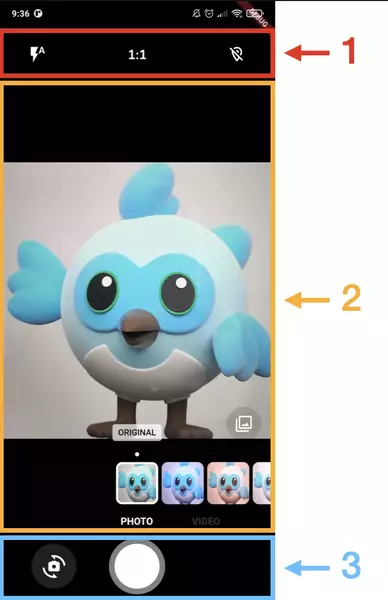
AwesomeCameraLayout separates the UI in 3 parts:

In Awesome UI, these parts are meant to be:
- Top actions: secondary actions like flash, aspect ratio, etc.
- Middle content: additional elements like filters or text indications for example.
- Bottom actions: main actions such as taking a picture or switching camera.
CameraAwesomeBuilder includes a builder for each part.
Here is the constructor of this widget:
AwesomeCameraLayout({
    super.key,
    required this.state,
    OnMediaTap? onMediaTap,
    Widget? middleContent,
    Widget? topActions,
    Widget? bottomActions,
})  : middleContent = middleContent ??
        (Column(
            children: [
            const Spacer(),
            if (state.captureMode == CaptureMode.photo)
                AwesomeFilterWidget(state: state),
            Builder(
                builder: (context) => Container(
                color: AwesomeThemeProvider.of(context)
                    .theme
                    .bottomActionsBackgroundColor,
                height: 8,
                ),
            ),
            AwesomeCameraModeSelector(state: state),
            ],
        )),
    topActions = topActions ?? AwesomeTopActions(state: state),
    bottomActions = bottomActions ??
        AwesomeBottomActions(state: state, onMediaTap: onMediaTap);
topActions, middleContent and bottomActions have default values if set to null.
The onMediaTap callback is used to handle the tap on the media preview in the default bottomActions widget.
The widget is then mostly a Column with middleContent being wrapped in an Expanded.
Feel free to use it in your custom UI.
Top actions
AwesomeTopActions is a Row with an additional padding and default children.
Use it like this:
AwesomeTopActions(
    // CameraState is required
    state: state,
    // Add your own children
    children: [
        MyFirstWidget(state: state),
        MySecondWidget(state: state),
    ],
    // Override default padding
    padding: const EdgeInsets.all(8),
)
You may want to show different children based on the current state:
AwesomeTopActions(
  // CameraState is required
  state: state,
  // Add your own children
  children: state is PhotoCameraState
      ? [
          MyFirstWidget(state: state),
          MySecondWidget(state: state),
        ]
      : [
          MyThirdWidget(state: state),
        ],
  // Override default padding
  padding: const EdgeInsets.all(8),
)
Bottom actions
Unlike AwesomeTopActions, AwesomeBottomActions is designed to include the main action of your Camera UI: taking a picture or recording a video.
Due to that, you can only set which widget you want besides that main action and customize the main action button:
AwesomeBottomActions(
  // CameraState is required
  state: state,
  // You can set your own capture button
  captureButton: MyCaptureButton(
    state: state,
  ),
  // Padding around the bottom actions
  padding: const EdgeInsets.only(
    bottom: 16,
    left: 8,
    right: 8,
  ),
  // Widget to the left of the captureButton
  left: AwesomeFlashButton(
    state: state,
  ),
  // Widget to the right of the captureButton
  right: AwesomeCameraSwitchButton(
    state: state,
    scale: 1.0,
    onSwitchTap: (state) {
      state.switchCameraSensor(
        aspectRatio: state.sensorConfig.aspectRatio,
      );
    },
  ),
  // Callback used by default values. Don't specify it if you override left and right widgets.
  onMediaTap: null,
);
left, captureButton and right widgets are then placed in a Row.
left and right are wrapped in an Expanded widget and centered within it.